I want my color to like it does in the preview window without display color management when I export
I'm working on a Mac, not with HDR footage, and have tried various approaches to correct for the gamma shift that happens during exports. I'm not well informed about the more technical processes of the premiere, so I've tried matching sequence settings between preview and export, encoding into different file types, using luts, troubleshooting in the dark, and no matter what colors have (slightly) less vibrancy then shown in the preview window.
Is it possible to tune the settings to match the colors shown in the preview when the display color management is off?
If the issue is Apple's playback what should I do to ensure my export looks the best for non-Apple screens and then come to terms with the less vibrant colors when watching back on my Mac?
Is it worth it when the presumed final destination is YouTube?
Any feedback or pointing me in the right direction would be appreciated. Thank you!
Reference example:
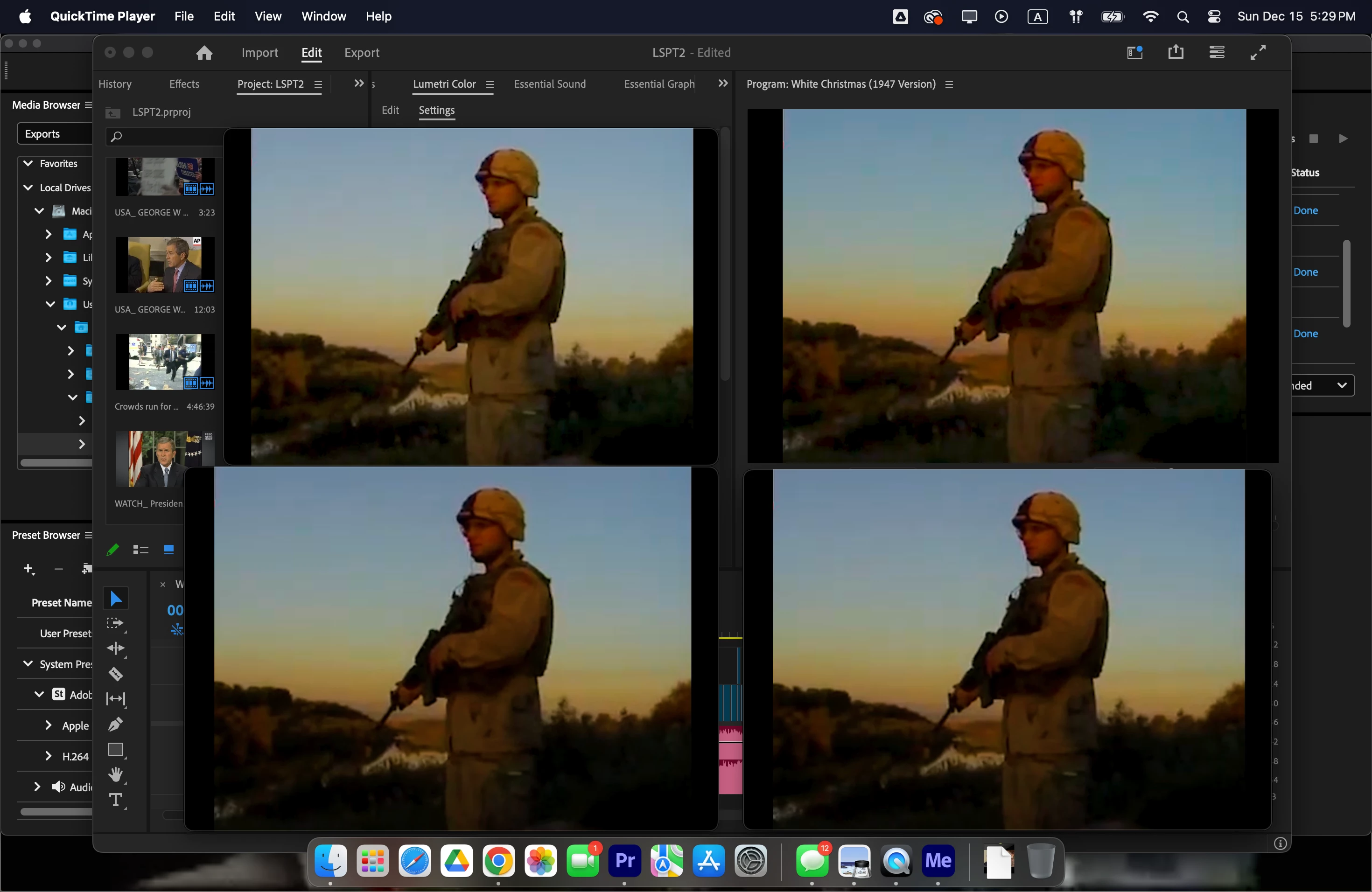
The top left is the preview window in Premiere without display color management.
The top right is export without a lut (what colors look like with display color management is on).
The bottom two are exports with a lut and different viewer gamma settings, 2.4 Broadcast, and 1.96 Quicktime.
I like the range of color and the contrast that doesn't black out the finer details of the 480p footage in the preview window.
Am I being too nitpicky with my color or can I get an export that matches my preview window?
Using Premiere 24.6.4 (Build 3)