Participant
February 2, 2020
Answered

Premiere program monitor color too contrasty on iMac Pro

  • February 2, 2020
  • 4 replies
  • 654 views

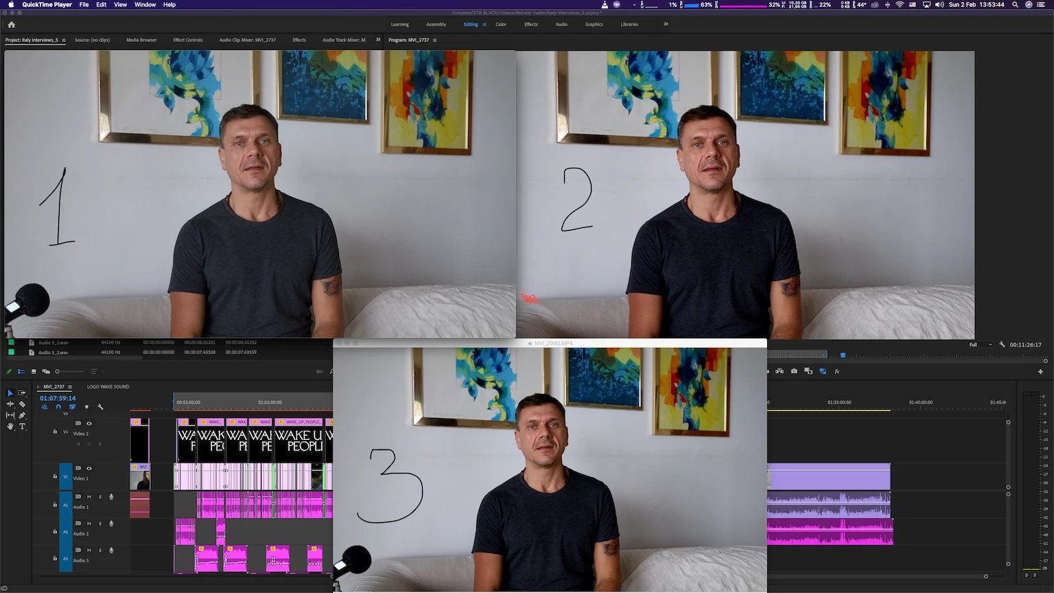
Turned out my iMac pro doesn't show colors correctly making image too contrasty and saturated (pic 2) comparing to QuickTime player (pic 1) and VLC (pic 3). And here is the best I could get by switching File > Project Settings > General > Render from "Metal" to "Mercury playback engine software only". Changing color profiles of the monitor doesn't  make it any better so I keep standard iMac profile. 


Any ideas how to match those? 


This topic has been closed for replies.

4 replies

Participant
May 10, 2022

Matching Source Monitor for S-LOG3:

Right-click footage in Project window > Interpret Footage > Color Management > Set Color Space Override to rec709

No Input LUT

R Neil Haugen
Legend
February 3, 2020

For anyone reading this ... here's a link to an article from one of the primary experts in video color setup and calibration. Steve Shaw of LightIllusions, who make one of the two top applications for calibration and testing of color accuracy for video work. On why to work with a carefully chosen and properly calibrated display system.


Neil


https://www.lightillusion.com/grading_display_accuracy.html

Everyone's mileage always varies ...
R Neil Haugen
Legend
February 2, 2020

To have consistent color requires having a system that functions according to expected color standards. That iMac ... doesn't.


Apple made a choice to go with a P3 capable screen, which is a rather larger set of color primaries than video sRGB ... that's part of it. But they created a ... unique ... color space, Display-P3 that isn't like any other color space out there, even the two professional spaces for P3 primaries.


However, if they'd also designed the OS color utility, Colorsync, to properly remap video sRGB/Rec.709 media within their unique color space, you wouldn't have a problem. But in application, their color handling design has three major errors.


- The standards require both the use of the camera transform function AND the display transform function. Color Sync applies only the first transform function, but NOT the display transform function.


- Colorsync doesn't apply the Rec.709 gamma curve of 2.4, but what they list as "sRGB gamma" ... which results in something sort of but not really like effectively 1.96, but with an odd flat area near the bottom.


- The above mentioned improper mapping of the color primaries ... you're way outside of "expectations" ... and any and every app will probably apply their own "assistance" ... so you, you get a mish-mash of color.


The way colorists function ... you make sure your system is down-the-line up to standards, you calibrate and test your calibrated results ... and do that every so often.


Even then, no one can ever control what happens outside your system. Which is why the only thing you can do is see to it that your system runs by the standards. Which are still video sRGB/Rec.709/gamma-2.4/100-nits brightness. And if you do, then your material will come across any other system as "the same" as other professionally produced material watched on that system.


But will never ever look exactly like it does on your system. That's Life.


Neil

Everyone's mileage always varies ...
Ann Bens
Community Expert
Ann BensCommunity ExpertCorrect answer
Community Expert
February 2, 2020