Participant
July 10, 2019
Question

The Gamma Shift in iMac Pro

  • July 10, 2019
  • 2 replies
  • 706 views

I use

imac pro

CPU: 3 GHz Intel Xeon W (10 Core)

Memory: 64 GB 2666 MHz DDR4

GC: Radeon Pro Vega 64 16368 MB

Premiere Pro 2019 (13.1.2)

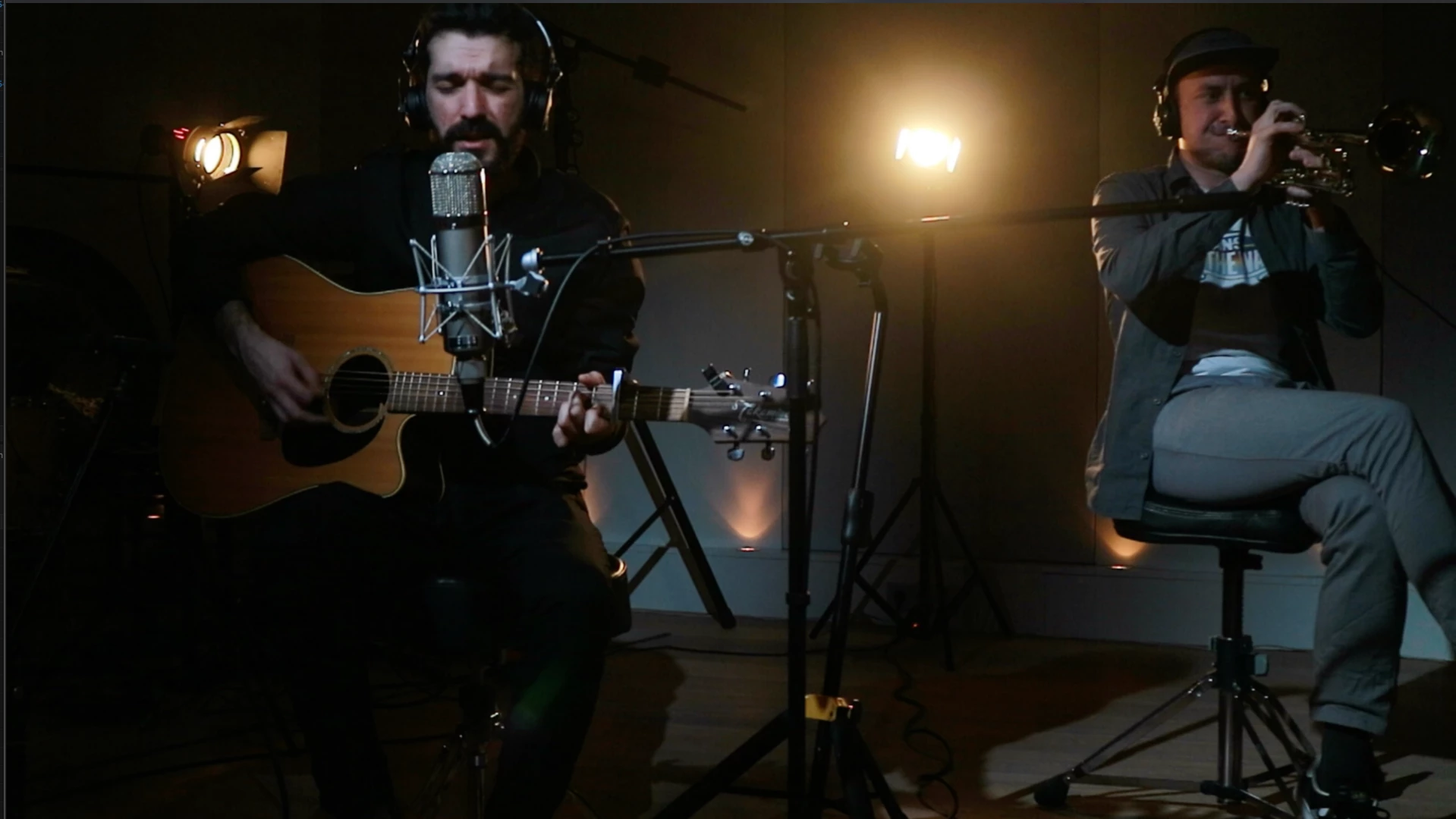
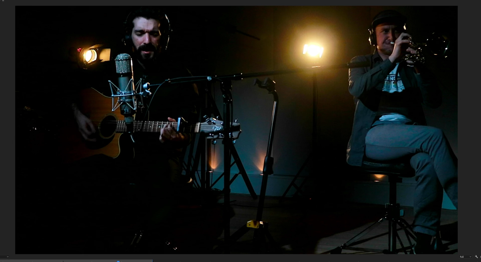
Since last December, I have been struggling with this Gamma shift in PP. I have been searching all around the web and forums and no answer. The problem no is a well known issue. In a chat I had with an adobe technician, I was told that the issue is because "Apple Interprets Color as – Gamma (1.96) , which is an older color curve". It means what I see in PP is the correct color. I uploaded a few photos and showed them how I am loosing the details in dark spots in PP preview so it can not be Apple's issue as the wrong color curve can not create details that do not already exist, however PP is killing the details. Therefore this can not be Apple issue.

I have been downgrading my files to PP2017 and color correcting and exporting over there. But this is really frustrating as some effects and transforms wwould change in 2017 and also I can not use color match which in my case (use of multicams) is essential.

Does anyone have a better solution? Is going to Picasa for color grade recommended?

I am attaching the photos here. You can see how much details are killed in dark. Look at the guitar, the guitarist's shoulder and also how the spot light fades gradually in Apple preview and how abruptly in PP. The first photo is Apple preview and the second one PP.

This topic has been closed for replies.

2 replies

R Neil Haugen
Legend
July 10, 2019

If you were working on a non-Mac monitor set to the by far most common professional standard, video sRGB/Rec.709/gamma-2.4/100-nits, you wouldn't be having this issue. At. All.

But you're not.

Apple created a completely new playground, using the P3 color space (which is 20-25% wider than sRGB), then applied a very uncommon way of applying gamma to the image. All other professional standards use a display-referred gamma, Apple apparently is using a scene-referred gamma ... the same essentially as the camera. Everything else applies a gamma to 'correct' for the camera gamma.

Those Retina "P3-Display" screens are beautiful to look at. But the color science ... the math ... involved is very, very different. And the only screens in the world using that space/math to display images are the Mac Retina P3-Display rigs. They are on about 4-6% of the screens in the US, but only 3-5% world-wide.

QuickTime player and the Chrome and Safari browsers seem to natively 'run' to the Apple scene-referred gamma now. Firefox stays with the main standard. So even which browser you use can make a big difference.

The darker tones ... and loss of detail ... you post, is because of that gamma and chroma difference. Going between them is not always 'safe' for the media involved.

Sadly the issue is a complicated one and there aren't any apps or OS's out there that auto-correct the screen to show proper Rec.709 on P3-Display screens, or media created on a P3-Display screen properly on a Rec.709 system.

And ... I do work with and communicate with quite a few colorists. Not one of them grades on a P3-Display Retina screen. None. Other than for the UI of the grading app, of course. But none use those for program-out/confidence/reference displays.

Neil

Everyone's mileage always varies ...
Ann Bens
Community Expert
Community Expert
July 10, 2019