Mike Dziennik
Community Expert
Community Expert
January 4, 2018
Question

Type tool - poor quality rendering

  • January 4, 2018
  • 1 reply
  • 1655 views

I'm generally a fan of all the new features and functionality of the new type tool (particularly pinning).

However, what concerns me is the remarkable drop in rendering quality compared to the legacy title tool.

Firstly, in INTERLACED sequences the rendering is clearly poorer than the legacy tool.

I have both fields displayed.

I have quality set to FULL.

Note the top of the letter 'e' in the bottom text (type tool). This is at 200% zoom.

Secondly, in PROGRESSIVE sequences, the difference is not as obvious - until you add strokes or drop shadows:

(Legacy tool shown on top and new type tool underneath)

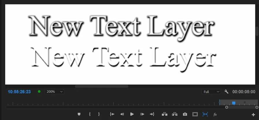
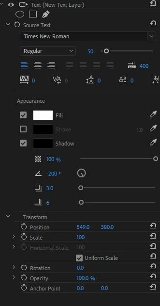
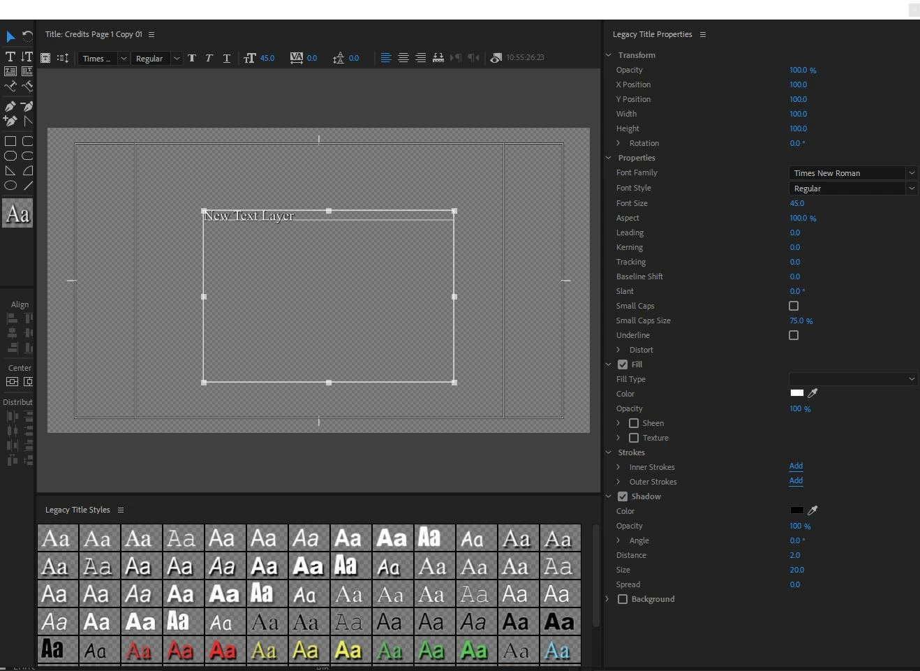
Legacy tool shown on top and new type tool below. Here are the settings for each:

Can anyone else testify to this issue?

    This topic has been closed for replies.

    1 reply

    Ann Bens
    Community Expert
    Community Expert
    January 4, 2018

    In interlaced settings you should use fonts that are san-serif.

    Serif fonts tend to give issue due to the scan lines.

    Sans-serif - Wikipedia

    Mike Dziennik
    Community Expert
    Community Expert
    January 4, 2018

    Yes I understand how interlacing works (and I have a broadcast monitor on output) and I wouldn't normally choose 'Times New Roman'. It does however best demonstrate the issue, which is still visible on san-serif fonts.

    Top of the 'e' and both sides of the 'y'.

    Ann Bens
    Community Expert
    Community Expert
    January 4, 2018

    Looks more like compression artifacts