Karolina25455503d5g7
Inspiring
February 13, 2026
Question

What would be the best sequence and export settings for iPhone shot videos (.mov) in PP2026? True colors etc

  • February 13, 2026
  • 3 replies
  • 0 views

I’m editing a video for YouTube which was shot on iPhone. (I work on MacBook Pro, M3) 

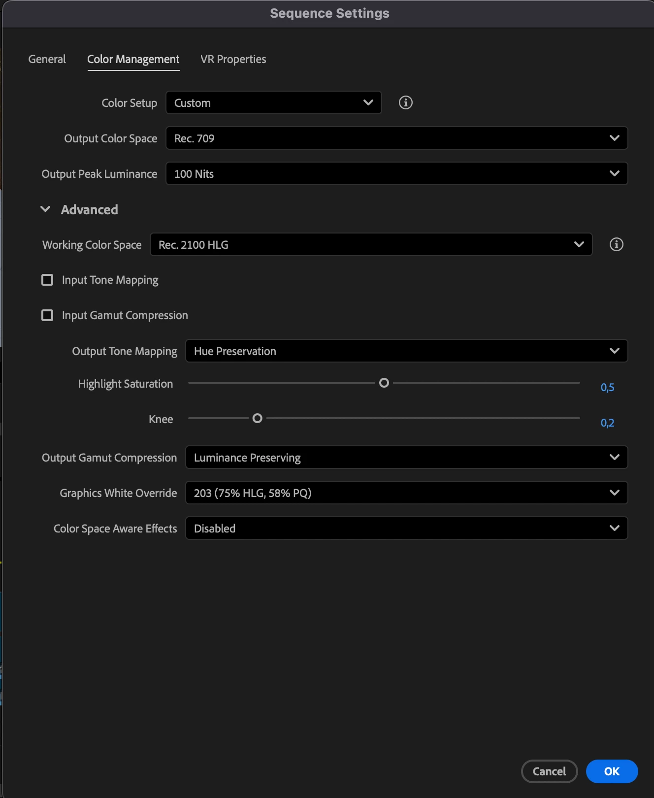
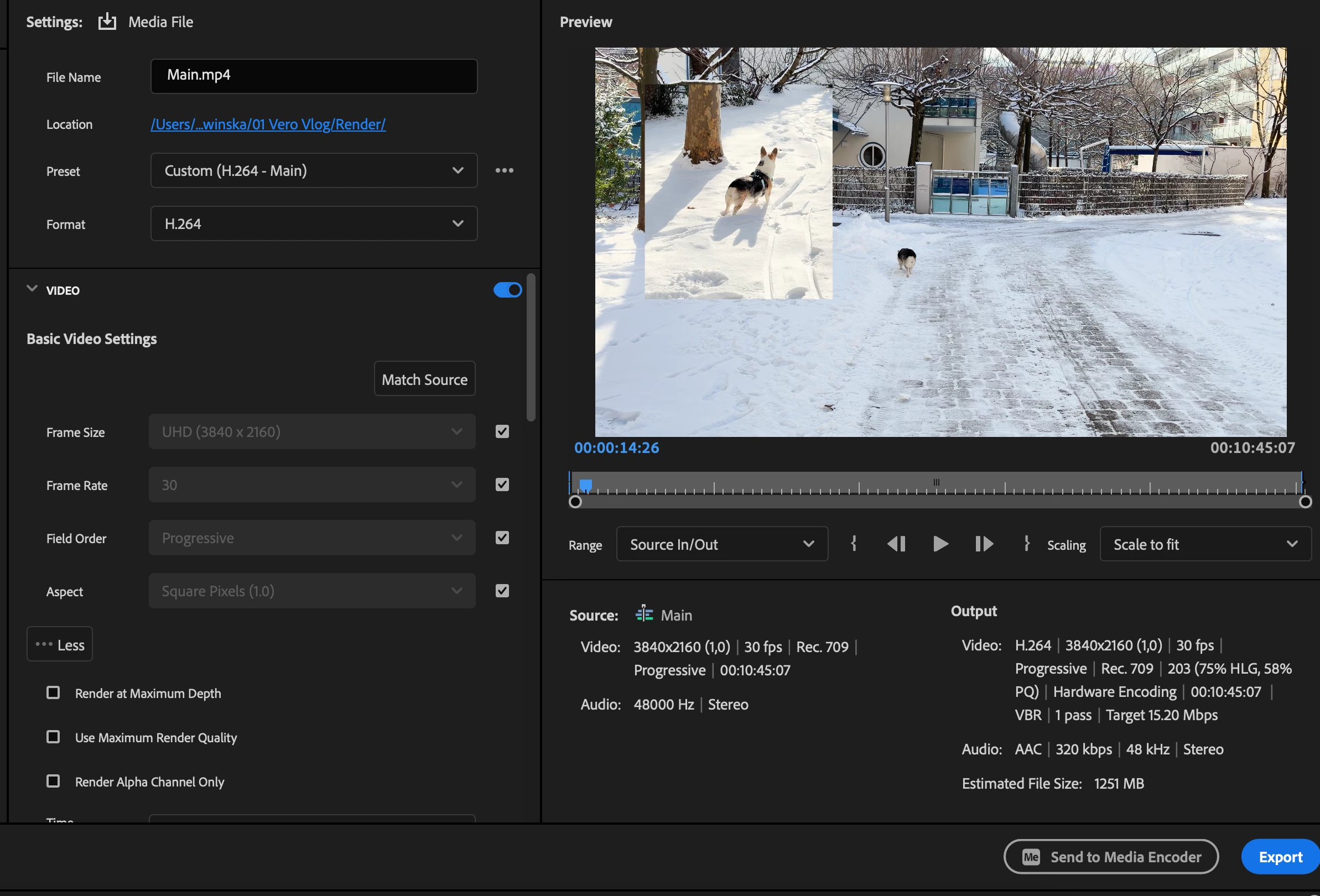
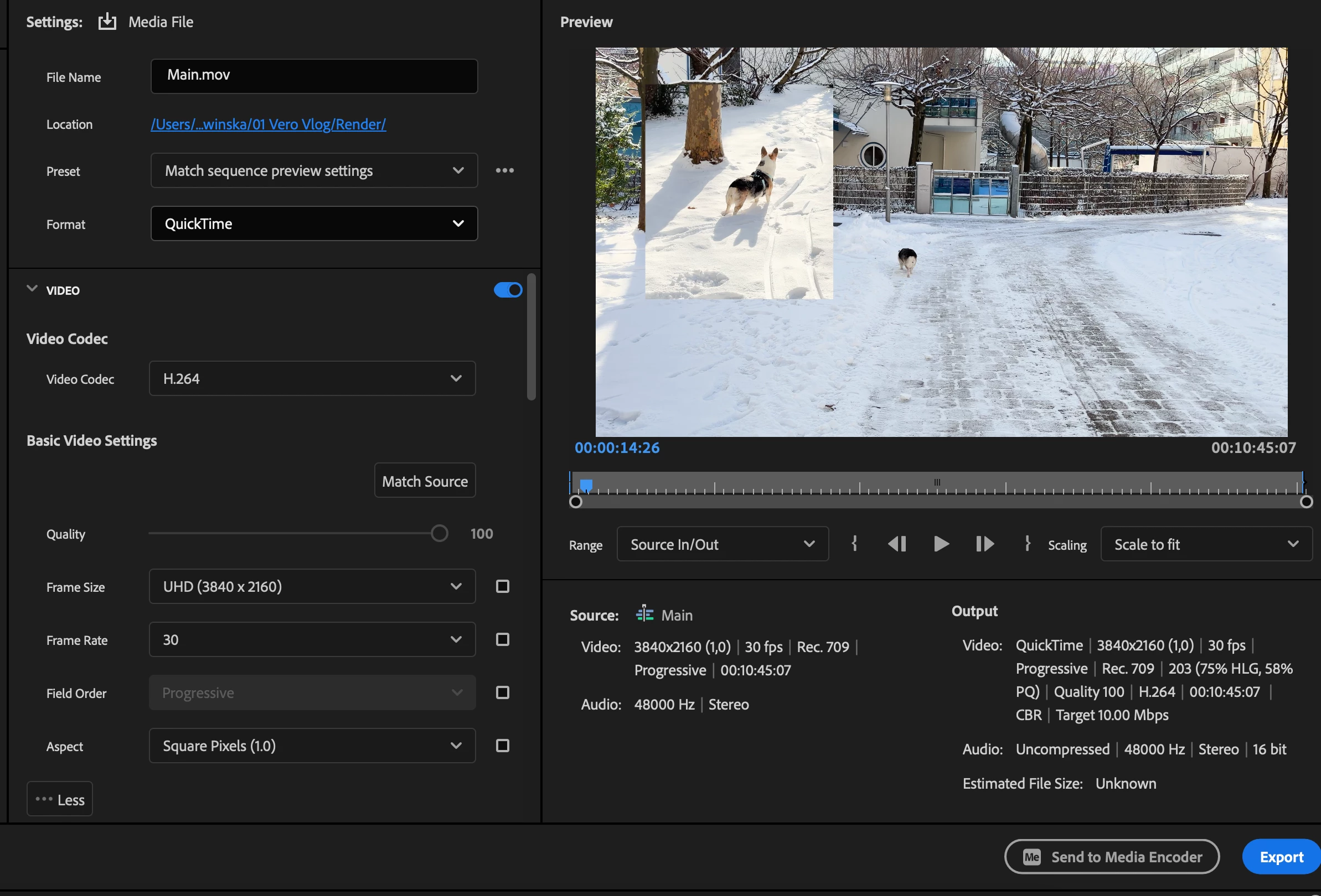
I edited and colored the clips as usual but when I exported it, the file was very heavy and colors almost comically oversaturated, skin was pink, whites was blinding. I moved back and changed the export settings to match the timeline preview (with lumetri completely turned off) and colors and size were back to normal. But I still need to color the video and I saw some tips to turn on the “Auto tone mapping” but this seems to be missing in the v26 version (or is placed somewhere else.). I learned that the Apple pro res uses some wider color spectrum than rec.709, so I changed that too, but I honestly don’t know if it’s working. 

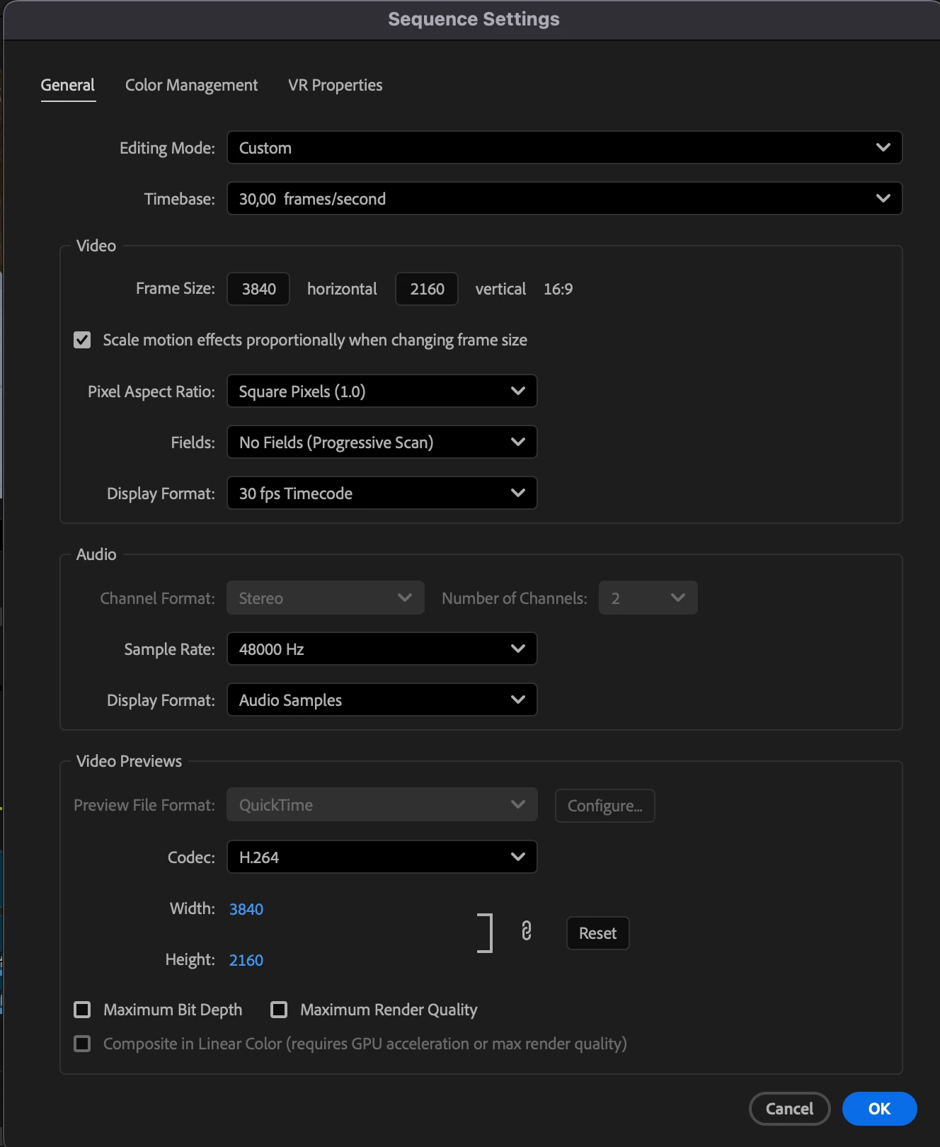
 In the screenshots are my current sequence and export settings, I’d be grateful for some help on how to get the best results with those clips! Thanks


    3 replies

    R Neil Haugen
    Legend
    February 13, 2026

    I can’t tell you precisely what to set as I don’t know what you want to end up with. HLG/HDR? Rec.709? What? But there’s something else to establish at the beginning of learning video color, or nothing you will ever do means anything.


    Ok, first …. completely lose the entire ideal that any capture device captures color at all. 


    They capture brightness data no color data!


    The color we ‘see’ is a total manufactured thing ... between the filters over the sensor elements, the fanstastical math used in processing that data to recreate ‘color’ pixel data, when there isn’t any such physical thing, and that’s only the start. The computer or display device reverses the process ... back to pixel brightnesses.


    And all equipment is flawed ... there are no perfectly even sensors nor processing chips nor display screens. The very expensive “Grade 1 Reference monitors” from Flanders and EIZO and Sony use panels that sure, are used for other less expensive monitors. But they are not the same! The panels are always graded off the manufacturing line, and the ones that are less problematic ... fewer dead or hot pixels, more even response across the panel ... get sold for a vastly higher price to those companies. 


    The sensors and panels in phones and tablets are shall we say, not noted for their graded perfection ... period.


    Due to undestanding what the actual nature of the beast is, no camera made, not even the $70,000 ones from Red and Sony, are thought by anyone to have an accurate screen on-camera. You want accurate, you pay a tech to have a spendy calibrated monitor in a portable viewing space on-set. All high-end production using the Venice and Red cameras also have that tech with the ‘accurate’ monitor and viewing tent to check the image within. They do not count on the camera’s screen.


    Now ... what your phone screen displays as far as your eyes are concerned will vary depending on the brightness and colors of the light around you at the time you’re viewing it. Basic human physiology.


    So lose the entire “true” or “this screen is accurate” unless you’re looking at a properly calibrated and profiled Grade 1 Reference monitor in a totally controlled semi-dark environment. Ok? Even then it’s only a solid presentation of the data of the file ... and no two Reference monitors will ever totally match visually! 


    Every screen, every app, every TV, tablet, monitor, whatever, will show at least a slightly different image than any other screen will. That’s just Reality. Colorists are taught this simple truth:

    No one will ever, no matter the deilverable method, broadcast, streaming, theatrical, or optical disk ... ever see the identical image you saw when grading the content. Ever.


    Now we’ve narrowed expectations to Reality, let’s deal with your images.


    You shot in HLG, a form of HDR ... high dynamic range ... which isn’t just brighter, it also uses one of at this time many different available color spaces ... which is the ‘pool of available hues’ for the device to create. And even then, just because two devices say they use the same overall color space, doesn’t mean their actual color hue outputs in their files will be similar. Just that ... they use the same overall outline of possible hues. Each willl vary in what it actually writes to the file.


    You look at that file on your phone, that is one of the many representations that image file will have, which will vary on every device it’s ever viewed on. 


    Ok ... what you want is then to narrow down the ‘data pool’ so that the viewed image is as similar to what you saw as you can expect. That’s where choosing and calibrating monitors, setting up a correct viewing environment, and as the last part of the chain, setting correct color management comes in.

    And if you haven’t chosen a high-Q monitor, calibrated it with a puck/software setup so you know it’s response is at least mostly what the color space says, and setup a controlled viewing situation, well ... you have no idea how close or far from ‘accurate data representation’ that screen is.


    But within Premiere ... do you want to end up with an HLG image, that new  and rather widely set of HDR specs? Or the standard Rec.709 that nearly everything you’ve seen over the last 25 years has been in?

    Next, you have to understand what the individual viewers will be seeing ... say you go to YouTube ... some will view it on their phone in broad daylight on a park bench. Viewing it on that same phone at night in a darkened room will actually give a different view to the human eyes. So on the same device, where it’s used changes the human reception of the data displayed.

    Now ... color management is not at all tightly uniform! Not “out in the Wild” ... it just isn’t. As colorists have been taught, “You can’t fix Gramma’s green TV” ... meaning you have no control over anyone’s screen’s representation ... ever, period. If that screen is off, and most will be off in something at the least! ... it will always be the same “off” for that viewer ... and they will never realize it’s “off” because to them, it’s “normal”. And does the same thing to every image it shows.

    You’re using Apple, sadly ... for Rec.709 that’s a massive problem. As Apple chose not to follow the long-established standards specifiied for Rec.709 display transforms. And there is no way around this.

    But even worse, it’s only “off” on some Apple screens! Apple will use the wrong display transform of essentially gamma 1.96, rather than the proper display transform with an essential gamma of 2.4 ...only on their cheaper screens!

    The higher-end Macs, which have Reference modes, when the screen is set to HDTV, will use the correct display transform for Rec.709 video media.

    So broadcast setups, most Androids, TVs, and all Macs with Reference modes set to HDTV ... will be in a similar “ballpark” for how they display the image brightnesses. 

    Only Macs without Reference modes set to HDTV will show the raised shadows and lower apparent saturation.


    Well if you want the standard SDR, which is still in the main more reliable across screens even with the mess I’ve just covered ... 

    Premiere SDR/Rec.709

    - Set auto detect log and auto-tonemapping to On, on Macs, add extended dynamic range where available.

    - Set the Sequence to Direct Rec.709 and Premiere will use the above to automagically remap the pixels to the middle of the Rec.709 range for tonal and color data.

    - Viewing gamma is ... the variable here. Do you only care about Macs without Reference modes, which will see a brighter image in QuickTime player or Chrome or Safari? Then set viewing gamma to 1.96. BUT ... it you want to be better represented across the majority of screens, then set viewer gamma according to the brightness of the room you are in while grading, not the intended output! 

    According to the heavily researched and thought out Rec.709 specs, grading is recommended in a rather dark, neutral gray space ... not black, but pretty dark, and while using display transform with a gamma 2.4 setting. This is actuallly for best evaluation of color hue and total saturation given the human Mark I Eyeball/brain combination.

    Those same specs require a display transform of gamma 2.2 if grading in a normally lit room environment. 

    So you need to choose what you are grading to and in ...


    Premiere HLG to HLG

    Set auto detect log, tonemapping, and extende DR as above

    - Set the Sequence CM to HLG


    Everyone's mileage always varies ...
    Karolina25455503d5g7
    Inspiring
    February 14, 2026

    Thank you for such insightful answer, this helps a lot since I’m beginner colorist and I don’t quite understand all the settings yet, but this answer made a lot of things clear and what I’m seeing now in the project already looks better than what I was working on before. Thanks sm!


    By the way, do you recommend any sources to learn more about color grading? 

    R Neil Haugen
    Legend
    February 14, 2026

    You’re most welcome ... getting started with actually a bit of an understanding of what Reality is compared to what it seems like it is is a lot better than going way down the road with misconceptions. They get harder to let go of over time, typically for nearly all us humans.


    How far in the weeds do you want to go? I can deal with things fairly lightly, or get way down that hole ... sigh.

    Everyone's mileage always varies ...
    Peru Bob
    Community Expert
    Community Expert
    February 13, 2026

    @R Neil Haugen 

    Can you help?

    Legend
    February 13, 2026

    The problem here is a mismatch in the color settings between the HDR HLG source and the SDR preset you used: HDR imported into an SDR color space will result in a gray, muddy look with washed-out color.


    I will defer to the color experts to determine which settings to use since I have only very basic knowledge of this as almost all of my work is SDR.

    Karolina25455503d5g7
    Inspiring
    February 13, 2026

    Okay this makes sense, so I should change the working color space and it will be better?