
New UI removes important visual lines in the bin
The updated UI meant for visual clarity actually removes some visual elements that have always brought clarity to the bins. There are thin lines dividing items in a bin, but moving forward the new UI look removes those lines making it nearly impossible to glance at the bin and find across horizontally.
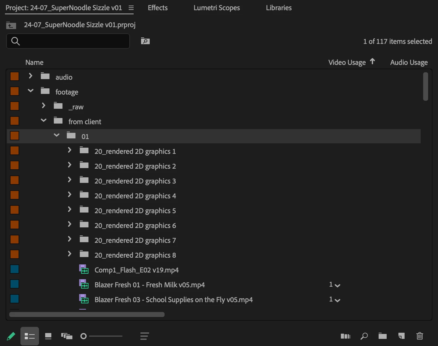
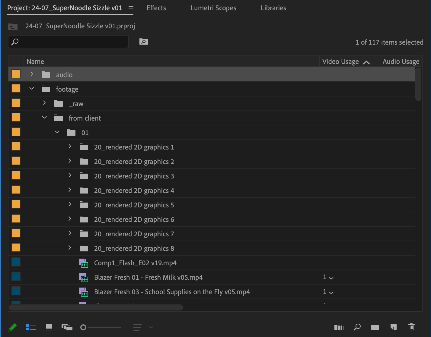
You can see how I can clearly scan across with my eyes horizontally to find the Video Usage (or whatever other pertinent info I choose to put there) across from my asset in the bin, however in the new version it just looks like a bunch of floating numbers. I'll now have to move the mouse, click on my item so it highlights the row just to confirm I'm even looking at the right number.
This is NOT a good change and this is going to just add more confusion, it doesn't help with visual clarity in any way whatsoever. In fact, it creates more visual clutter.
