Question
UI Colors
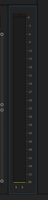
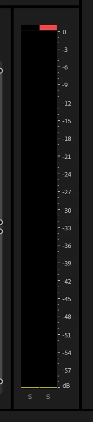
In general, the UI colors are not good for quick read of data, the blue theme for buttons was good, the grey thing buttons are not good.
1. The colors of the new Dark Theme are too strong, if the black zone could be less dark ?
24.5 vs Beta 24.6 b55
2. And why the borders have to be this large and that black ? could it be half size ?

3. Its harder to read at a quick glance what changes where made for the sequence menu, the blue colors where nice, the new "grey" theme for buttons and text is not readable
24.5 vs Beta 24.6 b55