
Don't want an image in a table cell to resize when window size changes
We recently coverted a RH2017 project to RH2020 (our exact software version is 2020.6.76).
In the project, notes are created using one-row, two-cell borderless tables in which the first cell contains the note image. We generate using using Responsive HTML5.
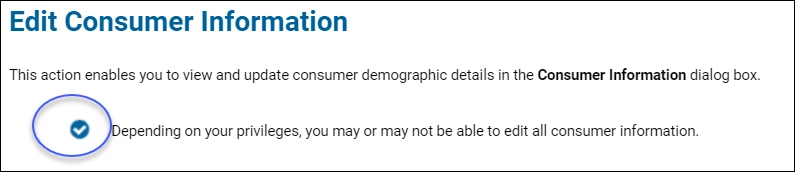
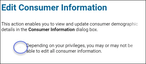
The issue: In the generated help, the note image shrinks as the display window's size is reduced. We need the image to remain the same size no matter what size the display window is. The following screenshots show the difference between the largest display size (monitor width) and the smalllests. The note image is circled in both.
Screenshot 1 - display at monitor width
Screenshot 2 - display is at its smallest
Here's the code for the table from the screenshots:
<table cellspacing="0" style="margin-left: 50px;" width="89.512%">
<colgroup>
<col style="width: 3%;" />
<col style="width: 93.778%;" />
</colgroup>
<tbody>
<tr style="vertical-align: top;">
<td style="padding-right: 10px; padding-left: 10px;">
<p class="NoteTable"><img alt="" border="0" src="../../Buttons_Icons_Fields_Logos_Tabs/Note-Checkmark-circled.png" style="border: none;" /></p>
</td>
<td style="padding-right: 10px; padding-left: 10px; vertical-align: middle;">
<p class="NoteTable">Depending on your privileges, you may or may not be able to edit all consumer information.</p>
</td>
</tr>
</tbody>
</table>
So far I've tried the following to try to stablize the image size:
- Set a specific size for the image in the image properties
- Set the table and column widths to be measured in px units instead of percentage.
- Changed cell padding and margins
- Disabled the Responsive option in the skin
Nothing I've done so far has made much difference. Does anyone in the community have any suggestions?
FYI - I read the community post Create a Caution/Warning note using a .png image before text in which Stefan-Gentz outlines why invisible tables are not the best way to format or define position for an item in a topic, but invisible tables have been used for notes in this project from the start many years ago. I'm trying to see if there is a way to fix what we already have before doing a total rework.

 AdChoices