EmanAssem
Inspiring
March 27, 2016
Answered

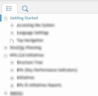
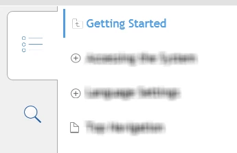
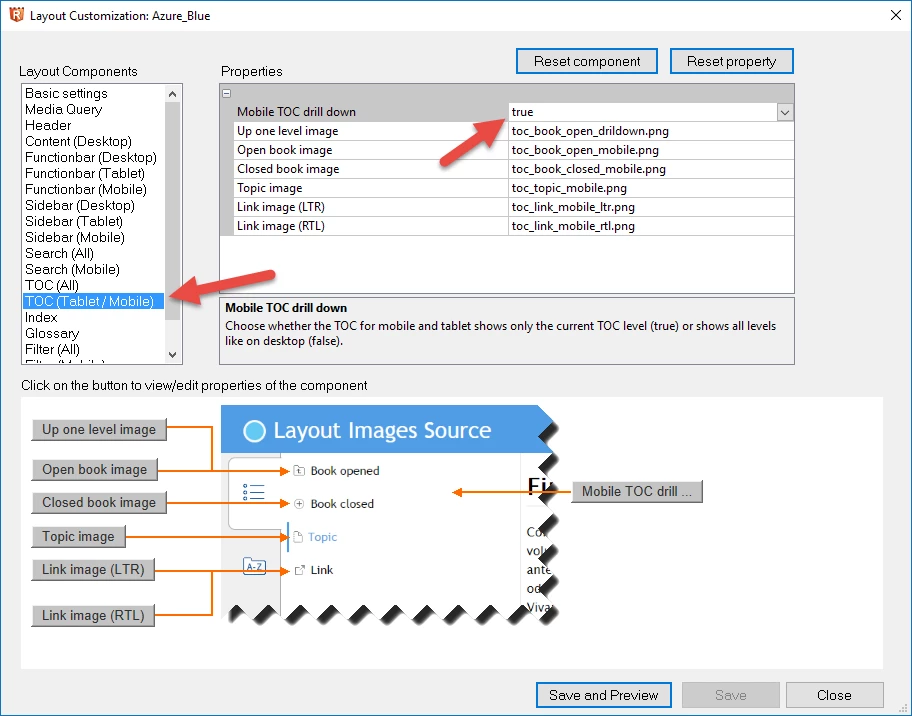
How can I keep TOC (drill-down) full view in different Desktop resolutions in RH HTML5 2015? I have tried changing resolution, but it doesn't work. It seems something has to do with the TOC itslef

  • March 27, 2016
  • 2 replies
  • 834 views

- In 1st image (90% zoom), the topics are all displayed and you can navigate through with keeping the full view

- In 2nd Image, (100% zoom), clicking any topic takes you from the full view to the sub-topics.

I need to keep Image 1 view in different Desktop zooming..Any advice?

This topic has been closed for replies.
Correct answer Willam van Weelden

Hello again

I believe what you need to do is adjust the pixel value for Tablet so the value is smaller. Exactly what value to enter will require experimentation on your end.

What you are looking at in the image I shared are the pixel values where the breakpoints occur. Sure, it reads phone and Tablet. But I think all it really means is at what pixel point do I change the display as you depicted.

Cheers... Rick


In addition to Rick's suggestions, note that the TOC behaviour is a setting as well. For mobile and tablet, the TOC collapses by default, but you can get the Desktop behaviour for those devices as well. If you follow Rick's instructions, you'll also find a section called 'TOC (Tablet/Mobile)'. You can change the behaviour there.

2 replies

EmanAssem
EmanAssemAuthor
Inspiring
March 28, 2016

Thank you all. Actually, what Willam has mentioned is the solution. When you change resolution, it detects as you are in mobile or tablet view, so setting this option to "False" makes it have the Desktop TOC view in differnet resolutions. I have tried that early today with Adobe support and it works.

Thanks a lot

Captiv8r
Legend
March 27, 2016

Hi there

Perhaps try adjusting the Media Query settings?

From the Responsive HTML5 settings ( 1 ), ensure the General category ( 2 ) is selected and click the Customize ( 3 )  button followed by the Media Query ( 4 ).

Cheers... Rick

EmanAssem
EmanAssemAuthor
Inspiring
March 28, 2016

Thank you, but this is has to do with mobile and tablet. My issue is with desktop across different zooming. I have also tried to change the Desktop resolution, but this doesn't  solve the problem as well..

Captiv8r
Legend
March 28, 2016

Hello again

I believe what you need to do is adjust the pixel value for Tablet so the value is smaller. Exactly what value to enter will require experimentation on your end.

What you are looking at in the image I shared are the pixel values where the breakpoints occur. Sure, it reads phone and Tablet. But I think all it really means is at what pixel point do I change the display as you depicted.

Cheers... Rick