johnvarvatsis
Inspiring
March 21, 2018
Question

How do I hide the Back icon on Indigo navigation

  • March 21, 2018
  • 1 reply
  • 1201 views

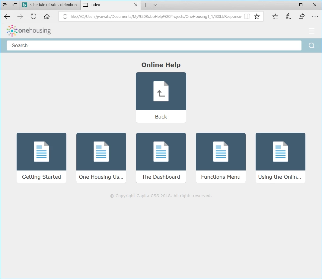
When I was messing around with the evaluation copy of RH I managed to generate output without the Back icon (shown on the screenpic below).

I cant remember how I did it now!

Any ideas folks?

This topic has been closed for replies.

1 reply

Inspiring
March 21, 2018

Hi,

If the top/first book has the Book with Link ticked as below, the back button doesn't get displayed - or the other tiles.

Captiv8r
Legend
March 21, 2018

Hmmm, thinking about the history of the way RoboHelp has always worked, I'd be surprised if that was the answer. But hey, these new Responsive layouts behave in seemingly odd ways. So maybe it will be.

Hopefully if that fixes it, Johnvarvatsis will reply back.

What I would have asked to see is what the TOC looks like inside the RoboHelp editing environment. And my own guess is that I would see something like this when screen captured and posted:

Sooo, Johnvarvatsis - Am I close? Can you share a screen capture of your TOC editor in RoboHelp?

Cheers... Rick

johnvarvatsis
Inspiring
March 22, 2018

I agree the new position of the Back button is wasting screen space but I understand there was some technical reason. What I am not getting in this thread is how the user goes back other than using the Browser back button. How are you expecting them to do that?

As you are not alone in not liking the new position, maybe a feature request to find a better solution should be submitted. Please follow this link to report bugs and request features. The more people who do so, the higher it gets prioritised.

https://tracker.adobe.com

Post the link to that bug/feature in this thread and others can vote for it.


See www.grainge.org for free RoboHelp and Authoring information.

@petergrainge


Success! I have a bug number (1510)

I'm beginning to realise the limitations of this tile system - or at least why I don't like it. Its great for the top level, where you might have 3 or 4 major sections. It provides an attractive front end to the help system. But suppose you have 20 topics in a second level book, with lengthy topic titles. Its not helpful or aesthetically pleasing. Not to mention that Back button. My solution for now is to create a "Contents" page in each book, with links to the topics therein. and a toc-based browse sequence. Its a lot neater and you can have long topic names without them being concatenated.

For now, I'd like to disable the second level of this navigation altogether, as it flashes up momentarily before my contents page is displayed which is a bit clunky. Can it be turned off at the second level?

As for navigation back to the top level, I will suggest my users click the company logo (home button) at the top left. Failing that, an old-school Home hyperlink at the bottom of the page will have to suffice.

I guess its all down to personal preference in the end though. If Adobe could  make the second level tiles / buttons a bit slicker I would be a happy chappie.