Inspiring
May 3, 2018
Answered

Indigo Layout Homepage TOC Question - Mobile Responsive View

  • May 3, 2018
  • 1 reply
  • 676 views

Hi All - I've been putting the finishing touches on my current project for work, and realized that on some of my sections that contain a lot of books and topics, the homepage TOC isn't showing the TOC items correctly when mimicking the "mobile" view. I did some counting, and it appears after ~14 items (books or topic pages) a new column is created. However, on sections with < ~14 items (books of topic pages) it displays as expected - one nice column. Below are some screenshots to help explain what I'm seeing. I've looked through the css and for the life of me can't figure out what to edit to remedy the "additional" column when the page view is shrunk down to mimic mobile devices.

Desktop Homepage View:

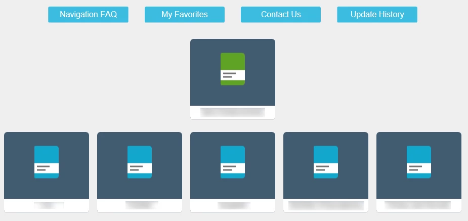
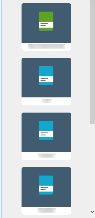
Mobile Homepage View:

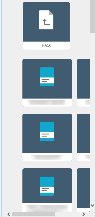
Mobile View When I Open a Book that contains +14 items (books/topic pages) - it doesn't remain one uniform column, it shifts to the right and creates an additional column (there are two columns as shown below, totally 28 items):

When I open a different book that has less than 14 books/topic pages (either from the top level of the homepage, or in a sub-book, etc.), it stays as one uniform column which retains the responsive look:

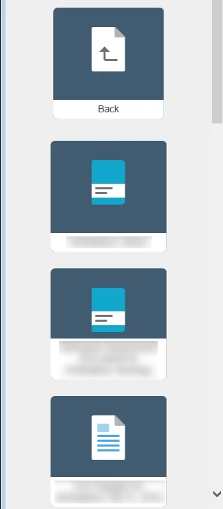
Thanks in advance for any thoughts or suggestions to try!

This topic has been closed for replies.
Correct answer pfos029

Wish I would have done more testing before posting my question. My browser was causing the issues with the TOC items shifting to the right. When viewed on an actual mobile device, it works beautifully. Please disregard my question and "identified issue" above. Thanks.

1 reply

pfos029AuthorCorrect answer
Inspiring
May 4, 2018

Wish I would have done more testing before posting my question. My browser was causing the issues with the TOC items shifting to the right. When viewed on an actual mobile device, it works beautifully. Please disregard my question and "identified issue" above. Thanks.

Peter Grainge
Community Expert
Community Expert
May 4, 2018

Useful to post the answer. I have seen such mismatches.


See www.grainge.org for free RoboHelp and Authoring information.

@petergrainge

Use the menu (bottom right) to mark the Best Answer or Highlight particularly useful replies. Found the answer elsewhere? Share it here.
pfos029Author
Inspiring
May 4, 2018

Of course. I was doing my initial testing to mimic the mobile responsiveness in Internet Explorer 11. This produced the issue of the TOC not becoming responsive and showing 2 columns.

When using my actual mobile device it behaved normally, with no second column added, etc. I tested in a different browser on my desktop and used Firefox. It behaved just like my mobile device. So it appeared to just be an issue IE11 based on my quick testing. I'll use Firefox going forward for any mobile "mimic testing."