Known Participant
May 8, 2025
Question

Mobile layout settings don't match desktop settings in HTML5 template

  • May 8, 2025
  • 4 replies
  • 354 views

How do you change the sidebar settings for mobile devices in the HMTL5 template layout?

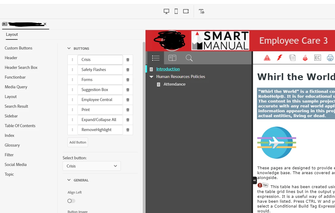
Desktop TOC. Notice the grey background, function bar background, and selected text colors.:


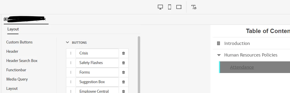
Phone TOC. Notice the white background and the grey selected text background.:
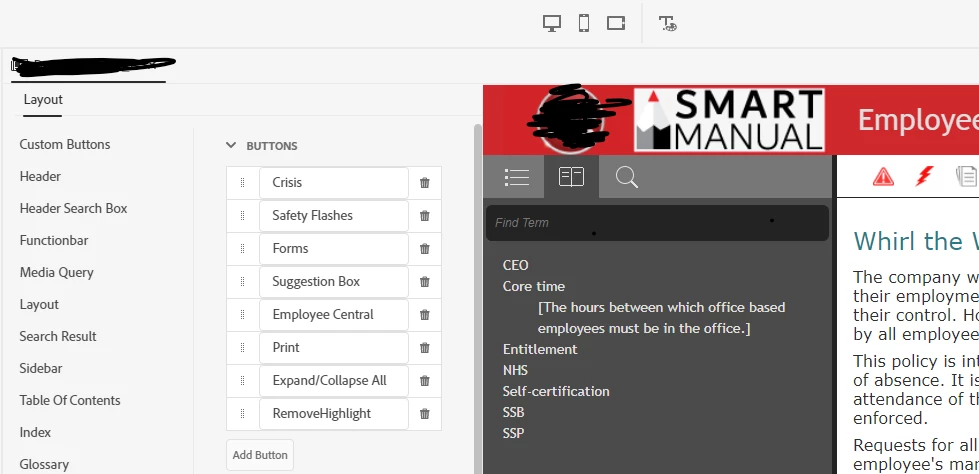
Desktop Glossary.

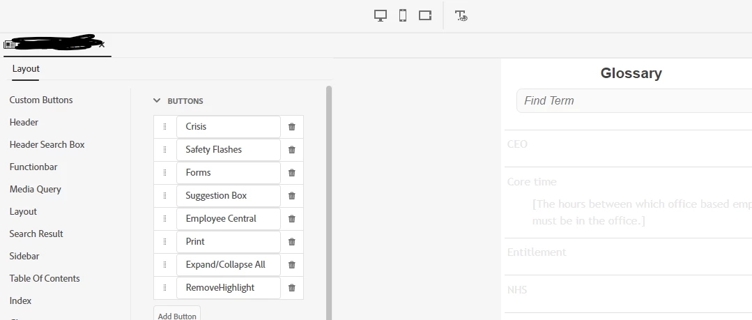
Mobile Glossary. Notice the text is so light, it's unreadable.


I want the mobile devices to match the desktop. The Layout settings dialog box seems to only apply to the desktop view and the mobile views don't seem to use the same settings.


I've looked at the layout.css and can see references to some of the settings, but am not clear on what to change.

Thanks.

    4 replies

    Peter Grainge
    Community Expert
    Community Expert
    May 9, 2025

    I can't find anything but there was a bug whereby changing a setting for one device changed it for all. If that is what you are seeing, maybe manually changing the CSS will help but I'm not sure of that.

    ________________________________________________________

    My site www.grainge.org includes many free Authoring and RoboHelp resources that may be of help.


    Use menu (bottom right) to mark as Best Answer or to Highlight particularly useful replies. Found the answer elsewhere? Share it here.
    Known Participant
    May 12, 2025

    Thanks for checking. Changing the settings once and having them apply to all devices is ideal for me, at least for this use case. However, I can see why changing them indepdently would be good. Having the option would be ideal.


    For now, is there a resource with detailed descriptions (a map of sorts) of each setting in the .css?


    I've changed the hex codes for the colors, but to no avail. Some of the settings names are pretty cryptic so I'm not sure I'm changing the right thing -- in the right .css file.

    Peter Grainge
    Community Expert
    Community Expert
    May 13, 2025

    The only map I know of is published by an outfit known as  Trial and Error. 🙂


    Did I mention the customisation in frameless? Sorry.


    Have you tried pointing at what you want to customise in an output viewed in a browser, then right clicking and selecting Inspect. It can help identify the style. Sometime it works and sometimes it's tricky.

    ________________________________________________________

    My site www.grainge.org includes many free Authoring and RoboHelp resources that may be of help.


    Use menu (bottom right) to mark as Best Answer or to Highlight particularly useful replies. Found the answer elsewhere? Share it here.
    Peter Grainge
    Community Expert
    Community Expert
    May 9, 2025

    I haven't been able to find anything on this but I am sure there there was a thread and a bug report that identified that when you click the different icons for phone, tablet and desktop, whatever you apply in one, changes the others.


    Take a look in both to see if you can find anything. I will look again later.

    ________________________________________________________

    My site www.grainge.org includes many free Authoring and RoboHelp resources that may be of help.


    Use menu (bottom right) to mark as Best Answer or to Highlight particularly useful replies. Found the answer elsewhere? Share it here.
    Peter Grainge
    Community Expert
    Community Expert
    May 8, 2025

    I think this more about there being a bug in Responsive templates. I'll try to find something in the morning.

    ________________________________________________________

    My site www.grainge.org includes many free Authoring and RoboHelp resources that may be of help.


    Use menu (bottom right) to mark as Best Answer or to Highlight particularly useful replies. Found the answer elsewhere? Share it here.
    Known Participant
    May 8, 2025

    Thank you, Peter.

    Jeff_Coatsworth
    Community Expert
    Community Expert
    May 8, 2025

    This is the Preview right? I wouldn't trust that 100% - generate your output as a test and use your browser to resize or emulate different devices (if using Chrome). See #10 in https://www.grainge.org/RoboHelp_Gems/RoboHelp_Gems.htm#templates 

    Known Participant
    May 8, 2025

    Thanks, Jeff. Yeah, I know not to trust the previews. The screenshots are previews just for simplicity for posting here, but it's the same on the actual devices.