Inspiring
November 20, 2023
Question

Responsive layout on phone

  • November 20, 2023
  • 1 reply
  • 174 views

Hi,

I'm using RH2022.3 and the Azure Blue responsive template. It appears to work well on an iPad, but when I view on a phone, any graphics are tiny.

For example, on an iPad, I see:
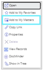
While on a phone, it is tiny.

I realise they'll be small on a phone, but I need them to be a little larger than this. Is there a setting I've missed, or something I need to add to get the graphics to show as more than a tiny box on a phone?


When I've had this problem on a website I coded myself, I needed to add the following code, but that doesn't seem to make any difference here.

<metaname="viewport" content="width=device-width, initial-scale=1">


Thanks.


    This topic has been closed for replies.

    1 reply

    Community Expert
    November 20, 2023

    Because you're using Responsive HTML you probably can't modify that directly.


    In the template switch to phone view using the icon at the top of the page and double-check for any relevant setting.


    If not (as i suspect) you'll have to inspect the output using the developer tools, with the browser resized to phone size, to figure out what css is causing it. Then add a custom css file with just that change to the User Assets section in the template.


    It'll probably be something like the following - values made up, but provided as an idea what to look for.


    @media screen and (max-width: 768px) {
    
      img {
    
        width: 50%;
    
      }
    
    }
    Inspiring
    November 21, 2023

    That's really useful, thanks very much. I had looked for a setting in the template in phone view, but I couldn't find anything, so I shall do as you suggest with creating a custom css file.