Inspiring
July 31, 2015
Answered

RH2015 - Responsive HTML5 Layout is not correct in IE

  • July 31, 2015
  • 2 replies
  • 1169 views

After generating my project using 'Responsive HTML5', the desktop and tablet layouts work perfectly in Google Chrome and Firefox, however there is a problem with Internet Explorer (I am using IE9). In IE when the content is viewed on the desktop it is always shown with the Phone layout and on occasions the TOC fails to populate when opened. I have also tried the sample projects with the same results.

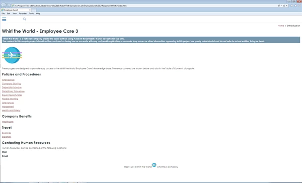
The image below shows the IE9 layout on the full size desktop:

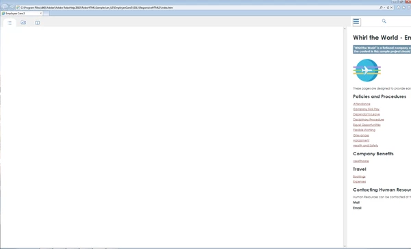
The image below shows what happens when the TOC button is selected.

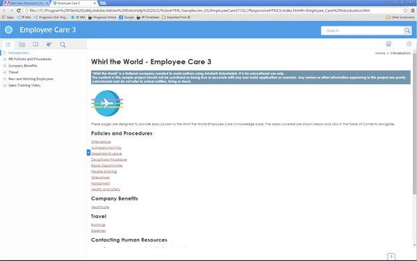
The image below shows the same project using Google Chrome on the same desktop. This is the correct desktop layout.

However, when I use RH11 all layouts, including IE, are correct!!

Is there a setting that I am missing somewhere in RH2015, or is there a file from RH11 that I can copy over to RH2015 that might correct the problem?

Thanks,

Chris

This topic has been closed for replies.
Correct answer Willam van Weelden

I did a quick check: IE9 does not support the JavaScript matchMedia property. This is the property being used by the RoboHelp output to switch the break points for mobile devices. That is the cause of this issue. According to the help, IE9 is still supported for Responsive HTML5 (http://help.adobe.com/en_US/robohelp/2015/robohtml/#t=book%2Frob_layouts_la%2Frob_layouts_la-11.htm) Either this help is incorrect, or it is a bug.

Please log an issue with Adobe at Home

2 replies

Inspiring
September 16, 2015

For everyone's information I have received the following response from the bug report that I raised with Adobe:

"Yes you are correct IE9 does not respond to Responsive layout from RH2015.

However i have two solutions for you:

1. If you are viewing it on desktop then you can set the default layout as Desktop which is set to mobile by default.

Steps: open ...\template\<layout_name>\usersettings.js in published output.

add rh.model.publish(rh.consts('KEY_DEFAULT_SCREEN'), 'desktop'); line after line 168 @

rh.model.publish(rh.consts('KEY_FEATURE'), features);

rh.model.publish(rh.consts("KEY_LAYOUT_VERSION"), "2.0");

rh.model.publish(rh.consts('KEY_DEFAULT_SCREEN'), 'desktop');

This will set your default layout as desktop but it will not solve the "being unresponsive" issue.

2. RH 11 layouts are supported in IE9 so you can import the RH11 responsive layout in RH2015 and use it. It will work fine.

We will update our Help soon. Feel free to query in case there is any confusion.

Thanks for highlighting this oblivious mistake in Help file."


I haven't tried these 'work arounds' as yet, but will do so as soon as I get a chance.


Chris

Community Expert
September 17, 2015

Gah! I was just telling my boss we should move to RH2015 to use the DUCC in HTML5, but we only just upgraded to IE9. :S

Does anyone know if we use a RH11 layout whether we can plug just the new DUCC feature into it, or if that feature is the reason RH2015 responsive isn't compatible with IE9 any more? (I've also made the assumption that DUCC is only available in Responsive, not Multiscreen...)

Willam van Weelden
Willam van WeeldenCorrect answer
Inspiring
August 12, 2015

I did a quick check: IE9 does not support the JavaScript matchMedia property. This is the property being used by the RoboHelp output to switch the break points for mobile devices. That is the cause of this issue. According to the help, IE9 is still supported for Responsive HTML5 (http://help.adobe.com/en_US/robohelp/2015/robohtml/#t=book%2Frob_layouts_la%2Frob_layouts_la-11.htm) Either this help is incorrect, or it is a bug.

Please log an issue with Adobe at Home

Inspiring
August 12, 2015

Thanks for the analysis William.

I will log an issue with Adobe today.

Chris