Inspiring
December 21, 2017
Answered

RH2017 - increase Indigo content pane width

  • December 21, 2017
  • 1 reply
  • 2292 views

Hi,

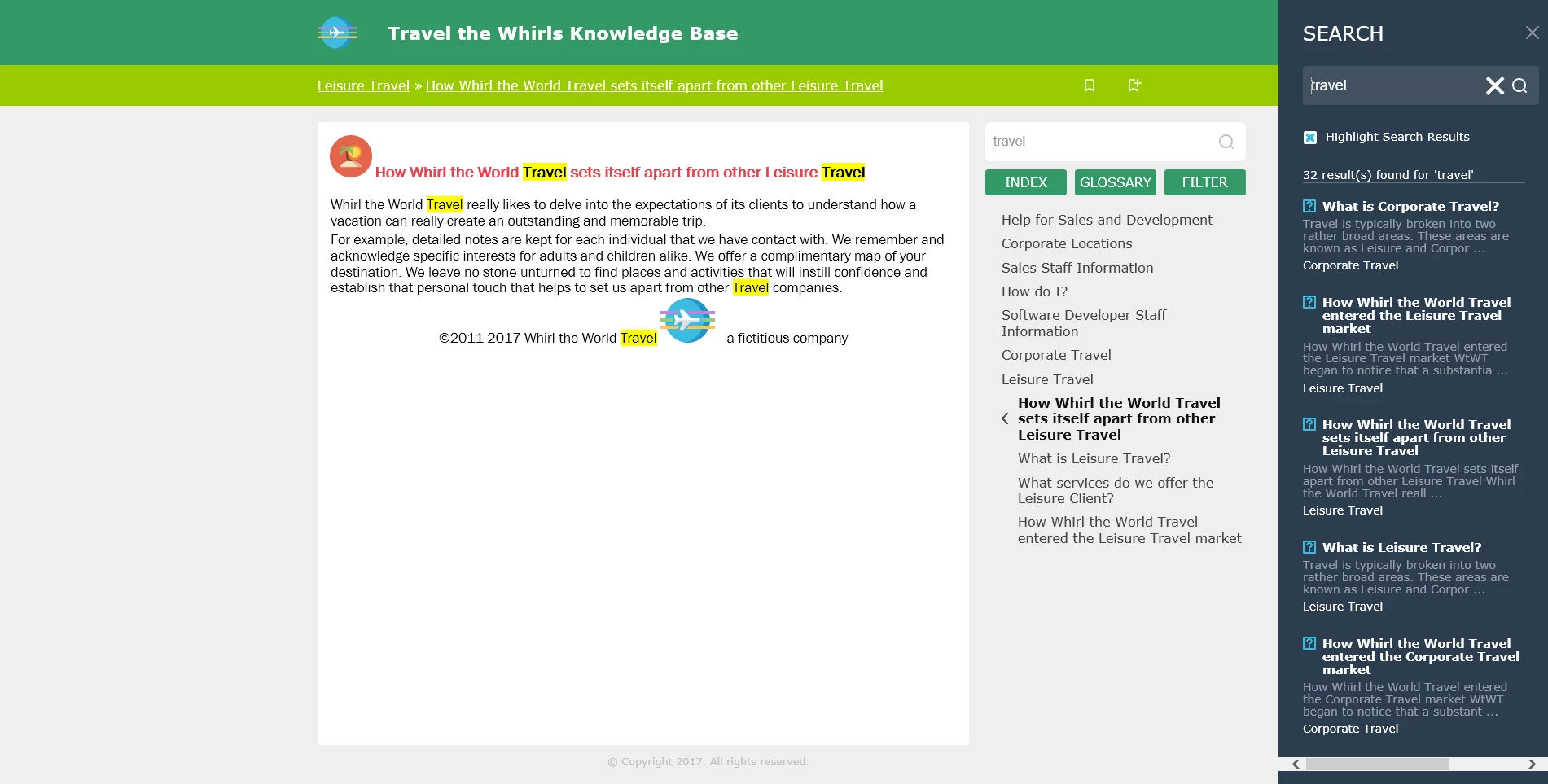
What is the easiest way to increase the width of the white content pane in the Indigo layout? To me it looks a bit narrow:

Thanks

This topic has been closed for replies.
Correct answer Willam van Weelden

Before discovering this older post, I asked about the content width as well in a new post. I am copying a link to my discussion thread here to connect the two. No one has replied to my discussion yet. I will explore the tips in this thread.

RH 2017 Indigo, how to eliminate unused space in rendered topics as browser size increases


Just to add to the other post: The other posts shows how to change the breakpoints of the layout, i.e. when the help shows phone, tablet or desktop layout.

If you want to retain the desktop layout, you will have to change the width of all elements through the CSS file. By far the easiest method for this, is using the SCSS provided by Adobe. (The source files to create the CSS file.) You can get the SCSS files here: RoboHelp screen profiles and layouts

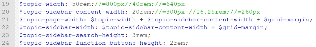
In the layout.scss, go to line 19. There you set the width of the different widths for the topic (50rem) and sidebar (20rem). You can change these widths to enlarge the topic or sidebar. Doing it here will make sure that all elements such as header, footer, buttons, etc. will scale as well. These variables are used in the SCSS to calculate the correct sizes so that you don't have to plough trough the CSS.

For more information on the SCSS, please see my free webinar: Get Geeky with SCSS: Home - Adobe Events

1 reply

Inspiring
January 5, 2018

Hello,

I also found the area too narrow. I wish one could just use a resize divider, but that is a browser limitation.
While it is possible to expand this area, other areas of the layout also become affected, so you need to be careful. (If you make it too wide, buttons need to also get moved for proper alignment.)

In the layout.css file, I made the following changes to the max-width and width values (my comments are enclosed in /* and */):

body.media-desktop div.topicpage-spacer{width:100%;max-width:76.25rem;/*was 71.25 Made topic area larger */ position:absolute;top:9.375rem;bottom:0;left:calc( (100% - 71.25rem) / 2 )}
body.media-desktop div.topicpage-spacer div.topic-content{position:absolute;top:0;left:0;height:calc(100% - 3rem);width:55rem}/*was 50rem */
body.media-desktop div.topicpage-spacer div.topic-content iframe{margin:.5rem;width:54rem;/*was 49rem */height:calc( 100% - .5rem * 2);border:none}

Disclaimer: I am not an HTML5 or css expert. I just changed values in areas that seemed relevant and observed what happened.
I hope this information is helpful!

Alexandra

gc31Author
Inspiring
January 5, 2018

Hi zandwich,

Thanks for this. Others had also mentioned how the topic content pages seemed narrow as well. It is a very different layout, with the TOC on the left as well but I like it.

Whilst editing the layout.css does indeed work, using the Index, Glossary and Filter buttons on the right does then obscure the TOC a bit. I'm sure this can be further tweaked. I had expected an option in the settings for this.

However, i suspect Adobe have set it like this for a good reason. It would be interesting to hear what some of the experts on here think about this?

Cheers

KFarrelly
Known Participant
April 18, 2018

Before discovering this older post, I asked about the content width as well in a new post. I am copying a link to my discussion thread here to connect the two. No one has replied to my discussion yet. I will explore the tips in this thread.

RH 2017 Indigo, how to eliminate unused space in rendered topics as browser size increases