tracym11665964
Known Participant
April 14, 2020
Answered

Robo 2019 (Full) Fix TOC Width & Prevent it Hiding

  • April 14, 2020
  • 10 replies
  • 714 views

I'm using the full version of RoboHelp 2019. I'm producing responsive HTML5.

I'm trying to produce a help system that matches the design of the web application, which has a left-hand menu panel. I therefore want to be able to fix the width of the TOC panel AND also prevent the toc from hiding if the user resizes the window. This is particularly important because our company logo shrinks when the TOC is automatically hidden.

I've seen that there is an article relating to TOC width, but this is only applicable up to version 2017 so I thought I would pose the two questions together.

I very much appreciate any help that anyone can give.

    This topic has been closed for replies.
    Correct answer Peter Grainge

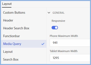
    It is simply screen size that determines the device rather than the help knowing what the device is. If the screen is a certain size, it shows the layout for that size be it a tablet, desktop or a very unwieldy phone. 🙂


    This is where you change the cut-off point.


    10 replies

    Community Expert
    April 17, 2020

    I poked around in the azure blue output but there are too many moving parts to make sensible suggestions without potentially breaking something. (It's possible, but depends on other things you've done and is probably fragile, and I'm not being paid enough 😛 😛  ) So, yeah, a feature request on this one I think.

    tracym11665964
    Known Participant
    April 22, 2020

    Thanks so much for trying Amebr.

    tracym11665964
    Known Participant
    April 16, 2020

    No worries Peter. I really appreciate all the help you have given. Thank you so much.

    Peter Grainge
    Community Expert
    Community Expert
    April 16, 2020

    Try this for the TOC width. I found it buried in something Adobe sent me.


    You can fix it manually in the layoutDiff.css file. Go to .RH-LAYOUT-LEFTPANEL-container section and add min-width and max-width values you want. I have changed it to 25 from 20 rem.

    .RH-LAYOUT-LEFTPANEL-container {

    min-width:25rem;

      max-width:25rem;

    }


    Use the menu (bottom right) to mark the Best Answer or Highlight particularly useful replies. Found the answer elsewhere? Share it here.
    Peter Grainge
    Community Expert
    Community Expert
    April 16, 2020

    Ignore that. It is for frameless skins only. Sorry.


    Use the menu (bottom right) to mark the Best Answer or Highlight particularly useful replies. Found the answer elsewhere? Share it here.
    Peter Grainge
    Community Expert
    Community Expert
    April 14, 2020

    My pleasure. Thank you for the donation. I was just about to email you as I didn't recognise the email address. Much appreciated.


    Use the menu (bottom right) to mark the Best Answer or Highlight particularly useful replies. Found the answer elsewhere? Share it here.
    tracym11665964
    Known Participant
    April 14, 2020

    Aha - thanks so much Peter. I've certainly been able to resolve the problem on the desktop and the tablet edition still works perfectly. You are a superstar.


    Thank you so much for taking the time to respond. I've made a small donation via your website - I very much appreciate that your time has save some of my time.

    Tracy

    Peter Grainge
    Community Expert
    Peter GraingeCommunity ExpertCorrect answer
    Community Expert
    April 14, 2020

    It is simply screen size that determines the device rather than the help knowing what the device is. If the screen is a certain size, it shows the layout for that size be it a tablet, desktop or a very unwieldy phone. 🙂


    This is where you change the cut-off point.


    Use the menu (bottom right) to mark the Best Answer or Highlight particularly useful replies. Found the answer elsewhere? Share it here.
    tracym11665964
    Known Participant
    April 14, 2020

    Thanks again Peter.


    It sounds like what I'm after is not possible.


    I obviously need it to be responsive and understand what that means. I think I was just hoping there would be more control over what is and isn't responsive. In the circumstance I'm after, I don't want to TOC to be responsive on the desktop. On a table it's always minimised, on the desktop I want it to be always maximised. The second screen shot I showed was of the desktop window when the window is minimised presumably to the window size of a table. I assume if I decrease that size, then the maximum width of the tablet will be affected which I obviously wouldn't want to do.


    Unless I have misunderstood, the icons at the top show the settings for desktop, phone and table, but the phone and tablet width settings are global so I can't control the point at which the shrinking occurs?


    Sorry if I've missed the point.


    I really appreciate your help. I'll try and sort an alternative option - I just didn't want to try and achieve something that wasn't possible.


    Tracy

    Peter Grainge
    Community Expert
    Community Expert
    April 14, 2020

    Narrower Width

    Good luck with that one. It's not a skin editor option so, to the best of my knowledge you cannot change it.


    Please follow this link to request features. https://tracker.adobe.com Post the link to your feature request in this thread and others can vote for it. The more people who do so, the higher it gets prioritised.


    Tablet layout - second image

    What you are showing there is the tablet layout you get when the window is shrunk. You can only prevent that by turning off responsiveness. You can change the point at which it happens. When you are in the skin editor you will see this toolbar at the top. The first three icons are for Desktop, Phone and Tablet settings.


    Use the menu (bottom right) to mark the Best Answer or Highlight particularly useful replies. Found the answer elsewhere? Share it here.
    tracym11665964
    Known Participant
    April 14, 2020

    Hi Peter,

    Thanks for the fast response. I wasn't sure what the "non classic" version of RoboHelp 2019 was called. I'm using the New UI version.


    The phone certainly isn't an issue because the TOC is only displayed if the user presses the menu icon. I haven't looked at the tablet yet. I'm currently looking at the desktop view. Firstly, I want the TOC to be narrower than the default width shown in the following image:


    I want to prevent the following from happening on the desktop OR prevent the company logo from shrinking. Either solution is fine, but having the logo shrink down isn't acceptable (although I understand why this occurs, I don't know how to stop it). I also think that having the TOC permanently displayed will match the software (as the menu is permanently displayed) so this would be the ideal solution.


    I could see how to determine phone and tablet settings, but not desktop.


    Does that clarify?

    Peter Grainge
    Community Expert
    Community Expert
    April 14, 2020

    You refer to the full version but both Classic and the New UI are full versions. I am assuming you mean the New UI.


    Unless I am misunderstanding you, the whole point of responsive skins is the layout changes when the user shrinks the screen to a certain point. Then it figures the user is on a tablet or phone when the normal layout would have to shrink to a point it is illegible.


    You can change the points at which the layout changes or you can turn off the responsiveness by going into the skin editor.


    Use the menu (bottom right) to mark the Best Answer or Highlight particularly useful replies. Found the answer elsewhere? Share it here.