OldBob1957
Inspiring
March 7, 2014
Answered

Identify Alphabet (not particular font)

  • March 7, 2014
  • 5 replies
  • 2156 views

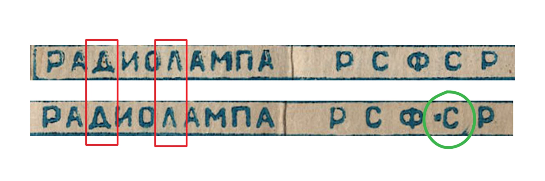
We are recreating an old package. As shown below, the printed message (whatever it says) appears twice, and the glyphs (mostly) match, so I doubt the red-circled ones are merely distortions or misprints (see explanation below -- I could be wrong).

My first thought was that it was Cyrillic. But there are two glyphs (circled in red) that do not appear in any Cyrillic, or Open Type font glyph sets that I can find. There is another (?) glyph (circled in green) where I am not sure if it is a separate glyph, or a print blob and a glyph.

I have had no luck at the usual suspects; whatthefont forum, etc.

If anyone can point me to a language / alphabet, or a font contining the glyphs I would be very appreciative.

Thanks for looking at this.

--OB

    This topic has been closed for replies.
    Correct answer station_two

    Old Bob:

    That's standard Cyrillic, specifically Russian.

    The first glyph in a red rectangle is simply an alternative form of the Russian letter D, or Д.  The pointy, triangular alternative is common in Cyrillic sans serif typefaces. The word reads RADIOLAMPA  (РАДИОЛАМПА).

    The glyph in the second red rectangle is simply and alternative of the Russian letter L, or Л. Again, the pointy, triangular alternative is common in Cyrillic sans serif typefaces.

    The acronym on the right reads R S F S R in Roman letters, or Р С Ф С Р in Cyrillic script.  I can't make out the "blob" either, but I cannot discard the possibility that it may have significance in another, non-Russian, Slavic language that uses the same script (alphabet) such as Ukrainian, Bulgarian or even Church Slavonic, in which I would be close to illiterate in contrast with Russian.

    I'm sure if you look at the entire glyph complement of a number of Cyrillic sans serif faces, you'll find your pointy D and L. 

    I'll see which of my Cyrillic fonts have them and report back

    Hope this helps—at least for now.

    5 replies

    station_two
    Inspiring
    March 9, 2014

    Just one more example:

    OldBob1957
    Inspiring
    March 10, 2014

    Thank you Station two and Thomas Phinney.

    I suspected it was a sans-serif face (and I had even guessed at the correct glyphs in the serif fonts), but none of the sans-serif I found had those exact glyphs and, not reading or speaking the language, I didn't want to go on a guess.

    Thank you both again for all your help!

    --OB

    Edit to add: Yep. That did the trick. Thanks again guys!

    --OB

    station_two
    Inspiring
    March 10, 2014

    You're welcome, Old Bob.

    FWIW, email notifications are not happening for me in this or any other thread in any other forum.  Despite having subscribed to receive email notifications for the thread, I never received notifications for TPh's reply nor for yours.

    Inspiring
    March 8, 2014

    Just to add to what's already been said, one Adobe typeface that uses those forms of De and El is my own Hypatia Sans:

    https://www.adobe.com/type/browser/landing/hypatia/pdfs/Hypatia_Sans_web_poster.pdf

    station_two
    Inspiring
    March 9, 2014

    Thomas Phinney wrote:

    …my own Hypatia Sans:

    https://www.adobe.com/type/browser/landing/hypatia/pdfs/Hypatia_Sans_w eb_poster.pdf

    Gorgeous typeface, Thomas!

    …but what a disaster the Adobe Type pages are!  Every second link returns an error. 

    station_two
    Inspiring
    March 8, 2014

    BTW:

    OldBob1957 wrote:

    …the printed message (whatever it says) appears twice, and the glyphs (mostly) match…

    The difference you see between the two lines of text is that the upper line contains uppercase glyphs, while the second one consists of lowercase letters.

    station_two
    Inspiring
    March 8, 2014

    Here are two screen shots of Font Agent Pro 6.104 showing the Glyph View of the pertinent sections showing respectively the uppercase and the lowercase of the late Richard A. Ware's "Glasnost DemiBold" Cyrillic typeface.

    lowercase:

    and

    UPPERCASE

    Any Adobe sans serif that has Cyrillic glyphs should show them too.

    station_two
    station_twoCorrect answer
    Inspiring
    March 8, 2014

    Old Bob:

    That's standard Cyrillic, specifically Russian.

    The first glyph in a red rectangle is simply an alternative form of the Russian letter D, or Д.  The pointy, triangular alternative is common in Cyrillic sans serif typefaces. The word reads RADIOLAMPA  (РАДИОЛАМПА).

    The glyph in the second red rectangle is simply and alternative of the Russian letter L, or Л. Again, the pointy, triangular alternative is common in Cyrillic sans serif typefaces.

    The acronym on the right reads R S F S R in Roman letters, or Р С Ф С Р in Cyrillic script.  I can't make out the "blob" either, but I cannot discard the possibility that it may have significance in another, non-Russian, Slavic language that uses the same script (alphabet) such as Ukrainian, Bulgarian or even Church Slavonic, in which I would be close to illiterate in contrast with Russian.

    I'm sure if you look at the entire glyph complement of a number of Cyrillic sans serif faces, you'll find your pointy D and L. 

    I'll see which of my Cyrillic fonts have them and report back

    Hope this helps—at least for now.

    station_two
    Inspiring
    March 8, 2014

    station_two wrote:

    …The acronym on the right reads R S F S R in Roman letters, or Р С Ф С Р in Cyrillic script…

    I should have added that it stands for Российская Советская Федеративная Социалистическая Республика, or "Russian Soviet Federative Socialist Republic."

    РАДИОЛАМПА simply means  "vacuum tube".