
Just Shoot Me
Legend
Mar 2, 2020 10:41 AM UTC
Question

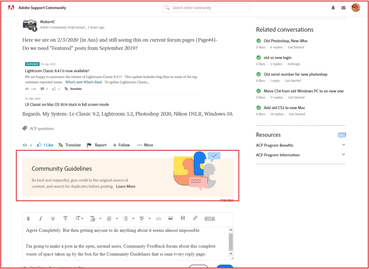
Community Guidelines banner, WHY SO BIG

Why Oh Why is the banner, and why oh why is there a banner at all, for placing a link to the community guidelines on every reply page.

Here is a screen shot of it with a full screen browser page and one with the browser as a Window. 
 

With my browser as a window that banner takes up even more space.
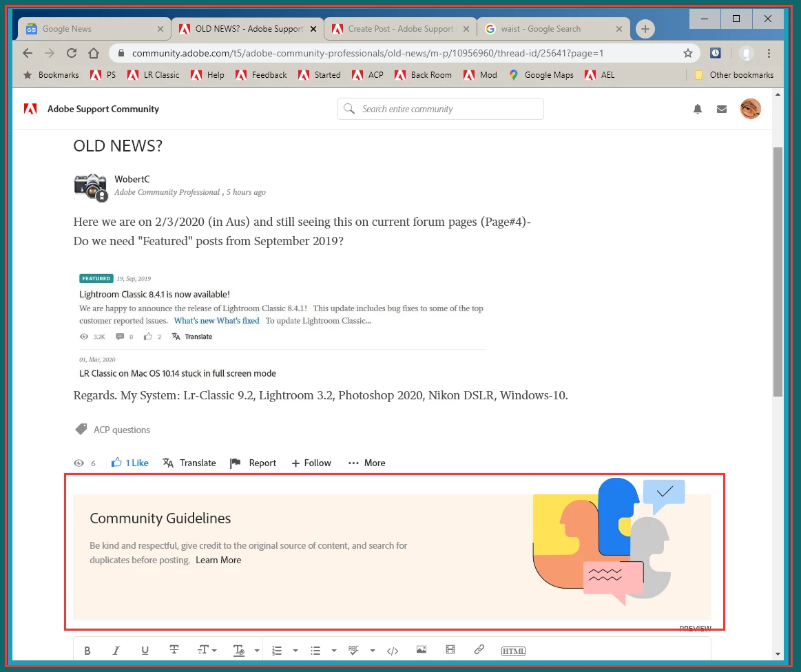


Don't you think that is a BIT OVERKILL?????

Especially since IMHO No one ever Clicks On it.


This topic is closed to new replies. Start a new post to keep the conversation going.

5 replies

Just Shoot Me
Legend
Mar 5, 2020 2:25 PM UTC

Thanks for the Replies, both Nancy and Ann. But I do not.


I would really like to be able to look inside the heads of certain people to see exactly What the HECK they were/are thinking when this system got chosen and the decisions made for it since.

Translate
Nancy OShea
Community Expert
Community Expert
Mar 5, 2020 6:11 PM UTC

In the absence of decent usability, the Guidelines box seems like a very minor annoyance.


Translate
Nancy O'Shea— Product User & Community Expert
Just Shoot Me
Legend
Mar 5, 2020 9:38 PM UTC

It is. But still why is it so big.

At one point If I put my browser in a Window mode, not filling the screen, it became a smaller square on the right hand side of the page. But not anymore.

Translate
Nancy OShea
Community Expert
Community Expert
Mar 5, 2020 1:05 AM UTC

But it looks pretty don't you think? 


Translate
Nancy O'Shea— Product User & Community Expert
Ann Bens
Community Expert
Community Expert
Mar 5, 2020 1:48 PM UTC

That is about all.

Translate