
Question
Forum Page Design
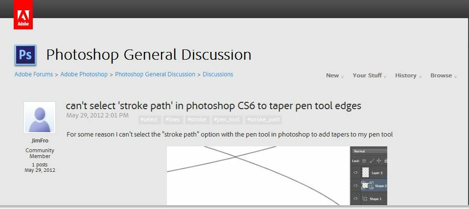
The latest page design does not work for graphics displays lower than 1024x768, you get overlapping headers. Something I mentioned in the past.
In IE9 you can hit f12 or go ro developer tools and under the size heading for IE to display differing resolutions. So this is what the forum page looks like at 1024x768 see the headers on the right overlap the headers on the left. Not good UI design at all.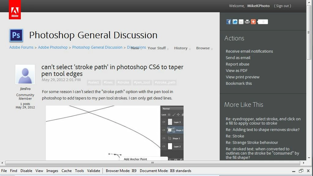
 This is what the forrum page looks like at at a size of 1280x768 - so the UI designers of this forum really have defined a minium of 1280x768 to be able to view without jumping through hoops to navigate. Makes you wonder who really tests this stuff?
Cheers
