Inspiring
November 24, 2019
Answered

Please change the layout of the post page

  • November 24, 2019
  • 3 replies
  • 2876 views

Hi,


Could you please consider tweaking the layout of the post page? Because the entire page has a white background, including all posts and almost all replies, it becomes very difficult the distinguish different posts. Also the serif font makes it very hard to read the content of the page.


Please make this page more readable for people with a visual disability and/or people with autism or other types of disorders/special abilities. Some people need clear boundaries and visual separation of different parts of content. Now, it looks like just one big bowl of word soup ... 🙂


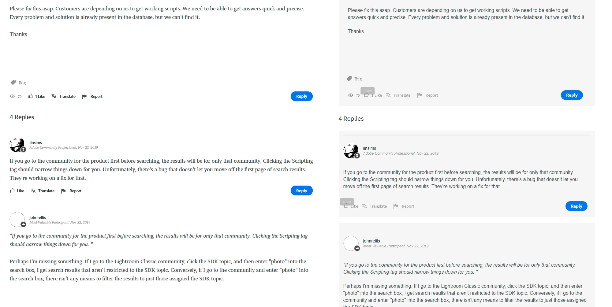
Attached to this post a small example of a before and after...


Thanx


Ps

For other people who also would like to tweak these pages, just use the "Stylebot" Chrome plugin 


This topic has been closed for replies.
Correct answer nicholasi33592111
Thank you for the suggestions and recommendations. We are looking to improve many aspects of the post page so bear with us.

Nicholas Ivanecky
Product Manager, Community Experience
Adobe

3 replies

Community Expert
December 2, 2019

Here's my example of a tweaked stylesheet. 


Changed font to sans-serif.

Indented the post content so it's easier to identify the start and end of the post - it's not lost amongst images and datestamps etc that have less importance.

Indented the nested replies a little bit. I have gone all out on the nesting customisation but at least there's a little distinction. (In my opinion it should go as there's no easy way to distinguish which posts I haven't read yet and I don't have the time or patience to re-read every page every time I visit the forums.)


For me, these changes make the reading experience immeasurably more comfortable.


nicholasi33592111
Adobe Employee
nicholasi33592111Correct answer
Adobe Employee
November 26, 2019
Thank you for the suggestions and recommendations. We are looking to improve many aspects of the post page so bear with us.

Nicholas Ivanecky
Product Manager, Community Experience
Adobe
Just Shoot Me
Legend
November 24, 2019

Sorry to say but the powers that be have made there choices and are Sticking with them. 99% of this new layout isn't going to be changed.


tmmlsAuthor
Inspiring
November 24, 2019

I just can't wrap my head around the fact that Adobe, a company which is a leader on the digital creative frontier and a pioneer in UI/UX design for more then 20 years, delivered a new portal and support platform aimed to support the millions of subscribed users, which ignores all basic typography, layout, UI and UX principles, and doesn't even try to make the platform available for people with special visual needs.... I'm sorry to say but it looks like the new SUV from Tesla ... And the sad thing is, just a few CSS tweaks can make the whole portal so much better... I found a work around to fix the problem for me, but what for all the other users? 

nicholasi33592111
Adobe Employee
Adobe Employee
November 25, 2019
Hi tmmls,
I’m sorry to hear that about your experience. The team is working to improve the portal so bear with us during this new site change. You mention a ‘few CSS tweaks would make the whole portal better’. Can you elaborate on this note and why you think it will improve the forum experience?

Nicholas Ivanecky
Product Manager, Community Experience
Adobe