Roger Breton
Legend
December 16, 2016
Question

Color Theme Tool vs Color.Adobe.com

  • December 16, 2016
  • 2 replies
  • 3501 views

Why is there such a difference between the colors generated out the same image with both color.adobe.com and InDesign's own Color Theme Tool?

After much experimenting, I can only conclude that the Color Theme Tool is far from "matching" color.adobe.com in quality.

I may be missing something obvious, after all this time.

Here's a simple example, an sRGB image I picked the other day on Facebook.

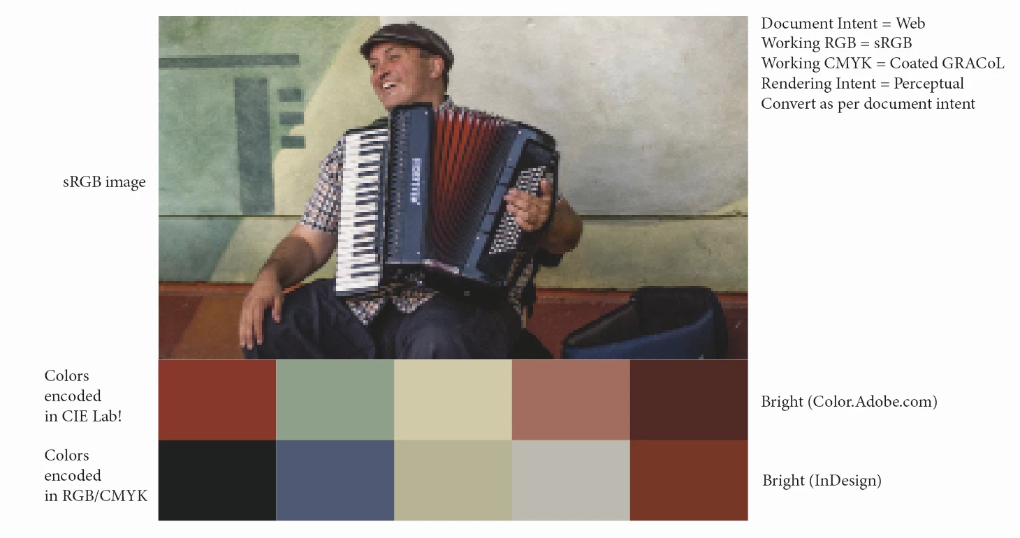
The Document Intent is "Print" ("Web" in the above screen capture), so the Color Theme Tool generates CMYK colors, out of the sRGB image. That's expected.

Granted, color.adobe.com generated themes are encoded in CIE Lab space.

To do a fair comparison, I made sure to "Proof" colors, so that the CIE Lab colors don't overly look "bright" as compared to their InDesign counterpart.

Don't get me wrong, I think the Color Theme Tool is a neat little addition to InDesign's toolbox but, as it stands, according to my limited understanding, it systematically "dumbs down" the colors of ANY image, regardless of the Document Intent (I experimented both ways, Print and Web, tried all the settings in the Color Theme Tool options).

The cherry on the icing, if I may say so, with the implementation on color.adobe.com, is the fact that, upon completion, it's plain to see where the "tool" sampled the colors from, as shown here:

    This topic has been closed for replies.

    2 replies

    Community Expert
    December 16, 2016

    In Indesign, do you have your display performance set to high quality display before you do an image sampling?

    Roger Breton
    Legend
    December 16, 2016

    Good suggestion Jeffrey!

    I'm glad to report that it brightened the swatches a bit. Worth it.

    So, the "main" RGB color I get from sampling the image with the Shift key down, with the Color Theme Tool is 209 114 122.

    Using the old or "regular" color picker, that value is 240 104 126, dazzlingly bright by comparison.

    Something else is going on...

    rob day
    Community Expert
    Community Expert
    December 18, 2016

    100C in any CMYK color space would never map to RGB 0/255/255, only in Adobe's twisted color profiles world, Rob.

    0/161/227 is bang on Coated GRACoL to sRGB, Rel Col with BPC.


    0/161/227 is bang on Coated GRACoL to sRGB, Rel Col with BPC.

    Right but the point is those values don't get saved unchanged. I can save them CM'd to the Swatches panel but not to the Theme panel.

    only in Adobe's twisted color profiles world, Rob

    No, it would never happen with Adobe's CM—at least if the CMYK profile was captured from a press sheet. I'm using the example to show that the online app isn't using the Adobe CM system because of the interaction with a web browser.

    Some browser's will honor embedded profiles, but there's not the comprehensive CM system in place needed to make conversions in a web app. So it's either not possible or too expensive to code. If you view a CMYK image in Firefox or Chrome you get the same effect. PS vs. Firefox:

    Roger Breton
    Legend
    December 16, 2016

    Here's a fresh, new experiment this morning.

    The Document Intent is Web.

    I used the Shift key along with the Color Theme Tool to capture this single color in the mad hatter's hat.

    I get the 6 harmony rules.

    Generated swatches are in RGB space.

    For curiosity, I took a sample of the same area with the old Color Picker tool -- see swatch on the right, top.

    Why does the color has to be "dumbed-down" from what it is, in the image? Why? Why? Oh why?

    It's as though the color *has* to be converted to the Working CMYK space *first", before being converted to RGB.