
Essential Graphics combines lowercase letter "f" -- letter spacing or "auto-kerning"?
Even though i hate it, it seems like this phenomena is a feature and not a bug, though I would much appreciate if someone could explain what this concept is, why it's happening and if there's a way to have it NOT happen.
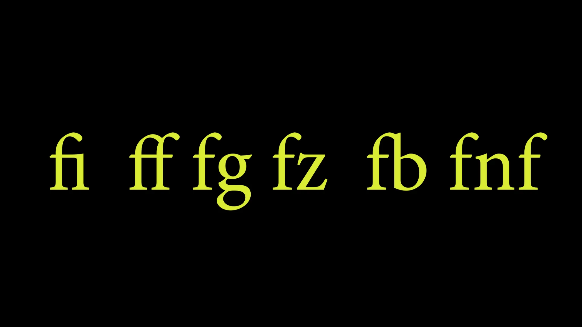
When typing in text with Essential Graphics, I'm seeing it combine letters (most often a lowercase "f" but it does it with other letter combinations) and it turns it into one letter unit. there is essentially no gap in between the letters and when keying through the text, the cursor goes over and you are unable to press space bar and key in a space. In image 1 you can clearly see the i, f, and b combined in with the upper tip and/or cross bar of the first letter f. I'm guessing this is just a stylization and letter spacing/kerning compensation thing but I sort of hate it and would love to know what this is and if it can be turned off. In image 2 you see that it is inconsistent across different fonts with white arrows pointing tot he instances:
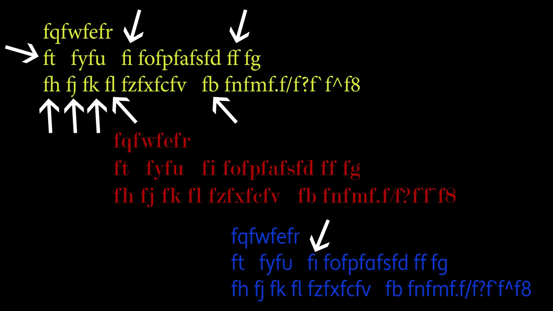
Yellow font = Minion Pro
Red font = Modern No. 20 (no letter combining)
Blue font = Apertura (sans serif)