Question
Acrobat UI Feedback for the iPad: Current UI is Cluttered and Intrusive
Please simplify the Acrobat UI on the iPad.
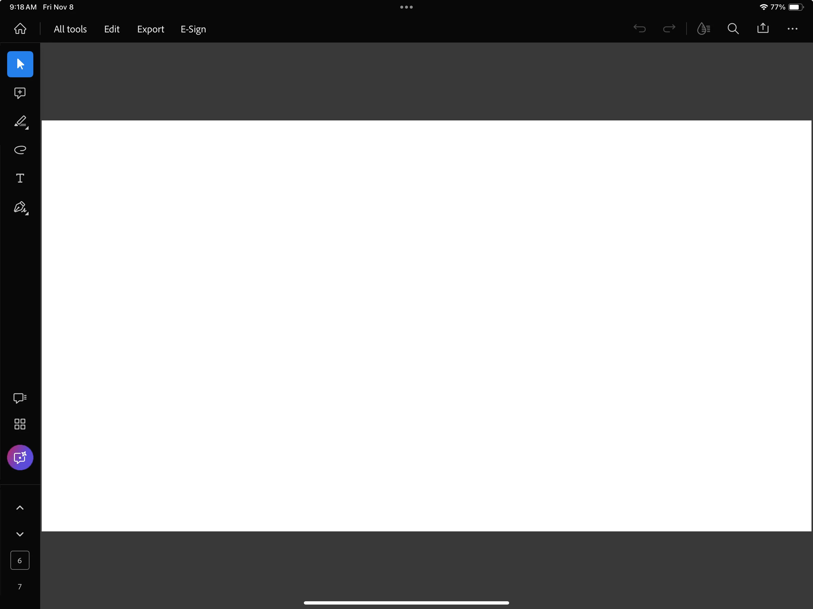
The current Adobe approach to UI is questionable. Tool buttons are placed in every direction and there are too many intrusive pop-up icon.
AI Assistant does not need to be a pop-up. Pop-ups are historically invasive and disliked. When using an application, especially during work, we DO NOT need to be advertised to.
To clean up the interface:
- Please move all tools to the left and have one top/down panel.
- Please remove the dynamic page counter.
- Please move the AI Assistant to the left tool panel, and/or provide an option to turn off.
- Expand the viewing canvas to fill the open frame.
Current UI: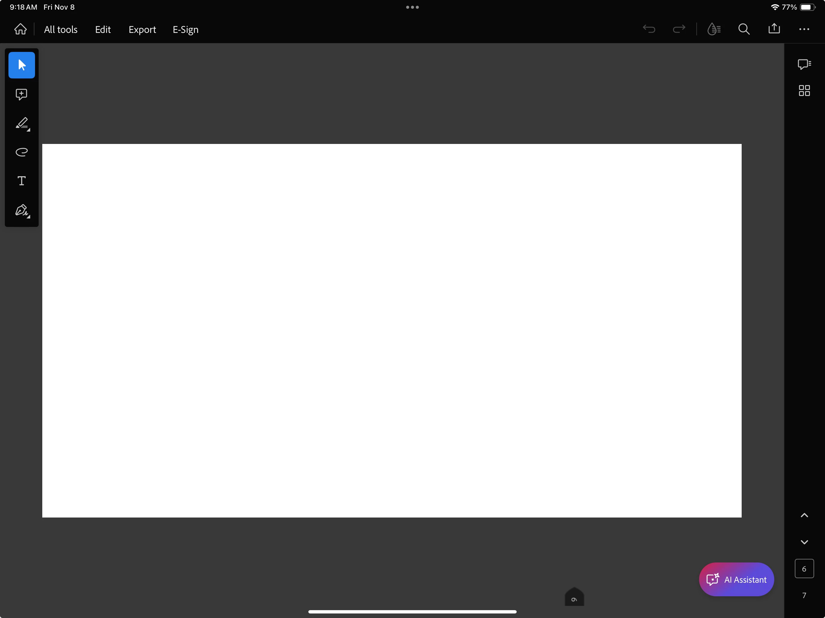
How it feels:
Proposed UI: