• Global community
    • Language:
      • Deutsch
      • English
      • Español
      • Français
      • Português
  • 日本語コミュニティ
    Dedicated community for Japanese speakers
  • 한국 커뮤니티
    Dedicated community for Korean speakers
Exit
0

Does the Bootstrap grid user an 8pt spacing system or not?

New Here ,
Mar 30, 2022 Mar 30, 2022

Copy link to clipboard

Copied

I have been trying to set up a Bootstrap grid in an artboard with the following specs 1440x1024, but I've seen different approaches to setting it up.


On the Bootstrap site, it tells you to use the following specs:
1. Gutter width of 30px (15px on each side of a column) > Which do not fall under the 4 or 8pts system.


Tutorials:

2. Most tutorials make it by following the 8pt spacing system. If you go this way, you see a weird column of numbers.


Can someone tell which of the approaches to implement this in XD is correct, or if it is ok to break the rules (odd column numbers) and still call it Bootstrap grid?
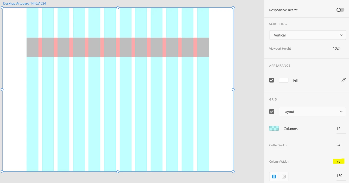
 Bootstrap example.PNG

TOPICS
Design , How to

Views

216

Translate

Translate

Report

Report
Community guidelines
Be kind and respectful, give credit to the original source of content, and search for duplicates before posting. Learn more
community guidelines

correct answers 1 Correct answer

Community Expert , Mar 30, 2022 Mar 30, 2022

Not sure where bootstrap mentions 15px / 30px gutters. The example they give is with 1.5rem, which is 24px (on a 16px base font size) like in your example. (Edit: I saw that v4 uses 15/30px, and v5 uses .75/1.5rem) The default bootstrap grid is with 12 columns. This can be modified, along with all other bootstrap defaults, but it depends on whether you want to bother with it.

You could simplify it and make it a 4 column grid, grouping each 3 columns, and keeping the gutters. The devs will then u

...

Votes

Translate

Translate
Community Expert ,
Mar 30, 2022 Mar 30, 2022

Copy link to clipboard

Copied

Not sure where bootstrap mentions 15px / 30px gutters. The example they give is with 1.5rem, which is 24px (on a 16px base font size) like in your example. (Edit: I saw that v4 uses 15/30px, and v5 uses .75/1.5rem) The default bootstrap grid is with 12 columns. This can be modified, along with all other bootstrap defaults, but it depends on whether you want to bother with it.

You could simplify it and make it a 4 column grid, grouping each 3 columns, and keeping the gutters. The devs will then use col-3 class to indicate that the element is 25% of the total, col-6 for 50% and so on.


If your main layout width is @ 1140px (bootstrap xl container width), and your artboard is 1440px wide, then you have exactly 150px on both sides as the margins, and with you gutter set to 24px, Xd will calculate the size of your columns, which in your case is 73px. Bootstrap is the same. In Bootstrap the column widths are also not defined in pixels, only in %s, which does not always amount to round values, especially between breakpoints.


I think as long as you use close values, it will be fine. I like round or at least even numbers and a few pixels difference when the website is later developed with bootstrap isn't a big deal. Also, bootstrap's default values can be changed, although few devs like to bother 🙂

Votes

Translate

Translate

Report

Report
Community guidelines
Be kind and respectful, give credit to the original source of content, and search for duplicates before posting. Learn more
community guidelines
New Here ,
Mar 31, 2022 Mar 31, 2022

Copy link to clipboard

Copied

LATEST

Very well explained Spas! Thank you!

Votes

Translate

Translate

Report

Report
Community guidelines
Be kind and respectful, give credit to the original source of content, and search for duplicates before posting. Learn more
community guidelines