- Home
- Adobe XD
- Discussions
- Re: Is Adobe XD "play preview" 100% scale?
- Re: Is Adobe XD "play preview" 100% scale?
Copy link to clipboard
Copied
Hi All,
I'm new to Adobe XD and currently getting an understanding of it by creating a website prototype—I am generally clicking the "Desktop preview" Play button at the top right-hand corner to see how its looking, however, when I publish and view the link in a browser (Enlarging it with the full-screen arrows) it seems to be a lot more zoomed in then the desktop preview.
So my question is which one is the actual size? The desktop preview or the published version? Just checking so I can understand the final fonts sizes and layout etc.
Thanks!
Aaron
[Here is the list of all Adobe forums... https://forums.adobe.com/welcome]
[Comments is to ask about the operation of the Forum, not a specific program]
[Moved from the Comments forum to the specific Program forum... Mod]
 2 Correct answers
The published version in fullscreen is the size that you are designing at. On desktop in the preview window we scale the prototype to fit the available space.
It's probably easiest to check in XD by changing the zoom to 100% (Cmd/Ctrl + 1) and looking at the size.
No of course not, because it's too damn difficult to take all the variables into account which might influence whatever text size those dreaded users eventually see on their screens. Your designs should be intended to give your valued client and routined front-end developer a fairly good idea what you're striving for. But the end result is always a mix of system and browser inconsistencies, and user preferences. So keep margins in mind while desiging and don't expect pixel perfect executions of
...Copy link to clipboard
Copied
Once again: the preview isn't intended to show how the website would interact like a real browser window on the actual screen you're watching it on. You were previewing a design of a website at e.g. 1920 pixels wide on a screen which is too small to accommodate that size at 100%. The question is not how it would behave responsively. The intention is to let others see the design for that 1920 width. If they don't have a monitor large enough to show it at 100%, then it's hard for them to tell how it would appear as a whole. So that's why it will be scaled down.
Having it at actual size, regardless of the monitor size, would require to implement responsive behaviors, or result in a cut-off rendition.
Copy link to clipboard
Copied
As I said a cut off rendition would be more useful to a designer than the situation we have now. As it is the preview is pretty much useless from a creative standpoint.
Copy link to clipboard
Copied
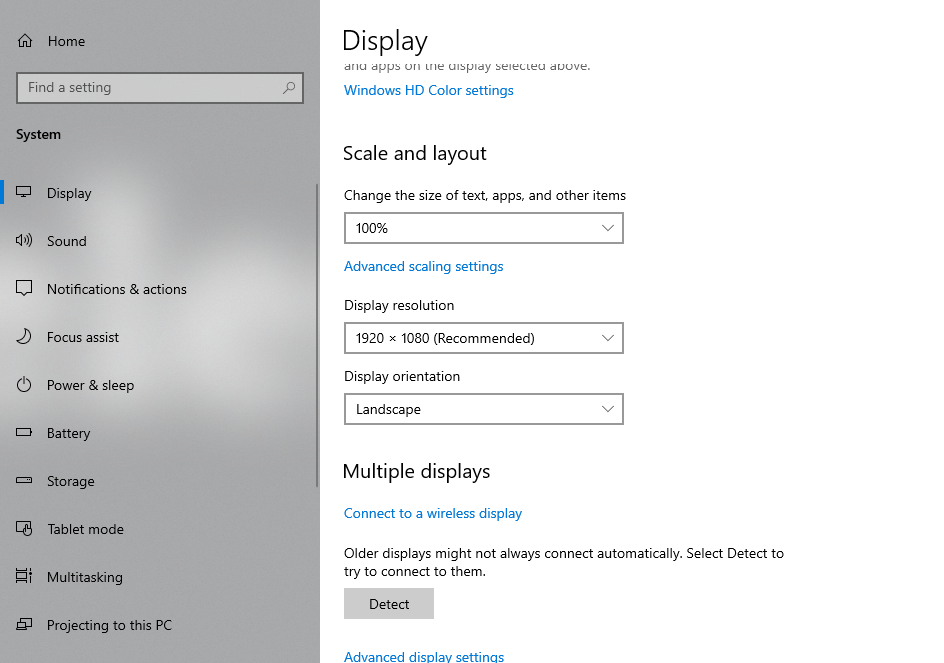
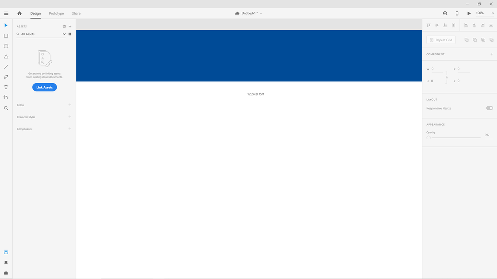
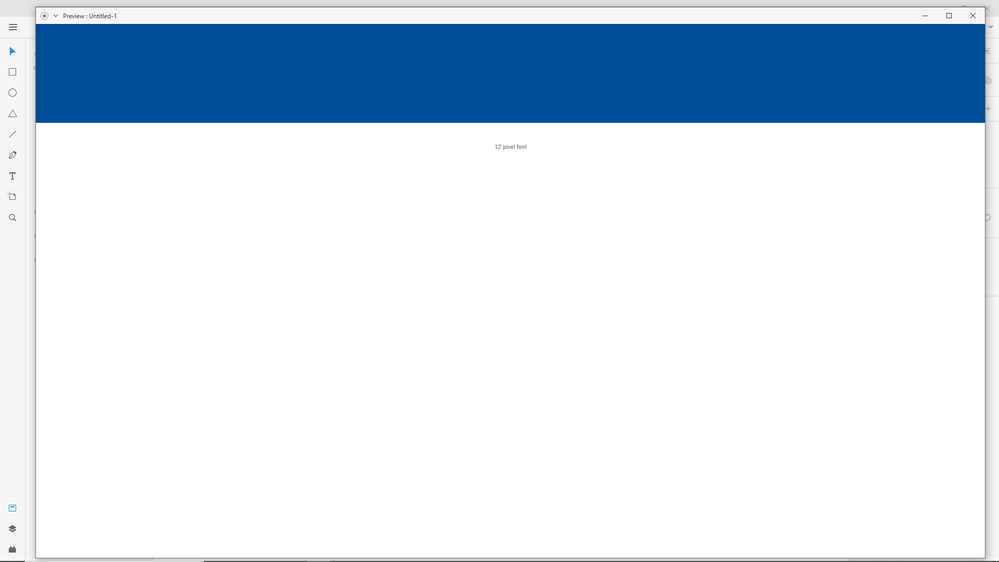
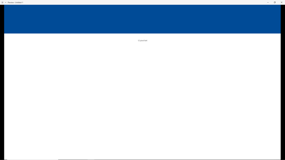
Case in point (lets try to concentrate on the real issue here please)
1 - Monitor Resolution
2 - Viewport withing the app at 100%
3 - Preview window
4. Preview window scalled to fit the resolution of monitor
Does anyone see the issue?
- when the preview window is maximized, the design within remains scaled.
At the very least provide an option to scale within the preview window so we can see what the designs will look like in real life.
No one is talking about responsive designs here yet. Lets concentrate on static screens first.
Lucas
Copy link to clipboard
Copied
In real life, in digital life, and on anyone's computer or mobile screen, any preset size like 1920 x 1080 is not what you'll be able to use as a viewport size. Yeah, I know, it's a scam, a rip-off, it's not fair.
Let's talk about browser chrome – no, not Google's Chrome browser, but the browser's URL and main navigation bar, the Title bar, Status bar, Favorites bar, scroll bar, and anything else the user stacks up in the edges of a browser window, restricting the viewport to a smaller size. That's we used to call a browser's chrome (until Google hi-jacked the term). And let's keep in mind that terrible notion that all these bars and stuff of all major browsers on various systems never have the same width or height. And finally Adobe XD's Preview window also eats another edge off that effective size. So you'll never know what you'll be getting for real. You do the math.
Or... get a larger monitor.
Copy link to clipboard
Copied
My Dear Design Friends, I'm really not trying to counter any argument you make just to prove Adobe is always right. I'm an independent graphic, web, and UX designer and instructor, trying to explain what's happening front stage and behind the screens. And in many aspects, users are not familiar enough with the idiosyncrasies of web or app design. And in some aspects, Adobe is wrong or giving us a bad day with their bugs, flaws, and silly decisions...
In this case, I'm afraid there's not much wrong with what the applications is built to do.
Even if they would initially present the Preview window at a 100% scale, then I bet many users will be grumbling and gruntling it should scale ! They can't please us all... But they could slap some shortcuts onto the window, to let us quickly change between zoom in/out, 100% and Fit, or implement a preference for the default view.
Copy link to clipboard
Copied
I hear what you're saying, Adobe can't give us designers a wholly realistic translation of design to development purely with the preview... I get that. But from a whole list of possible ways they could try their best to replicate the experience scaling the design and without making it clear to the designer that the software is doing that is pretty much the worst option. At no point does a website simply scale down or up to fit a screen dimension does it? A background image might crop to fit, the content would be designed to responsively shift to display all elements on screen WITHOUT scaling them (unless designed to by the developer).
Copy link to clipboard
Copied
Well, hypothetically the design could do that (as engineered), but did you ever notice how a desktop user simply hits Ctrl or Cmd + or - to immediately scale the viewport's content up or down ? And how mobile users have found the preference for text scaling in accessibility settings ? So that's another design insecurity and flexibility you have to take into account, regarding the final result: the user's personal preference...
You and your team of previewing testers should be indeed aware of what they're looking at: the design of a typical screen size, perhaps scaled up or down to oversee the whole, to mimic what that screen at that same (pixel) size would physically be able to display as well.
Maybe it helps if you'd overlay the design of the viewport within the chrome of the browser and the system. Then the preset sizes also makes more sense. And as a final touch, you can top it off with the frame of the device as a real-life mockup ! This helps less routined team members and previewers to understand they need to regard the design as a whole – scaled or not.
Copy link to clipboard
Copied
Well regardless of what manual functionality a viewer has in the browser the preview should show what I would see at 100% on my screen, which it doesn't. If the preview can't demonstrate what the site will look like on my own screen what chance do I have of designing or other screen sizes? Let me reiterate, the dimensions of the artwork make no difference to the size the preview displays the design at. it's massively misleading, completely unhelpful and the worst way of addressing what I admit is a complex issue. The worst part is the software doesn't point out to the designer that they're not previewing the design at actual size... I've produced so many sites using XD without realising this was an issue. And it's no good laying the blame for that situation at the feet of the designer... none of us are stupid and tools like XD should be designed to be as easy to use as possible for everyone. This is an issue that Adobe should address or at least make designers aware of.
Copy link to clipboard
Copied
Add /?fullscreen to the end of the URL.
Copy link to clipboard
Copied
@Peter Villevoye- respectfully, you're talking about responsive design and development, and so you're derailing the thread here. These are static, fixed designs. XD does not output responsive designs or html/css - these are images only, as you correctly state. It makes no sense to take an image of a screen design and just arbitrarily shrink the image. As others have said, this is nothing to do with responsive design, and that's not how responsive design works anyway (the content would reflow when the user zooms in and out). This is completely unhelpful. This is a bug, not a feature.
But they could slap some shortcuts onto the window, to let us quickly change between zoom in/out, 100% and Fit, or implement a preference for the default view.
I think this is a great suggestion, and I hope it gets implemented. In the meantime, if anyone from Adobe is monitoring these forums, please just make the preview render the actual size of the design. (That should be the default.)
Here's how Axure does it in the browser view:
(Default Scale is the scale of the design. Scale to Width will scale the design larger or smaller to fit the viewport, and Scale to Fit will shrink the whole thing down to fit within the *height* of the window (which is pointless 99% of the time, so could ditch that option).
thanks
Copy link to clipboard
Copied
Peter you found the solution, as you said in the last paragraph.
We need exactly that: "But they could slap some shortcuts onto the window, to let us quickly change between zoom in/out, 100% and Fit, or implement a preference for the default view."
Is there a way for you to report this problem for us?
With each update I keep waiting for this functionality but it never arrives, it will certainly make my job much easier and give me more reasons to continue subscribing to Adobe XD.
Copy link to clipboard
Copied
cool
Copy link to clipboard
Copied
Adobe XD proposes to speed up the Front End Develop generating CSS and everything, WRONG ?
THE DESIGNER SEE IN 93%,
THE CLIENT SEE IN 75%
And them a programmer export and develop at 100% ?
It's Logic, in the end will be a scaled layout by programmer, generating confusion and problaby rework.
Quick FIX:
1. To programmer develop what the design and client preview, take a print screen of what client and designers preview, ignore all CSS sizes generated and all Images sizes in export and recalculate everything my friend.
or
2. With your team, change the Viewport Height at the Atboard settings, to less then 1080, this will preview at 100% to designer. But not a good preview for an presentation for an client.
Adobe: The preview its not consideranting the windows/mac bars, so no one had 1080 free space of height, then the layout is scalling to fix the 1080 pixels setting in Artboard.
The problem: No one knows that, its causing a lot of confusion and rework, hope had an option, easy to access, to preview at 100% but not trying to fit.
Solution: Wanna Preview trying to Fit or Not ?
The Viewport Height option in ArtBoard is confuse. No one uses that. Hope Adobe fix, with a smart solution, with a simple option, Do you wanna Preview scaled to fit or not. Maybe generating a option with scroll, but in 100%, something like that.
Copy link to clipboard
Copied
Hi
I tried to follow the thread and I really apprecite the discussion. When I'm writing this in October 2020, it seems to work for me with Adobe XD web previewer in Chrome.
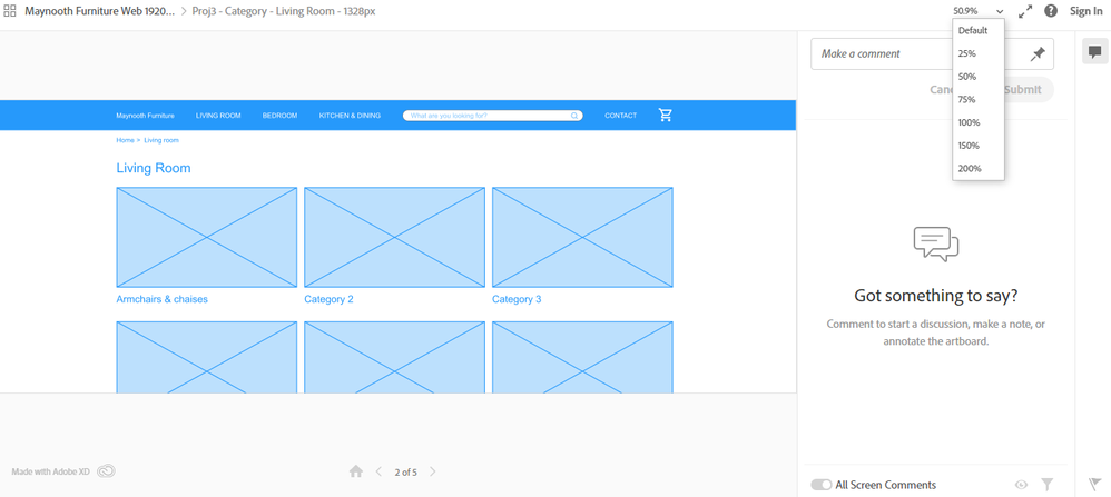
I have done a mockup with artboards that are 1920, but using only 1328 px in the center and a viewport height of 700. This to design for a screen size of 1366x768 and 1920x1080 at the same time. When I preview my design on 1366x768 screen (I lowered the resolution from 1920x1080), with a Chrome icognito window on Win 10, I get this screen
As you see, I can change the zoom, in the upper right corner. The default zoom became 50.9 %. I can change the zoom to 100 %.
The thing I miss here, is a way to scroll left and right, both in fullscreen and not in fullscreen with the Adobe XD web previewer (The two diagnoal arrow button, to the right of the zoom). Just note that are two fullscreens, one in the Adobe XD web previewer and Chromes itself (F11).
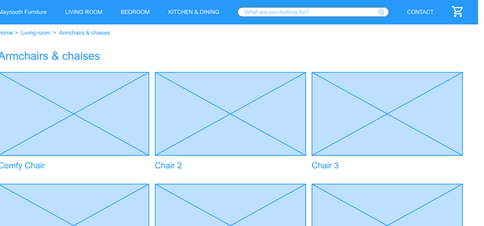
When I use 100 % and Adobe web previewer full screen, I get this
where you see that the left side is cut. So I guessed, the Adobe XD web previewer, tries to center it. But I would like to be able to scroll a bit to the left.
Copy link to clipboard
Copied
Consider voting for this feature request on Adobe XD UserVoice, which is from 2016 and has 58 votes:
Zoom in the Preview Window
Also note that the "Viewport height" setting will determine the scale of your preview. Make sure to set that to a value slightly smaller than the height of your screen - otherwise XD will shrink your design and you'll have black bars on the sides. (I don't like or understand this, but that seems to be how it works.)
Suggestion to Adobe: ignore the viewport height, and just render the design based on the artboard width. Or make this a setting/option. In either case, this needs to be more obvious because lots of people on lots of forums are, like myself, confused by the size at which the preview is getting rendered.
Copy link to clipboard
Copied
I think I know what might be happening here, causing some (or perhaps a lot) confusion.
Like @platypusman correctly stated (once again), the viewport setting is of course crucial in defining the initial view in the Preview. If the width of the artboard and/or the height of the viewport isn't larger than your monitor's (perceived) resolution, then the preview will be okay, unscaled, matching your 100% design. This is what's happening normally. Some users might be wishing for other initial behaviors or an option to change the behavior while viewing, which is not too crazy or wouldn't be too difficult to develop. But with only 58 users voting for this UserVoice request in 5 years, I think the current incarnation of the Preview isn't that bad.
But one of the UserVoice comments (Rishi's) made me go "ahhh..." as I read his tip, back in 2019:
2. Add Vertical Scrolling to your artboard.
That's it ! For all preset artboards the default Scrolling setting is Vertical. (Custom artboards don't.) As I switch it to None, the Preview immediately and correctly shows the whole artboard in the (live) Preview. There's your "Fit" Preview option or even preference, in a make-shift way though. But as I switch Scrolling back to Vertical again, I notice that the Viewport height is left at the momentary height of the artboard. It doesn't change back to any previous or preset setting. So if the artboard has ended up just a bit too high for your screen, the design keeps scaling to fit the Preview window, with black borders and all...
So I guess that might be a behavior which is causing some unexpected and conflicting results.
Fortunately, it's easy to tackle. Just set the Viewport height back to an obvious or feasable height.
The only use cases in which scaling options in the Preview would be useful, is when you're designing with exact pixel precision in mind for double or Retina resolutions (like one of the voters does), or when you want to accommodate your screen to –how appropriate– a Zoom session (like another voter does). But then again, I could come up with a dozen more challenging circumstances (and solutions) for Adobe XD to anticipate.
Copy link to clipboard
Copied
Hey Peter, hello everyone.
I haven't read all your comments but I am experiencing the same issues as everybody else...
I think the sad thing is that at least here in Brazil, with the clients I have to deal with, it's hard to explain to them that the software I'm using will only go as far as showing a kind of real life representation of their website. I always have to start meetings explaining this to them before showing the prototype, and it feels like I'm not being professional with the project because I choose to use XD. I love XD, but I have considered changing to Figma, I've been told they don't have those kind of issues, which makes it harder to understand why Adobe still has them. Anyway, I'm glad I'm not alone at this! Thank you for all your insights.
Copy link to clipboard
Copied
InVision lets you stretch the background so that the screen width adjusts regardless of the monitor size. This is similar to a repeat pattern in HTML. I'd love to see this in XD.
Copy link to clipboard
Copied
Copy link to clipboard
Copied
After some time testing, i cold solve this problem changing de height of de screen at XD arboart menu. Example: if you are using 1920 display on windowns use 970px in height...seems adobe XD respect the real size of your artboard so you dont see your design complete, because we have bars menus on OS and Browsers.
Copy link to clipboard
Copied
Just adding this for anyone else who have also found themselves here after googling for a solution.
Drag the viewport guide (the blue horizontal guide) to the very bottom of the artboard. Not sure why, but that allows the preview to be viewed at actual, proper 100% scale.
Copy link to clipboard
Copied
Quick FIX:
1. To programmer develop what the design and client preview, take a print screen of what client and designers preview, ignore all CSS sizes generated and all Images sizes in export and recalculate everything my friend.
or
2. With your team, change the Viewport Height at the Atboard settings, to less then 1080, this will preview at 100% to designer. But not a good preview for an presentation for an client.
___________________________________________________________________________________________
Adobe: The preview its not consideranting the windows/mac bars, so no one had 1080 free space of height, then the layout is scalling to fix the 1080 pixels setting in Artboard.
The problem: No one knows that, its causing a lot of confusion and rework,
Solution: Hope had an option, easy to access, to preview at 100% but not trying to fit.
Maybe generating with scroll, but in 100%, something like that.
-
- 1
- 2

