

PROPER TEXT scaling and allignment is currently impossible...
Surprisingly, the XD team slept on adding the typography scaling and alignment controls required to create and hand off design properly.
The random feeling em box around text, is just a complete mess and options to scale and align text properly by baseline and cap height are just entirely missing.
Here is a visual illustrating the severity of this. Showing a 20 sized text in different fonts aligned to the top of the 20 sized cubes on the left.
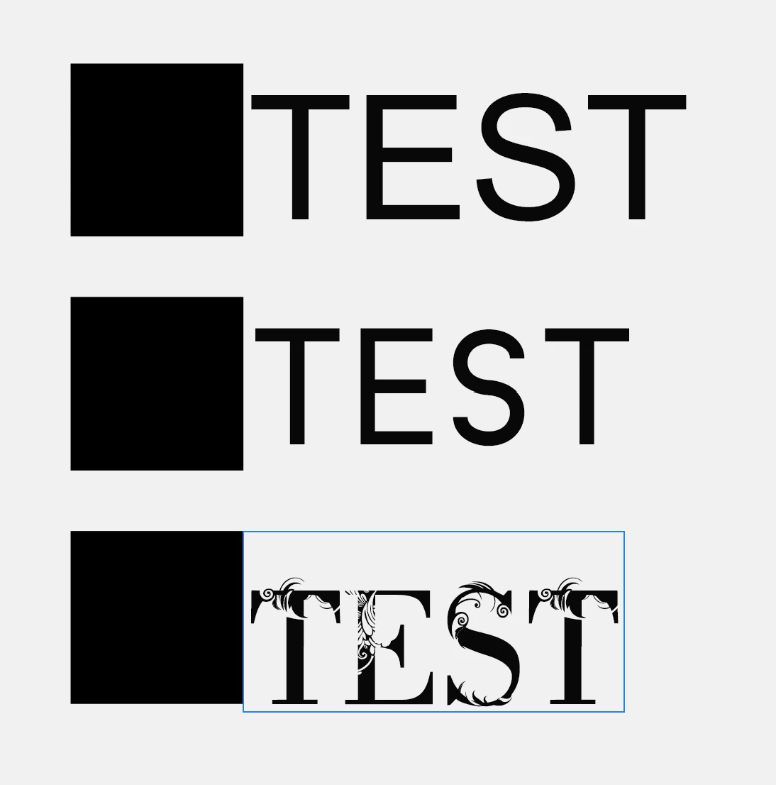
As even a blind man can see, aligning this properly and getting a consistent design feel which can be handed off to development, is completely out of the question as it is.
Here the exact same scene in Illustrator. Where "font height reference" can be set to "cap height".
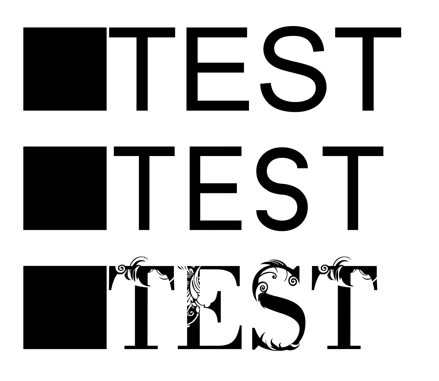
Beautifully consistent result in other Adobe software, just not the one where it matters the absolute most...
How this was overlooked in XD is baffling to me.
This should be the default. I see no reason why anyone would not want their typography to work consistently.
Have you ever heard the designer say "ohh I love how my text does not align to the graphic or object next to it" NO? WHAT A SURPRISE.
If anyone has a fix for this in XD, please let me know.
Thanks for the help.
If anyone from Adobe reads this, I genuinely hope you realized how large this issue of not being able to scale and align text properly is. I seriously hope this finds the right person.
Thanks.