Known Participant
June 14, 2025
質問

Align inbox panel content

  • June 14, 2025
  • 返信数 1.
  • 435 ビュー

I think I would look better visually and and less tight towards the margins if the content of the inbox panels were aligned to the panel title. Is that possible? thanks team. 🙌


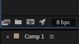
This is another example, the Interpret Fotage button is attached to the edge of the panel (and the monitor).


返信数 1

sskaz
Inspiring
June 17, 2025

Please, no. I use every ounce of pixels and make my panels’ columns as small and narrow as possible to fit more room for viewports and more panels without needing to scroll.


I vastly prefer the snug fit of the “legacy” panels, as opposed to the modern Properties panel which uses a more visually aligned approach, and results in tons of empty and useless whitespace, especially on the left and right sides.

QuietRobot作成者
Known Participant
June 23, 2025

But if you are not going to lose any pixeld and your panels, just aligning the content giving a consistent appearance.

Even if you don't use the new panel, I shouldn't worry that I adobe fix this.


sskaz
Inspiring
June 23, 2025

Sure, if the minimum width didn’t change, but I just don’t see them doing that since everything (nearly all apps and platforms) have converged on the design idea of gigantic whitespace as if I was using my fingers to interact with the UI.


But since Adobe pushed out the Spectrum UI After Effects updates last Summer/Fall, it might be quite a while before they shift any focus back onto UI/design changes again.