- Home
- After Effects (Beta)
- Discussions
- Re: Feature Focus: Text animator support for bidir...
- Re: Feature Focus: Text animator support for bidir...
Feature Focus: Text animator support for bidirectional text
Copy link to clipboard
Copied
Text Animation by Character and Word has been Left to Right (Roman)-centric since the beginning and consequently in the case of Right to Left languages such as Hebrew and Arabic it was 100% wrong (unless your content was a single character or single word!)
Essentially the code assumed that the order the glyphs appear on the screen is the same as the character order but that is only true for Left to Right. For a line of Hebrew text, for example, the glyph on the left is actually the last character and the glyph on the right is the first character.
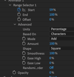
Consider with the following Text Animation settings:
With Roman text it looks correct as we scrub about half way - first character in the Story is the "R":
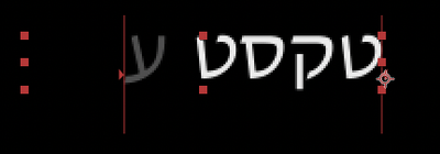
But not so good with Hebrew text where the first character in the Story is on the far right. See how the left glyphs have been exposed before the right most ones? Bad.
With Beta build 22.3.0 (89) this has now been addressed and After Effects is properly iterating the Story in true character order wherever the glyphs end up. See how the right most glyph is exposed before the left most glyph? Ah, that is better:
Now, a note about that though - this can lead to some surprising visual jumps in the case of mixed Roman and Hebrew text in the same line. In this example the text (in story order) is "Hebrew Text Roman" but when it gets composed it looks like this:
We have scrubbed though all of the Hebrew text and are now on the first character of "Roman" and so it is exposed - but there is this visual gap!
Remember Text Animation is defined here in character order so wherever the composer puts the glyphs of those characters is where we are going to animate them without regard to any other considerations.
A number of people have found this surprising when they first see it because I think we expect animation to be in a visual order, with neighboring glyphs, but of course that is not how the feature is defined although it does behave that way when the writing direction is the same in a paragraph.
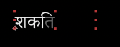
While investigating this I realized that we are also failing, but in a different way, with languages which use what are called combining characters, such as Hindi. There we have two more characters which are actually composed on top of each other thus appearing as they were a single character.
So what you might ask? Internally we are assuming that every character in the Story is an animatable element which is causing us to effectively split these characters which should be working together:
The glyph which is just being exposed is actually supposed to be associated with the beautiful swooping glyph just to the left of it - they should be animated together as one unit instead of two.
So we have more to do here in this area which is where we could really use the help of our diverse community to look for cases where our Text Animation handling of particular language issues is flawed and point it out to us - help us help your own workflow.
Finally, a big shout out to forum member Roei Tzoref who filed the triggering bug and patiently explained to me the subtlety of right to left composition when I reach out to him. It all seems so obvious now but it was not when I started to look at it!
Douglas Waterfall
After Effect Engineering
Copy link to clipboard
Copied
We were shouting years and years ago to support arabic language RTL animation, its good to be solved now. We hope also to take in concideration the paragraph animation RTL.
Copy link to clipboard
Copied
Hi Ziad,
Could you tell us more about how you expect RTL to affect paragraphs? Can you test the beta and see if it is doing what you expect?
Thank you!
Brian
Copy link to clipboard
Copied
Hello Brian,
We hope also to take into consideration the paragraph animation RTL.
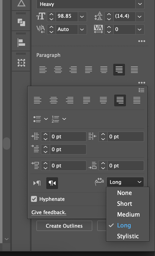
Like an illustrator paragraph can insert Kashidas
Copy link to clipboard
Copied
First, I really wanted to thank you, Douglas, this is a true breakthrough! It is a long-anticipated feature for many many years now by the RTL user community! really this is a historic moment in AE's development.
Now as for the "Visual Gap" you have smartly noticed - Indeed that could be a problem in some cases - and is looking weird.
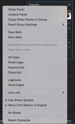
Let me suggest a way to resolve this for all scenarios if you add a feature (a button in the character menu - or even an option to check in the character's sub-menu) that will animate Latin letters and numbers (in RTL mode) VISUALLY (from right to left) even though they correct order for Latin and numbers is from LTR.
When this feature will be unchecked then the letters will animate the way they animate right now in the betta (the "weird" way with the gap) - because there are scenarios when this option is better.
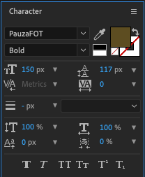
You can add this feature either here:
or in character's submenu here:
By doing so you will cover all animation options for the RTL AE User community. and by that will solve the 2 decade RTL text support problem!
Thanks!!!
Now, a note about that though - this can lead to some surprising visual jumps in the case of mixed Roman and Hebrew text in the same line. In this example the text (in story order) is "Hebrew Text Roman" but when it gets composed it looks like this:
We have scrubbed though all of the Hebrew text and are now on the first character of "Roman" and so it is exposed - but there is this visual gap!
Remember Text Animation is defined here in character order so wherever the composer puts the glyphs of those characters is where we are going to animate them without regard to any other considerations.
A number of people have found this surprising when they first see it because I think we expect animation to be in a visual order, with neighboring glyphs, but of course that is not how the feature is defined although it does behave that way when the writing direction is the same in a paragraph.
While investigating this I realized that we are also failing, but in a different way, with languages which use what are called combining characters, such as Hindi. There we have two more characters which are actually composed on top of each other thus appearing as they were a single character.
By @Douglas_Waterfall
Copy link to clipboard
Copied
Hi Ariel.
Thank you for looking into this and suggesting a way forward - Roei Tzoref has also made suggestions about this privately to me so you are in good company.
There are probably numerous ways we could handle this, I happen to prefer another technical direction entirely from yours, but it is easy to get ahead of ourselves with the hows when first we should agree on the whats. That is - should we do anything about this at all?
The feature (now) behaves like the specification says which is in character order.
I have argued that changing/augmenting the behavior to be entirely in glyph order is a new feature/functionality which costs something in engineering time to implement and so must be traded off against other things we might do in a wide range of other areas.
Often these questions are tough to get answers to, but the questions are easy to ask - how often is this a problem?
Designers who are able to consistently keep to one writing direction within the same line are already getting what they want with the new (corrected) behavior.
Therefore the question we wish we could get an answer to is: what percentage of lines have mixed writing directions long enough to be visually displeasing, and if the number is big enough to be interesting we could start talking about how expensive it would be to add additional control back to the user for them to choose how it should behave.
That is kind of how it works - lots of cool things we could do, but there is a long list already held by the Product Managers.
Here is how YOU could help us though: provide us some real world examples that visually you are not liking enough to be annoyed enough about them. I provided some theoretical ones but it would be way better for us to see something like: Ugh! At least one of my Hebrew Text Layers I create every day has this kind of content and there is no getting around it (picture please!).
That can at least begin a conversation here about impact and cost, including cost to the designer of their workarounds.
Thanks
Douglas Waterfall
After Effects Engineering
Copy link to clipboard
Copied
Text Animation of combining characters is now working as of Beta 22.4 (43).
You can read about combining characters here: Combining Characters
Bad Animation:
Good Animation:
BTW, combining characters are not specific to Devanagari text - diacritics are as well but this was an easier demo.
Many common diacritics, such as with Cyrilic text, are supported as ligatures in the fonts so you would not get the two-glyphs-needing-be-behave-as-one problem anyway.
Douglas Waterfall
After Effects Engineering
Copy link to clipboard
Copied
Thanks for this upcoming update, we've been waiting for this for years now 🙂
I'm anxious to record an update to my workaround tutorial from January 2022.
One question I might have missed from this thread:
Will the exsiting Animation Presests work corretlly when applied to RTL text?
Copy link to clipboard
Copied
I expect them to do so - the only change is the (now fixed) order of glyphs in the animation.
If you see something odd or unexpected, please let me know.
There remains the outstanding request from Ariel (above) and separately from Roei to provide an additional feature so that glyphs are iterated strictly by paragraph direction and glyph order - thus avoiding the "jump" which occurs in the paragraph with mixing writing directions. We're thinking about it.
Douglas Waterfall
After Effects Engineering
Copy link to clipboard
Copied
Happy to report that the animation presets are working correctly.
You don't understand what it means for us the RTL peeps.
Thanks Adobe 🙂
Find more inspiration, events, and resources on the new Adobe Community
Explore Now