• Global community
    • Language:
      • Deutsch
      • English
      • Español
      • Français
      • Português
  • 日本語コミュニティ
    Dedicated community for Japanese speakers
  • 한국 커뮤니티
    Dedicated community for Korean speakers
Exit
0

Difference in type size between After Effects and Illustrator

New Here ,
Nov 03, 2024 Nov 03, 2024

Copy link to clipboard

Copied

Hello, I got a little head scratcher here. I have designed a font, on a 1000pt grid (with a cap-height of 760pt). Then I type H in Illustrator at 500pt size and outline the strokes, the letter is exactly 380px tall (as it should be). When I type a 500pt H in After Effects and convert it to a shape layer, it is 382,6904 pixels tall. 

Does anyone know why there's a difference and how to fix it? I need it to be precise in After Effects so I can work with whole numbers. 
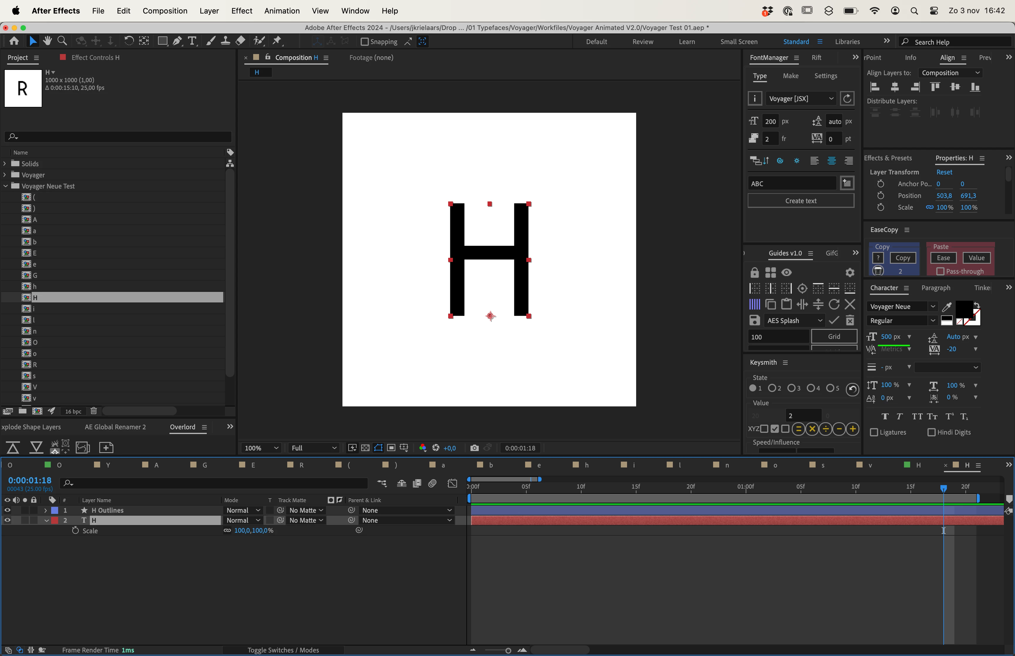
live type in Ae.pngLive type in Ai.pngOutlined type in Ai.pngOutlined type in Ae.png


Bug Unresolved
TOPICS
Troubleshooting , Workflow

Views

77

Translate

Translate

Report

Report
Community guidelines
Be kind and respectful, give credit to the original source of content, and search for duplicates before posting. Learn more
community guidelines
1 Comment
Community Expert ,
Nov 03, 2024 Nov 03, 2024

Copy link to clipboard

Copied

LATEST

I don't know much about designing fonts, but when you create files in Adobe Illustrator for video, you should set the top Artboard size to a standard comp size, and Artboard 2, under that one, should be centered on the pallet and big enough to include any artwork that extends beyond the first artboard. The document should be set up with RGB color space, and the Document Setup should be in Pixels. There are also standard Typography settings in the Document Settings. The latest Illustrator versions include video and film templates for most standard frame sizes to make it easy to use. You should also continually work with snap-to-pixel turned on when creating art for video and film productions. Zooming in to about 400% with pixel preview turned on is also a good idea to ensure your artwork is properly aligned to the pixel grid.


Ensure that the setup you used to create the fonts matches the setup in Illustrator.

Votes

Translate

Translate

Report

Report