
Question
Comp text jagged vs sharp pre-comp text
I have typed text in a pre-comp and it looks great, but when viewed in the main comp (the comp it's nested within) it becomes jagged. Here's a screenshot comparison:
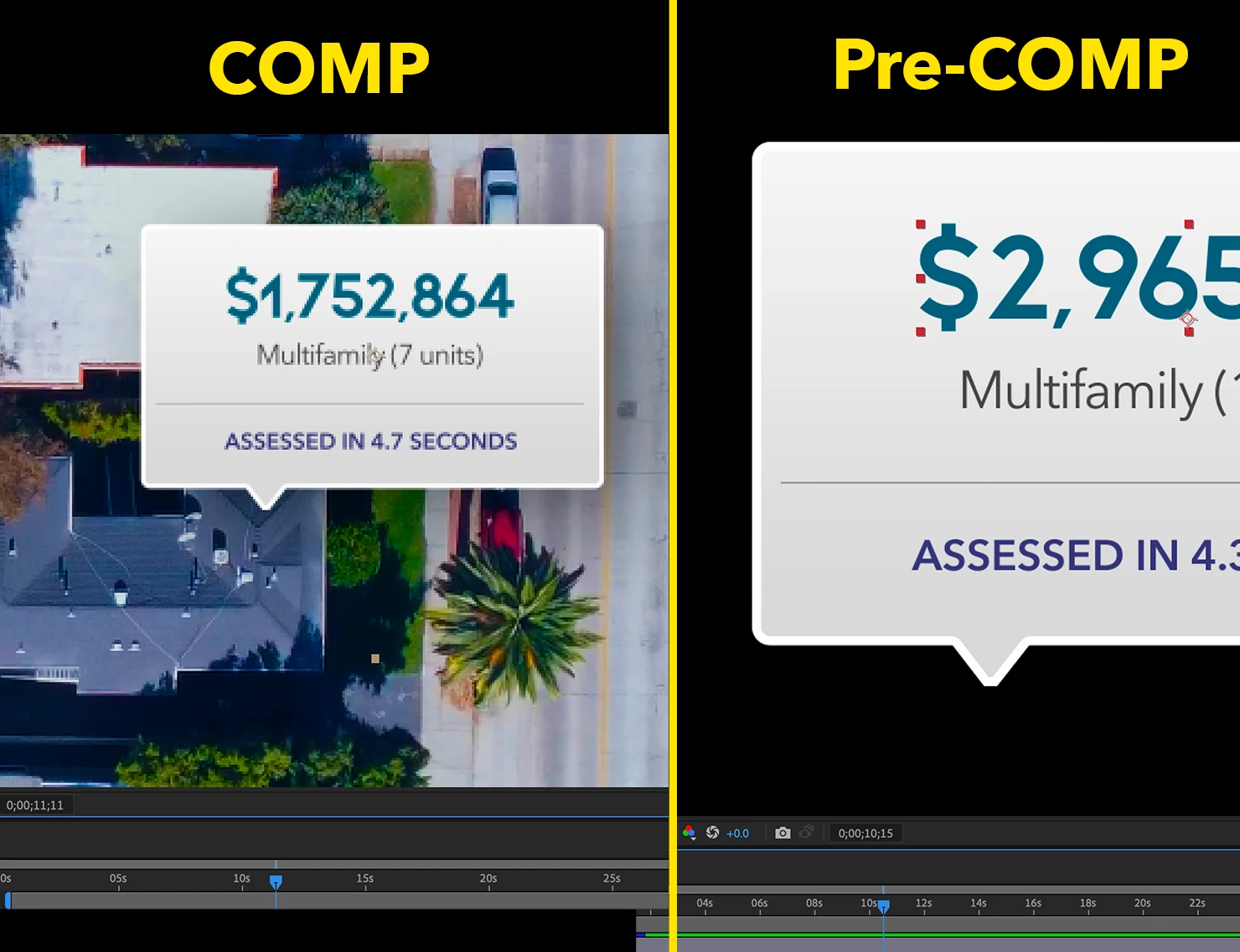
I have "continuously rasterize" on in both comps and the only difference I know of is that the text in the main comp has been reduced from 100% to 25%. However, even when I keep them both scalled to 100% I get the same results; sharp text in pre-comp, jagged text in main comp.
Thanks in advance for your help.