

Responsive html5 animation not scaling to fit on mobile
I am very sorry, I am sure this is a stupid question, but I just can't seem to figure it out.
I have made a looping animation in Adobe Animate. I have gone into the publish settings and given it these settings:
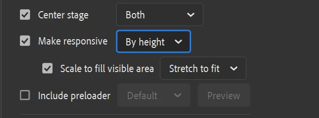
I want it to fill the vertical dimension of whatever window I have the browser set to including the mobile window.
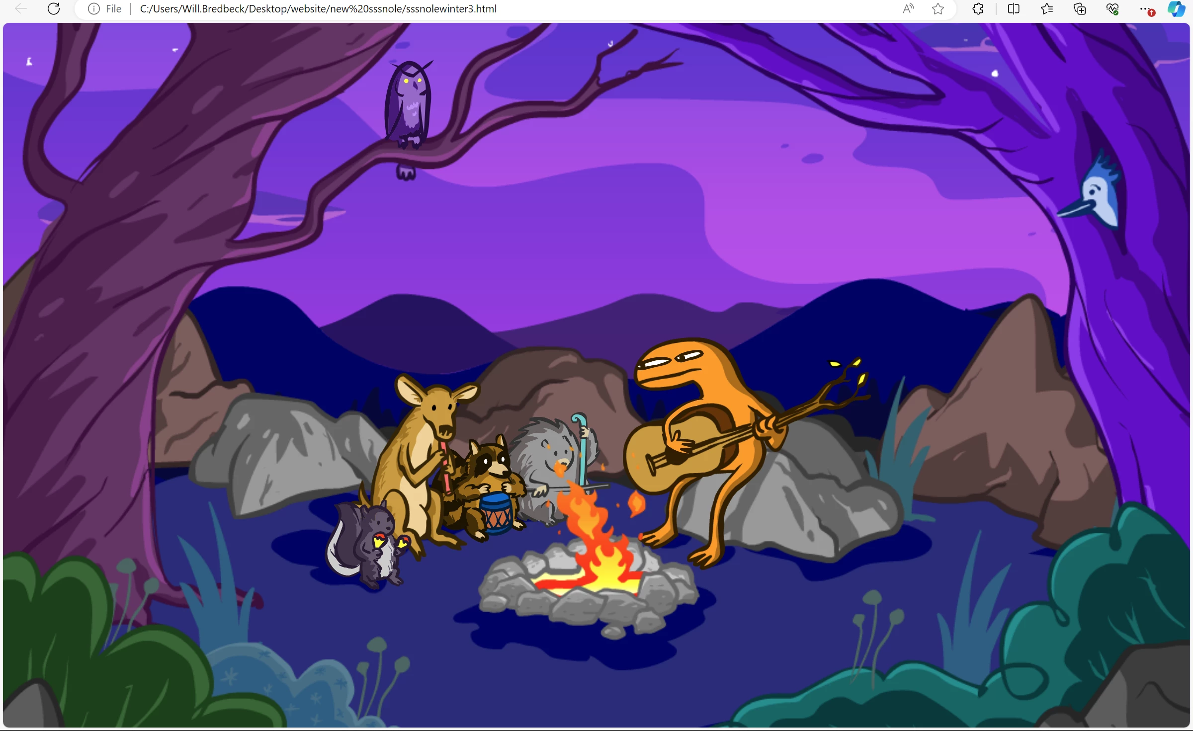
On desktop it looks great and acts as expected:
on mobile it does not:

Nevermind that it is not centered, it is not scaling to vit the vertical dimension. There is a whole bunch of white space at the bottom.
I have tried changing all of those publish settings and nothing is working. Interestingly it shows the animation correctly for a quarter of a second before resizing it to this incorrect view. What am I doing wrong?
Thank you for any help that you can provide! Adobe Animate version 23.0.3
 AdChoices