Question
Bridge 14: Quick most basic GUI fixes
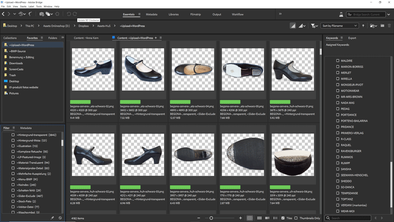
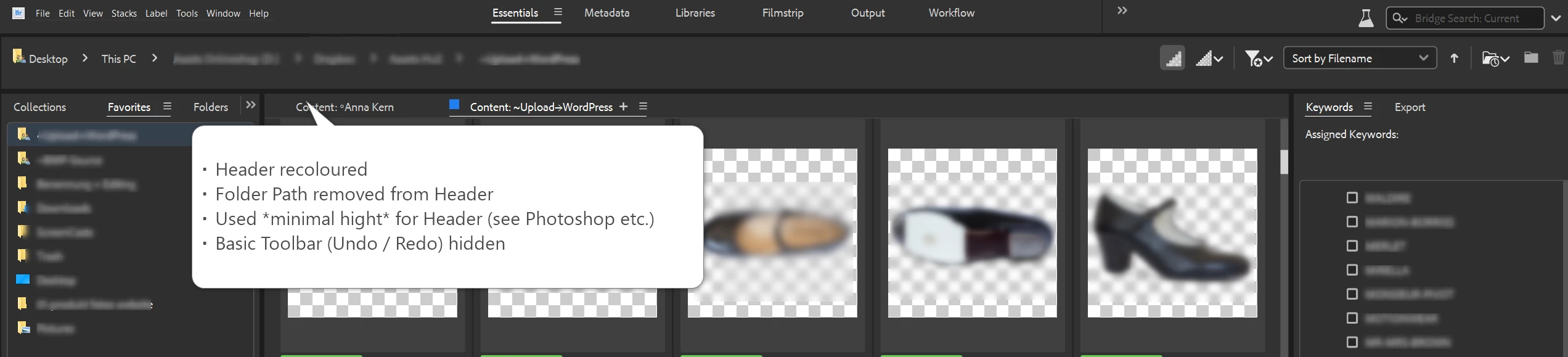
Among the many issues with the new user interface in Bridge 13 and 14, the bright header on Windows stands out. Here are a few suggestions to make the appearance more pleasing, quickly.
- Adapt to theme colours
- Reduce the header to Single Row (see headers in Photohop, Illustrator, InDesign). Indicators for secondary windows don't need to have a second row of text, and the same goes for the file path. It was best if you made additional Bridge Windows first class citizens (as in V12), then you wouldn't need hints.
- Let us hide the toolbar. No Adobe program I use shows toolbars for such basic functions. In more than 10 years, I have not clicked that Bridge toolbar once - it only wastes precious vertical space.
- Move Workspace Tabs to the Header
- Revisit other areas of wasteful element arrangement (see attached gif)
I crossposted this to Uservoice.