• Global community
    • Language:
      • Deutsch
      • English
      • Español
      • Français
      • Português
  • 日本語コミュニティ
    Dedicated community for Japanese speakers
  • 한국 커뮤니티
    Dedicated community for Korean speakers
Exit
0

Help me out please! Colors seem to show wrong after monitor calibration?

Explorer ,
May 06, 2019 May 06, 2019

Copy link to clipboard

Copied

Hi folks,

maybe somone with more knowledge when it comes to color management is able to help me out. I'd appreciate it a lot as I have been struggling to find correct answers on the web lately. Without much effort to be honest 😕 If someone could lead me to the right direction, I'd clearly make some kind of tutorial to help people out who have

been struggling as well. Now here's my problem:

I am trying to get consistent colors (and color values) in my Adobe CC programs after having calibrated my Eizo CS240 (Wide-Gamut-Monitor) with a colorimeter from

Eizo (Eizo/Spyder EX2). Something seems to be clearly wrong and I am trying hard to get consistent results.

First of all, I want to point out that when using sRGB as my default monitor profile in Windows 10, colors and color values seem to show right. I'll show you some screenshots first so you hopefully understand what I mean (I have my OS set to German language so I hope you still understand what I mean):

1. "Farbprofil" == display profile for monitor

(set to sRGB profile)
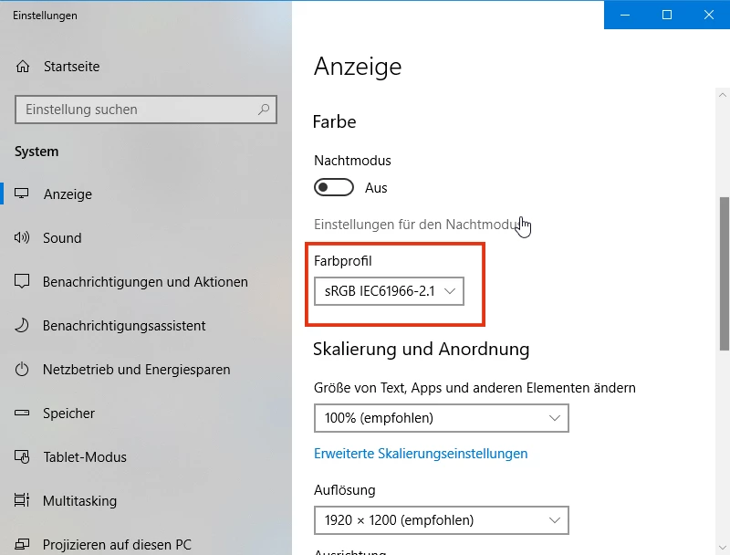
When set to sRGB (which would most likely not make a lot of sense in a color managed environment because it would propably limit a wide-gamut-monitor to sRGB I guess), everything plays out normal in the rest of Adobe programs. I have attached a screenshot of Illustrator showing what I mean:
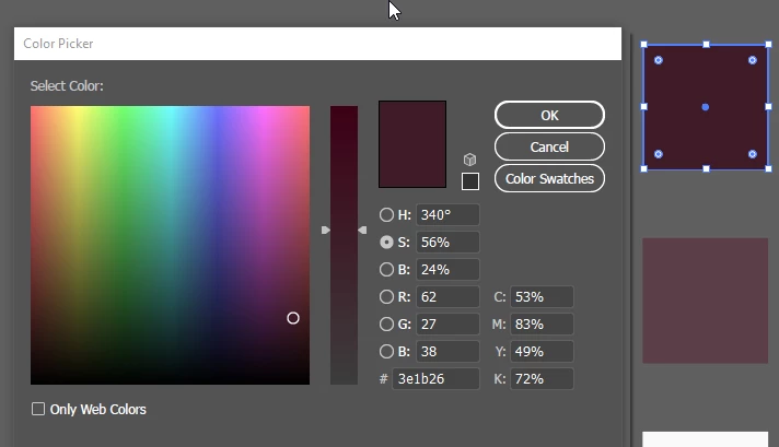
2.jpg

I got this square which I colored red with values RGB = 62/27/38 and HEX = #3e1b26.

Inside Illustrator the two colors visually match (the colored square and the displayed color inside the color picker).

In addition to that, not only do the colors visually match, but the color values are matching up as well.

I have used another external color picker (YS Instant Color Picker) to show you what I mean:
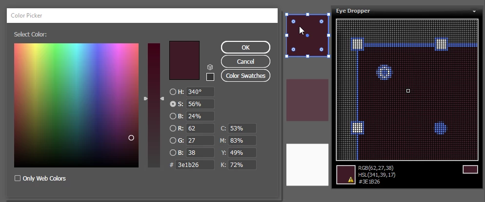
So far, so good it seems. All colors do visually match and the color values do match as well between a) the colored square, b) the displayed color inside Illustrator's color picker and c) the displayed color inside the external color picker.

PLEASE remember that all this happens when seen on my CS240 Eizo Monitor (wide-gamut) when set to sRGB in the display settings of the OS.

NOW HERE COMES THE PROBLEM:

When I now close all applications which use color management (like Adobe programs for example), then set my display color settings to a profiled one (instead of using sRGB like in the first screenshot I am now switching to Eizo CUSTOM profile which was the standard setting when the monitor was shipped) and reopen my Adobe programs, I am now getting the following problem:
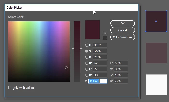
Now that I am using my calibrated and profiled color profile for my OS, Illustrator keeps showing me the right color inside the color picker but a wrong color

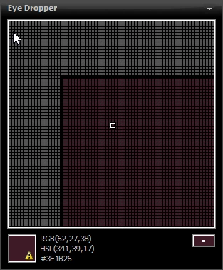
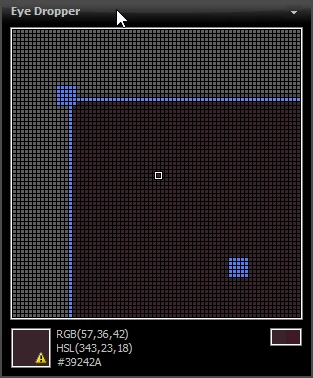
on-screen (the colored square which should be the exact same color). When inspected with the external color picker you can clearly see that not only does the visual appearance inside Illustrator differ from one color to another, but that the RGB values also no longer match:

1. color shown when inspecting color inside Illustrator's color picker (expected and intended values):
2. color shown when inspecting the actual colored square inside Illustrator ("washed out" representation when compared to color above):
Now I really don't quite understand what is going wrong here... I can no longer say which sRGB representation is the "right"...

What strikes me as especially strange is that even inside Illustrator colors no longer match up. I would have expected colors showing

wrong or different when using color-managed applications VS. non-color-managed applications BUT to get different color representations

inside the SAME color-managed application is utterly strange I think.

PLEASE SOMEONE HELP ME OUT. THIS TOPIC HAS TAKEN TOO MUCH TIME ALREADY TO GET THE GRASP OF AND I NEED HELP FROM SOMEONE

WHO CAN TELL ME WHAT EXACTLY S GOING WRONG HERE AND WHY. ANY HELP IS HIGHLY APPRECIATED

THX IN ADVANCE GUYS AND GIRLS

Views

3.5K

Translate

Translate

Report

Report
Community guidelines
Be kind and respectful, give credit to the original source of content, and search for duplicates before posting. Learn more
community guidelines
Community Expert ,
May 06, 2019 May 06, 2019

Copy link to clipboard

Copied

The problem with your testing is the color picker app is not color managed.

The Adobe apps use Lab as an intermediate, device independent color space to make the translation into your monitor‘s RGB profile, which is created by the hardware calibrator. So sRGB wouldn‘t likely be an accurate profile of your display, and using it would defeat the purpose of hardware calibration and monitor profile creation.

With Adobe apps the conversion for display goes from your editing space to Lab to the monitor profile—it might be AdobeRGB>Lab>MonitorRGB RGB, or sRGB>Lab>Monitor RGB, or US Web Coated SWOP CMYK>Lab>Monitor RGB etc. Your color picker app can’t deal with different editing and display RGB color spaces—it’s assuming there is a single RGB space.

Votes

Translate

Translate

Report

Report
Community guidelines
Be kind and respectful, give credit to the original source of content, and search for duplicates before posting. Learn more
community guidelines
Explorer ,
May 06, 2019 May 06, 2019

Copy link to clipboard

Copied

Hi,

thanks for the fast reply!

Now I get what you mean. I have contacted the customer staff at Eizo and he also replied saying that my external color picker app might not account for being color-managed.

STILL, how is it possible that the colors displayed inside Illustrator differ from one another?

(colored quad VS. the color shown in Illustrator's color picker)?

I would highly assume these two should be the same visually if viewed in the same program (Illustrator)?

Thanks for every advice in advance!

Votes

Translate

Translate

Report

Report
Community guidelines
Be kind and respectful, give credit to the original source of content, and search for duplicates before posting. Learn more
community guidelines
Community Expert ,
May 06, 2019 May 06, 2019

Copy link to clipboard

Copied

kain, can you please keep this in one thread? Having this spread over three separate threads is completely impossible to keep track of.

Please state which of these three threads we should respond to.

Votes

Translate

Translate

Report

Report
Community guidelines
Be kind and respectful, give credit to the original source of content, and search for duplicates before posting. Learn more
community guidelines
Explorer ,
May 06, 2019 May 06, 2019

Copy link to clipboard

Copied

Hi D Fosse,

i am sorry, I am new to making forum posts. I would appreciate it if we could use this new thread if that is ok with you, as I think some problems I am encountering are differing from the other posts.

Thank you!

Votes

Translate

Translate

Report

Report
Community guidelines
Be kind and respectful, give credit to the original source of content, and search for duplicates before posting. Learn more
community guidelines
Community Expert ,
May 06, 2019 May 06, 2019

Copy link to clipboard

Copied

OK, I'm assuming this one. I will ignore the other two threads.

You cannot use sRGB as default display profile for that monitor. It is a wide gamut unit. The monitor profile needs to describe the actual, current behavior of the monitor.

This is what ColorNavigator makes for you. It measures the display and makes a profile based on that. ColorNavigator will then set up the profile at system level, and there's nothing further you need to do. That's it - done. There's normally no need to go into the Windows Color Management dialog, except to check.

Color managed applications load the monitor profile at application startup. They load whatever profile they get from the OS. This profile will be used until next startup.

In other words - if you change monitor profile, you need to relaunch Illustrator.

Run ColorNavigator again and don't do anything else. If it still doesn't display correctly, come back and we'll figure it out. Is this a dual display setup, like for instance a laptop + the Eizo? In that scenario it has happened that the wrong monitor profile is loaded.

Votes

Translate

Translate

Report

Report
Community guidelines
Be kind and respectful, give credit to the original source of content, and search for duplicates before posting. Learn more
community guidelines
Explorer ,
May 06, 2019 May 06, 2019

Copy link to clipboard

Copied

Hi,

I do understand the point you are making. i understand that when using a wide-gamut-monitor, you NEED to use the display profile made by Color Navigator Software instead of sRGB. But the downside of this is that inside Illustrator, my colors do no longer match.

I have tried both calibrating my Eizo Screen and running Color Navigator 7 with only my Eizo Screen connected, with both my Eizo AND a secondary monitor connected. Both ways give me the same results:

Colors inside Illustrator no longer match

--->

(I don't know how this picture looks on your screen, but looking at it through the CUSTOM Profile of my Eizo

(calibrated and profiled), the two colors visually do not match (color picker color vs. colored quad). They are

(or at least should be) the same color.

I cannot explain why this is happening.

Do you have to set some special settings inside Color Navigator 7 maybe? If so, do you have some general settings

I could import in my app?

I am more and more thinking this could be some WIN 10 issue but I am not sure.

Maybe reinstall Adobe products and see whether issue is still pertaining?

Thx so far guys, rlly appreciate it!

Votes

Translate

Translate

Report

Report
Community guidelines
Be kind and respectful, give credit to the original source of content, and search for duplicates before posting. Learn more
community guidelines
Community Expert ,
May 06, 2019 May 06, 2019

Copy link to clipboard

Copied

But the downside of this is that inside Illustrator, my colors do no longer match.

Sorry if you mentioned this somewhere, but are you sure the Illustrator document color space is RGB and the assigned profile is sRGB (Edit>Assign Profiles not Color Settings>Working RGB?)

Votes

Translate

Translate

Report

Report
Community guidelines
Be kind and respectful, give credit to the original source of content, and search for duplicates before posting. Learn more
community guidelines
Explorer ,
May 06, 2019 May 06, 2019

Copy link to clipboard

Copied

Hi there again,

yes, I made sure to assign the right profile via Edit > Assign Profile.

I made a screenshot investigating this further:

The strange thing is the following:

When setting sRGB in the OS (which defeats the purpose of using a color-managed monitor),

I get the same color for ALL the fields above (A, B, C, D, E).

All colors match and when compared to an external color picker, also the RGB values match.

When setting my CUSTOM Eizo "calibrated and profiled" profile in the OS then I get what you can see in the above image

(A, B, C, D match BUT E does NOT match).

So the preview color of Illustrator's color picker stays the same regardless of whether I am using sRGB as monitor profile or my custom profile. RGB numbers also stay the same.

The only difference is how the other colors (A, B, C, D) look like.

When compared to the external color picker (YS Instant color picker), field E does still match and values also do.

What do you guys think? Is this normal?

Thanks rlly!

Votes

Translate

Translate

Report

Report
Community guidelines
Be kind and respectful, give credit to the original source of content, and search for duplicates before posting. Learn more
community guidelines
Explorer ,
May 06, 2019 May 06, 2019

Copy link to clipboard

Copied

Is it possible that it has something to do with my Nvidia Control Panel?

I have attached a screenshot, it is in German but maybe you can compare it to your settings

by typing in "Nvidia Control Panel" in the search bar of Windows.

Votes

Translate

Translate

Report

Report
Community guidelines
Be kind and respectful, give credit to the original source of content, and search for duplicates before posting. Learn more
community guidelines
Explorer ,
May 06, 2019 May 06, 2019

Copy link to clipboard

Copied

Another thing I have noticed: strangely there are 2 different sRGB profiles installed, is this a problem?

Votes

Translate

Translate

Report

Report
Community guidelines
Be kind and respectful, give credit to the original source of content, and search for duplicates before posting. Learn more
community guidelines
Community Expert ,
May 06, 2019 May 06, 2019

Copy link to clipboard

Copied

Too many things going on simultaneously here. We need to simplify and look at one thing at a time.

First, reset video card to default settings. Then reset Illustrator's color settings by choosing the "North America General Purpose" preset. It doesn't need to match other Adobe applications BTW. Close Illustrator down again.

Then create a new target in ColorNavigator. Set gamut to "Native", and the other parameters as you prefer. When you get to the point where you name the profile, click "customize profile". In the window that opens, set version 2.2 and tone curve "gamma value". This ensures a robust profile with minimum risk for errors.

policy_2.png

Once ColorNavigator has finished, you should have this new profile set as system default. If you like, you can check in Windows Color Management (but don't do anything there).

At this point, open up Illustrator again. Create a new document in RGB mode. At default color settings, this will be sRGB, the profile will be embedded, and embedded profiles will always be preserved.

Avoid CMYK for now. The default policy of "preserve numbers" is there for a good reason, but can easily cause problems for the purpose at hand now.

---

If you follow this procedure, we have a scenario where everything should display correctly. All possible configuration errors should be eliminated. So if it still doesn't look right, there has to be a very specific issue somewhere. But to pinpoint that, we need first to be absolutely sure that everything is set up correctly.

Votes

Translate

Translate

Report

Report
Community guidelines
Be kind and respectful, give credit to the original source of content, and search for duplicates before posting. Learn more
community guidelines
Explorer ,
May 06, 2019 May 06, 2019

Copy link to clipboard

Copied

Hi D Fosse

Thanks for all the help, really appreciate it. I will be doing what you requested and will come back once finished.

THX!

Votes

Translate

Translate

Report

Report
Community guidelines
Be kind and respectful, give credit to the original source of content, and search for duplicates before posting. Learn more
community guidelines
Explorer ,
May 06, 2019 May 06, 2019

Copy link to clipboard

Copied

Just a quick question:

Do I have to use Color Navigator 6?

Because the settings for version and tone curve can be found somewhere else using Color Navigator 7.

But I can deinstall CN 7 and reinstall CN6 if this is better...

All the best!

Votes

Translate

Translate

Report

Report
Community guidelines
Be kind and respectful, give credit to the original source of content, and search for duplicates before posting. Learn more
community guidelines
Community Expert ,
May 06, 2019 May 06, 2019

Copy link to clipboard

Copied

No, I just haven't bothered to upgrade to 7 yet. You can use that.

Votes

Translate

Translate

Report

Report
Community guidelines
Be kind and respectful, give credit to the original source of content, and search for duplicates before posting. Learn more
community guidelines
Explorer ,
May 06, 2019 May 06, 2019

Copy link to clipboard

Copied

Alright, I have followed the steps and (sadly) get the same results as before.

I have attached several screenshots in case I am missing something, which I don't think...

A0.png

A1.png

A2.pngA3.pngA4.pngA5.png

Do you think reinstalling my Adobe programs would make sense in this case maybe?

Thanks for sticking with me and trying to help me out. I have followed you through in several other forum posts

covering problems with Color Management and really appreciate the time you spend helping others

Votes

Translate

Translate

Report

Report
Community guidelines
Be kind and respectful, give credit to the original source of content, and search for duplicates before posting. Learn more
community guidelines
Community Expert ,
May 06, 2019 May 06, 2019

Copy link to clipboard

Copied

OK. All your settings look perfectly fine. There's nothing there that could explain any problems.

So now the big question: How does the sRGB file look? Is it oversaturated, undersaturated? What are you comparing to, what's the reference?

Let's try one thing. Export this sRGB file from Illustrator, to jpeg. (File > Export > Export As). Make sure you embed the sRGB profile:

ai_export_2.png

Now open this sRGB jpeg in Windows "Photos", which is not color managed. That tells you one important thing: this is not how it's supposed to look! It will be oversaturated. So that gives you a pointer.

Pull them up side by side, and make a screenshot. If you have Photoshop, open the screenshot in Photoshop and Edit > Assign your current monitor profile. Then Edit > Convert to sRGB. Post that here. If you don't have Photoshop, skip that and just post as-is.

I'm a photographer and pretty good at judging natural color in an image. That might be harder with Illustrator artwork. I'll see if I can figure out a way to bring us on the same page. Busy the rest of the evening, will check in tomorrow.

Votes

Translate

Translate

Report

Report
Community guidelines
Be kind and respectful, give credit to the original source of content, and search for duplicates before posting. Learn more
community guidelines
Explorer ,
May 06, 2019 May 06, 2019

Copy link to clipboard

Copied

Hi again, thx for replying so fast

Here are several screenshots documenting the various steps you have proposed.

I am using a software called ShareX, which is a screen capturing software to make screenshots. hope that is ok!

PLEASE KEEP IN MIND THAT PICTURES FROM STEP 2 & 3 ARE UNTAGGED (== HAVE NO PROFILE EMBEDDED) AS THEY ARE SCREENSHOTS.

(please tell me if I should change anything, like if there's the need to assign sRGB to them for example)

Step 1:

I made a 1000px X 1000px square with the desired color (RGB = 62/27/38 and HEX = #3e1b26) inside Illustrator.

I have exported it directly out of AI the way you told me above, this is what it looks like:

01-testsquarefromillustrator(sRGB)-01.jpg

Step 2:

Here is a screen grab of the Illustrator window and next to it the preview inside WIN 10 Photo App - clearly the colors are different.

02-screenshot_AI_vs_Fotos.jpg

Step 3: the screenshot above does not contain any profile, when I open it in PHOTOSHOP you can clearly see this because of the "#" next to RGB in the tab displaying the file name (hope you understand what I mean). I then assigned my monitor profile (the one we specified) and after that, I converted it into sRGB. I used the following export settings for saving the final file:

06-exportsettings.jpg

Step 4: In the end, I got this picture using the export settings above:

07-exported_jpg_sRGB_embedded.jpg

STRANGELY, if I view the picture above from step 4, the square to the right looks "right" as intended when using the monitor profile we decided upon.

If I inspect the right square using my external color picker (YS Instant Color Picker), it's almost exactly the same

color and color values (RGB and HEX) I originally intended them to be and as I originally defined them via the

color picker of Illustrator in the screenshots at the top of this thread.

Hope we can find out what's going on here

Thx again for all the help! Have a nice evening

Votes

Translate

Translate

Report

Report
Community guidelines
Be kind and respectful, give credit to the original source of content, and search for duplicates before posting. Learn more
community guidelines
Community Expert ,
May 06, 2019 May 06, 2019

Copy link to clipboard

Copied

I'm becoming pretty convinced everything is working normally here. This is the color difference you should get, when you display these sRGB numbers on a wide gamut monitor without color management. I see nothing unexpected here.

Yes, it will look duller in Illustrator because it applies color management to remap the numbers from sRGB into your monitor color space - which is considerably larger than sRGB.

Without this remapping, all numbers are "inflated" like a balloon into your monitor color space. The same set of numbers produces a much more saturated color on screen. But that doesn't make it right!

Illustrator is right. Photos is wrong.

With a wide gamut monitor, you make an unbreakable deal: you can only use applications with full color management. The very first thing you need to do, is find out which of your applications aren't color managed - and stop using them. They cannot be trusted. Throw them out. Find color managed alternatives instead.

Votes

Translate

Translate

Report

Report
Community guidelines
Be kind and respectful, give credit to the original source of content, and search for duplicates before posting. Learn more
community guidelines
Explorer ,
May 07, 2019 May 07, 2019

Copy link to clipboard

Copied

Hey D Fosse,

I understand what you are trying to say. All my sRGB files have certain RGB Values that define their color. When viewed on a wide-gamut-monitor in a non-color-managed app they look more saturated because numbers are now translated to a much wider gamut the monitor has. I think I have more or less understood what is happening and why.

I really appreciate your effort, and hate to say it, but there still seem to be things that just don't work correctly. I guess I just got some special bug in the software for these things to happen...

But just to recap:

Inside the same color-managed application (Illustrator) I get different visual representations of the same color. This should be impossible. It would make sense that colors show wrong when the monitor isn't profiled for example, but then again, ALL colors would show wrong (or right depending whether monitor has been profiled or not). There is just no explanation I can think of other than that the color picker itself inside Adobe programs isn't color-managed. But this would be irrational to say the least.

Nonetheless, I will try to be working with color-managed apps only. Or start neglecting color management as a whole. I still have to decide. There are benefits and downsides to this, and I think I can't do anything about it but accept them. The problem with such a bug in Illustrator is, simply said, you cannot work efficiently anymore without some type of workaround. Not a big fan of this to be honest.

It seems that when I don't care about color management and disable it as a whole (like when using sRGB as monitor profile), I do get oversatured (and therefore wrong) imagery on a wide-gamut-monitor. that's just the way it works I guess. But all of this pretty much matches the visual representation of cell phones nowadays (I know that cell phones are not color managed and too saturated factory-wise, but that's exactly the reason why it doesn't look a lot different than on a non-color-managed wide-gamut-monitor I guess). The same seems to be true when setting chrome to [force color profile ==sRGB]. So if I neglect color management, I get a better representation of what I intended to design on the screens of my users. So if you are designing for screens, it seems a color managed workflow doesn't make any sense because it worsens the outcome of the design for the customer and users. You can tell your users of course, that they cannot see color the way they are meant to because they just have the wrong devices to look at, but then after all, it doesn't make a lot of sense if only 1% of the world (who use a color-managed-monitor) see it as it should be and the rest sees it wrong...

The problem of neglecting and disabling color management as a whole is that when you want to send something to print, you have a much more saturated representation on screen (if using no color-management) than what you would get when using a color-managed-workflow (which is the true representation of color after all). So I guess everything you view on your non-color-managed wide-gamut-monitor would a) be much more dull than what you wanted it to be because of a wrong visual representation of sRGB and  b) after that it would even become more dull the moment you convert from RGB > CMYK.

Almost seems that if you do work like screen design, web design etc. a non-color-managed workflow would be superior. When doing print it would be better to use a color-managed workflow. I am in the middle of both worlds (like a lot of designers I guess), so it is strange that there hasn't been more resources that explain this topic so everybody is on the same side and can use this information effectively.

It also seems a lot of designers don't care about color-management at all because, to be honest, it is easy to make things more complicated than they are.

I probably had totally wrong assumptions about sRGB itself as well: I always thought that it would be some standard somehow. That sRGB is displayed (more or less) the same on a wide-gamut than it is displayed on a normal monitor. And that the benefit of a wide-gamut-monitor is that it can simply show more colors in addition to that. Meaning that when set to sRGB, colors look (more or less) the same everywhere. When looking at a larger color space like Adobe RGB on a wide-gamut-display, it would show everything correctly, and the only scenario when color would show wrong would be if viewing a larger color space (like Adobe RGB) on a standard monitor, as it is technically not able to show more than sRGB. Guess I was wrong here. sRGB isn't sRGB. I hope you get what I mean.

Correct me if I made any wrong assumptions here please ^^

I guess I'll just install my Adobe programs and see if this Illustrator bug is still pertaining.

Special thanks to D Fossee for being so patient with me

THX!

Votes

Translate

Translate

Report

Report
Community guidelines
Be kind and respectful, give credit to the original source of content, and search for duplicates before posting. Learn more
community guidelines
Community Expert ,
May 07, 2019 May 07, 2019

Copy link to clipboard

Copied

All color controls, everything related to color numbers, are color managed inside Illustrator (and Photoshop, InDesign etc).

The same visual color, in different color spaces, will have different numerical readouts. All the tools reflect this. For instance this yellow:

srgb.pngargb.png

Yes, sRGB is displayed identically on standard and wide gamut monitors, provided there is full color management. Not if there isn't. But once you hit the sRGB boundary, the wide gamut unit is capable of showing even more saturated colors.

You still seem very concerned with how things look in non-color managed applications. You need to put that out of your mind. It no longer has any relevance or significance - it will be wrong, end of story. You have a wide gamut monitor, work with it, not against it.

I have been using a series of wide gamut monitors exclusively for many, many years. There is zero problem with that, as long as you take your precautions. Don't use software without color management.

Votes

Translate

Translate

Report

Report
Community guidelines
Be kind and respectful, give credit to the original source of content, and search for duplicates before posting. Learn more
community guidelines
Explorer ,
May 07, 2019 May 07, 2019

Copy link to clipboard

Copied

Hi D Fosse,

just a last question to clarify, maybe you can comment on this (hope you are not totally annoyed by all these questions already).

I tested whether the colors I get inside color-manged-programs (Photoshop in this case) correlate with the colors I see in Firefox.

I have read somewhere that firefox is the only browser really capable of color management, not sure whether this information is up to date (as chrome has a force color profile option as well).

But let's look at firefox here. Now with my CUSTOM Eizo profile used (calibrated and profiled as we discussed), I get the same visual representation of an image in Firefox AND Photoshop when I set gfx.color_management.mode to 1 (full color management mode).

To quote something I read: "Full color management means that everything rendered by Firefox, with the exception of plugins, has its colors corrected."

So if firefox colors in mode 1 and my photoshop colors match, I should see the "real" sRGB colors, right?

If I set the mode to 0 (no color management), it will show more vibrant colors on my Eizo, because firefox behaves like other non-color-managed programs like Windows Photos, therefore showing wrong and overly saturated colors.

So to sum it all up, to make sure I get the "real" colors, I need to use color-managed-programs with a custom calibrated and profiled monitor profile in conjunction with firefox in mode 1 to get the right and consistent colors on screen. Is that right?

THX AGAIN TO ALL OF YOU!

all the best!

Votes

Translate

Translate

Report

Report
Community guidelines
Be kind and respectful, give credit to the original source of content, and search for duplicates before posting. Learn more
community guidelines
Community Expert ,
May 07, 2019 May 07, 2019

Copy link to clipboard

Copied

Yes, Firefox mode 1 is what you want. This is the fully color managed configuration. In mode 1, it also assigns sRGB to any untagged material, including html and graphic page elements, which allows the source > monitor conversion to operate consistently. In mode 1, everything displays correctly.

In mode 0 all color management is turned off. You don't want that.

The default is mode 2, where color management operates only if there is an embedded profile. Untagged material is not color managed. This is the "Safari mode", because Safari traditionally worked like this, until Apple were forced to change it when they introduced wide gamut iMacs and MBPs.

Everyone tells me Chrome works correctly ("mode 1") by default. I've never used it (I'm not letting Google record everything I do online. Why else would they have a browser?).

Votes

Translate

Translate

Report

Report
Community guidelines
Be kind and respectful, give credit to the original source of content, and search for duplicates before posting. Learn more
community guidelines
Explorer ,
May 07, 2019 May 07, 2019

Copy link to clipboard

Copied

Alright, thanks again D Fosse,

I was sure at the beginning of this thread that I completely messed up my color management. Now it turns out that I just didn't understand color management to its full extent. Now I get the concepts behind it, thanks to you

One small addition: In FF Mode 1 everything turns out the way it should. Except for Background Gradients which are not color managed despite mode 1. But this is another story and I have read several threads where people say it is actually a bug still prevalent today.

I am still wondering if color management is really a 100% usable nowadays considering 99% of people are not using it. ^^ And considering a lot of softwares do not cover CM as it must be quite costly to implement and a lot of programs like Excel don't need it. I understand that this is not really something I have control of as a designer since I cannot force my customers to buy a wide-gamut display. And even if they did, they would still complain that their customers would see it the wrong way.

At least I can be assured that what I see is the 'real color'. Guess that's all one can hope for.

The color picker bug inside Illustrator is still strange but as it is only happening in Illustrator and not in the other CC programs, I guess it really is just a bug.

Thanks for all the help! I highly appreciate it, all the best to you

Votes

Translate

Translate

Report

Report
Community guidelines
Be kind and respectful, give credit to the original source of content, and search for duplicates before posting. Learn more
community guidelines
Community Expert ,
May 07, 2019 May 07, 2019

Copy link to clipboard

Copied

kain19406534  wrote

I am still wondering if color management is really a 100% usable nowadays considering 99% of people are not using it.

A lot of people worry about this. I stopped worrying some time back when I realized the obvious: it's their problem, not mine. I can't tell them how to set up their systems. What I can do, however, is get it right on my end. There is one right here, and 23 million wrongs. Which one do you pick? I think that choice is easy.

Votes

Translate

Translate

Report

Report
Community guidelines
Be kind and respectful, give credit to the original source of content, and search for duplicates before posting. Learn more
community guidelines