Adobe Portfolio Side-by-side Texts are Misaligned on Certain Device Layout
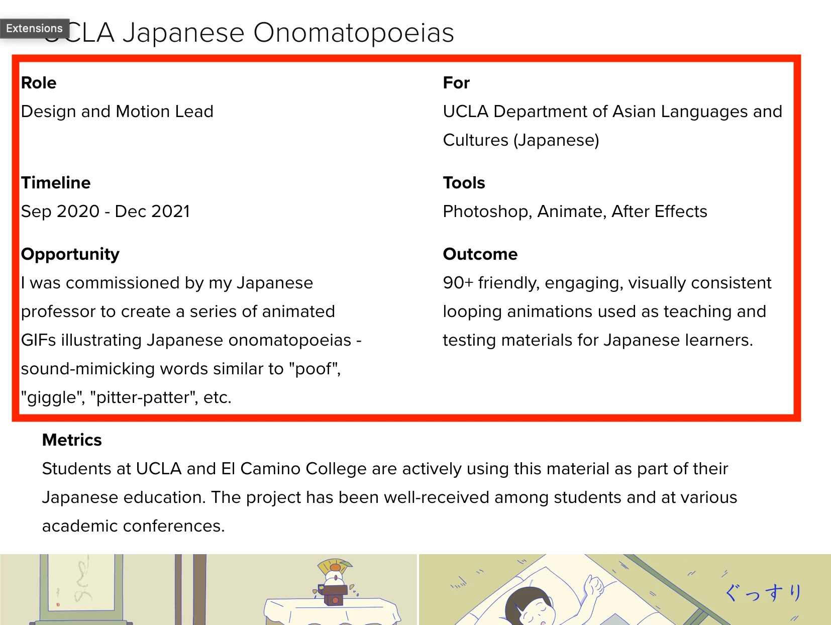
The side-by-side texts become misligned when the browser window is resized to 1/2 of its full width, or on a vertical iPad layout. Dear Adobe developers, please fix this problem. I use this side-by-side text feature on almost every portfolio page so it can be extremely annoying at times. Thank you very much.
Here is the orignial website if you want to experience it in-person:
https://wenhuamin.myportfolio.com/ucla-japanese-onomatopoeias

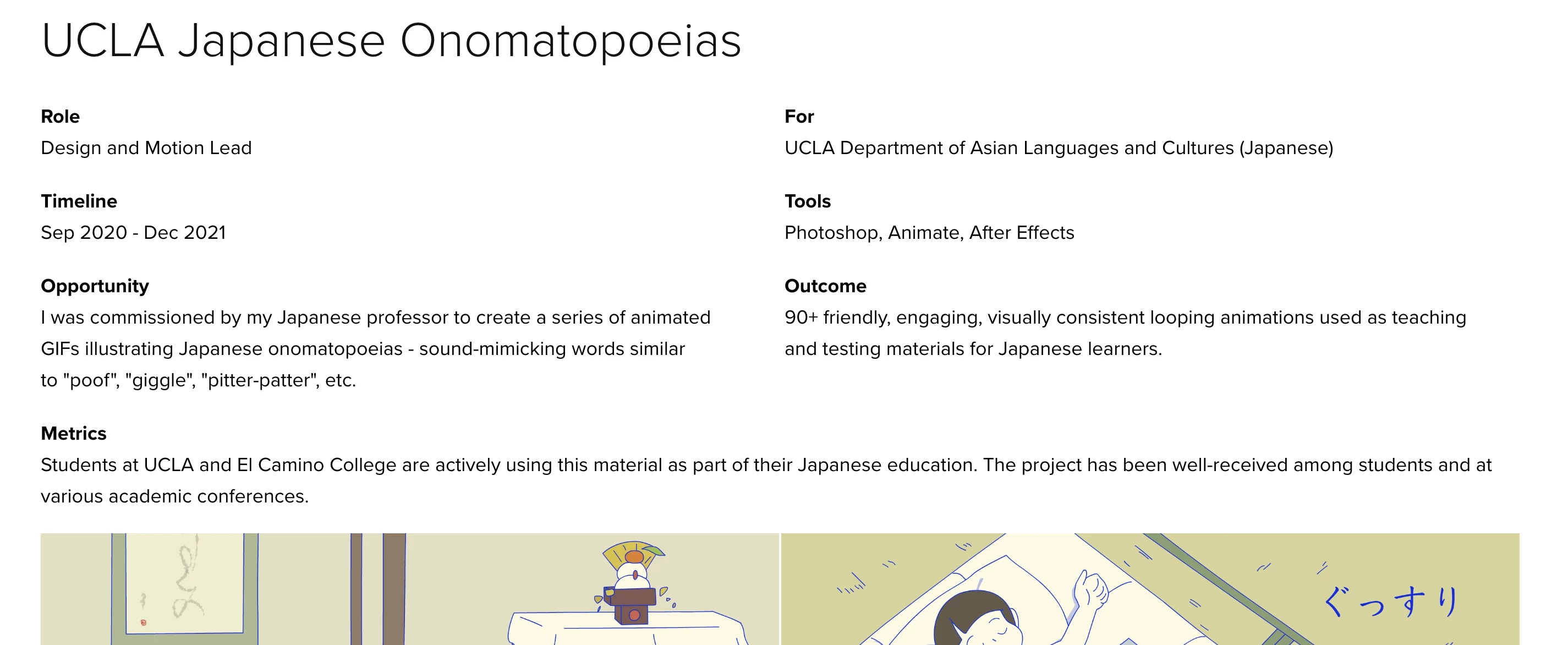
Full width

1/2 width or on vertical iPad

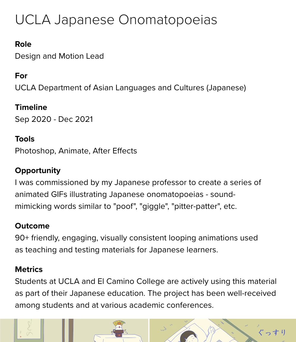
1/4 width or on mobile
