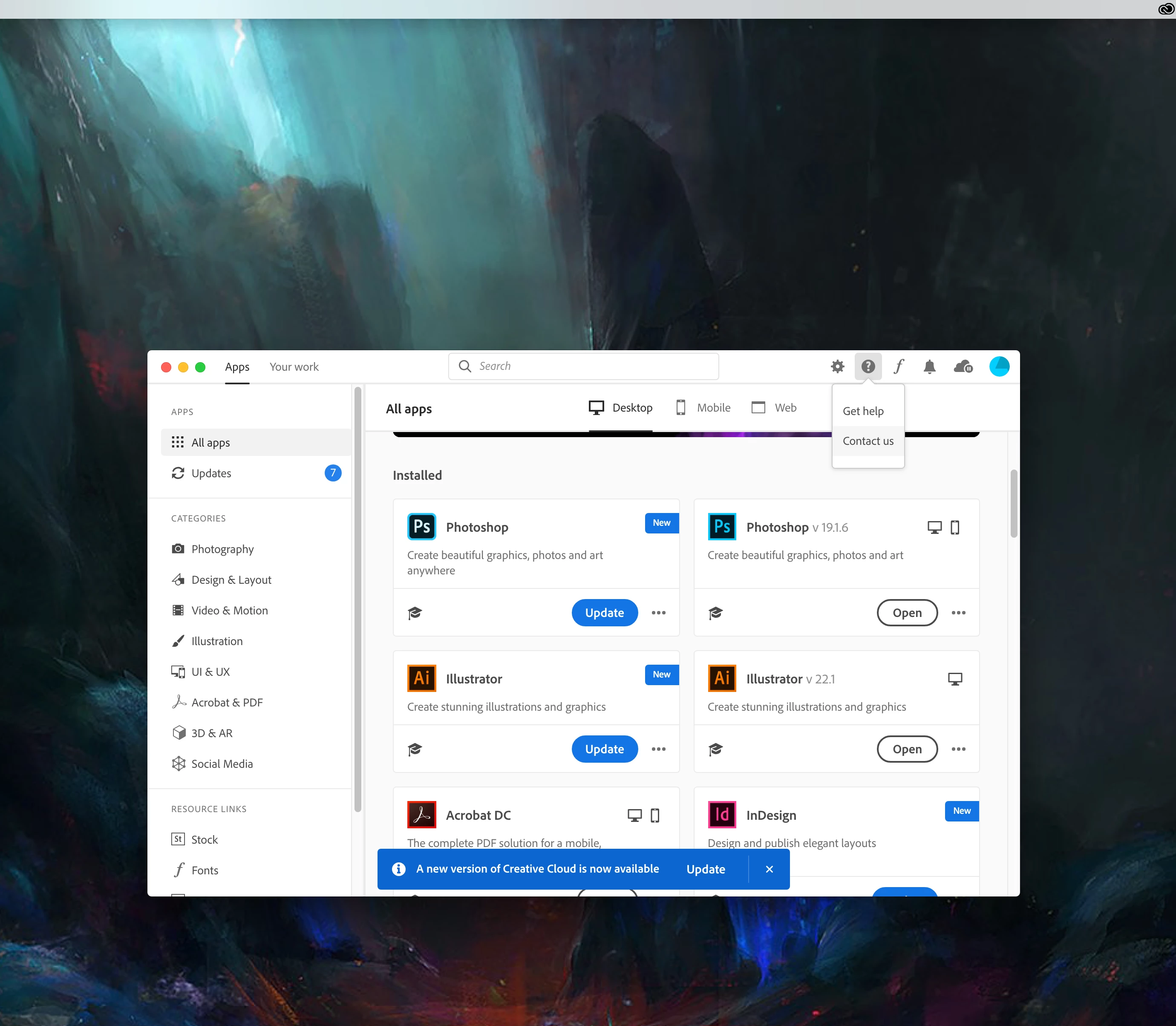
The new Adobe CC desktop app list view
Please please PLEASE give your users the ability to customise their experience... The old list view drop down from menu bar was a great way to interact with the product. Introducing the floating window is just creating an extra and uneccesary step of having to close a window everytime you click on the CC logo in the menu bar.
The list view was great because we could see if something needs updating, but also launch an app there - when clicking away, it closed automatically. Unlike the new floating window thing. Like the other CC apps, there should be a button saying "don't show this again" so we can quickly look through a lsit rather than all these boxes of apps spread out across a floater.
Again - it's very simple, when you bring in a new feature, GIVE US THE OPTION OF CUSTOMISING AND USING THE LEGACY SYSTEM. You could probably track users experiences and see how much people use one mroe than the other and that will speak for itself.