h2obeek
Known Participant
December 26, 2023
Question

Adobe Adobe Community Display inline block fail when uploaded to web?

  • December 26, 2023
  • 2 replies
  • 1050 views


Hi All. 

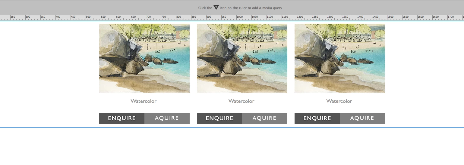
Any ideas why this fails.. Div Containers as inline blocks centered. Flows to a stack when the browser is reduced which is what is wanted. Works in Dreamweaver and preview but when uploaded to web the divs center stacked. Center is what is wanted but not stacked. Want them to flow with the browsers. 


When the orginal website was created and images are added it works to the old pages. But with current  Dreamweaver it fails? Any ideas? 


Help is appreciated!  


    This topic has been closed for replies.

    2 replies

    Nancy OShea
    Braniac
    December 26, 2023

    What's the URL to your problem page online?

    You have referrences to two external stylesheets we can't see.

    Also inline-block styles are rarely used anymore. There are better ways to do this.


    Nancy O'Shea— Product User, Community Expert & Moderator
    h2obeek
    h2obeekAuthor
    Known Participant
    December 26, 2023

    Hi Nancy....yes understood I did the orginal site 20 years ago. What I'm liking because it is basically a portfolio page is that the boxes flow no restrictions on browser page..so my view destop flows to 6 across then the rows centers below. There will be ad ons so don't want a restriction as to amount of boxes.  Next step will be making it phone friendly. Why I want the boxes to stack also. Not concerned that the boxes look justified on desk top.  

    Braniac
    December 26, 2023

    The answer would be in the code, can you paste what html and css you are using to display this layout?


    Have you heard of flexbox or grid...............rather than using display-inline

    h2obeek
    h2obeekAuthor
    Known Participant
    December 26, 2023

    Hi, osgood. I have tried the Flex box..no luck 


    Braniac
    December 26, 2023
    quote

    Hi, osgood. I have tried the Flex box..no luck 


    By @h2obeek


    Might the following help?


    <!DOCTYPE html>
    <html lang="en">
    <head>
    <meta charset="UTF-8">
    <meta name="viewport" content="width=device-width, initial-scale=1, maximum-scale=1">
    <title>GRID/FLEX</title>
    <style>
    * {
    box-sizing: border-box;
    }
    /* GRID EXAMPLE */
    .responsive-grid {
    display: grid;
    grid-gap: 10px;
    grid-template-columns: repeat(3, 1fr) ;
    width: 75%;
    max-width: 1200px;
    margin: 0 auto 30px auto;
    }
    /* Media 768px */
    @media screen and (max-width: 768px) {
    .responsive-grid {
    grid-template-columns: repeat(2, 1fr) ;
    width: 85%;
    }
    }
    /* Media 480px */
    @media screen and (max-width: 480px) {
    .responsive-grid {
    grid-template-columns: 1fr ;
    width: 95%;
    }
    }
    .box {
    display: grid;
    place-items: center;
    background-color: tomato;
    color: #fff;
    padding: 20px;
    font-size: 30px;
    }
    
    /* FLEXBOX EXAMPLE */
    .responsive-flex {
    display: flex;
    justify-content: space-between;
    flex-wrap: wrap;
    width: 75%;
    max-width: 1200px;
    margin: 0 auto;
    }
    /* Media 768px */
    @media screen and (max-width: 768px) {
    .responsive-flex {
    width: 85%;
    }
    }
    /* Media 480px */
    @media screen and (max-width: 480px) {
    .responsive-flex {
    width: 95%;
    }
    }
    
    .responsive-flex .box {
    display: grid;
    place-items: center;
    flex-basis: 32.5%;
    background-color: purple;
    color: #fff;
    padding: 20px;
    font-size: 30px;
    }
    /* Media 768px */
    @media screen and (max-width: 768px) {
    .responsive-flex .box {
    flex-basis: 49%;
    margin: 0 0 10px 0;
    }
    }
    /* Media 480px */
    @media screen and (max-width: 480px) {
    .responsive-flex .box {
    flex-basis: 100%;
    }
    }
    </style>
    </head>
    <body>
    <!-- GRID -->
    <div class="responsive-grid">
    <div class="box">Grid</div>
    <div class="box">Grid</div>
    <div class="box">Grid</div>
    </div>
    
    <!-- FLEX -->
    <div class="responsive-flex">
    <div class="box">Flex</div>
    <div class="box">Flex</div>
    <div class="box">Flex</div>
    </div>
    
    
    </body>
    </html>