

- Home
- Dreamweaver
- Discussions
- Aligning Bootstrap Cards Vertically
- Aligning Bootstrap Cards Vertically
Aligning Bootstrap Cards Vertically

Copy link to clipboard
Copied
Hi all,
I have two questions. 1. How do I align my bootstrap cards vertically when they are in a row of columns? The cards are lined up side by side, but some of the cards have longer text than the others, which is causing some weird spacing vertically. 2. I have changed all of my text to Century Gothic, however, when I access my site via mobile phone it uses an alternate font. I'd love any tips or support, thanks in advance! My site can be accessed at 'gatewaygreenbuilding.com' and the page with the cards is located under the green roof icon (click the icon to get to the page). I've also included a screenshot to show what I am talking about.


 34
Replies
34
34
Replies
34

Copy link to clipboard
Copied
This is the direct URL to the page in question.
http://gatewaygreenbuilding.com/GreenRoof.html
You don't know how to use Bootstrap's 12-box grid system do you? The absolute maximum number of columns you can have spanning a row is 12.
1 col x 12 = 12
12 col x 1 = 12
3 cols x 4 = 12
4 cols x 3 = 12
2 cols x 6 = 12
(1 col x 8) + (1 col x 4) = 12
(1 col x 2) + (1 col x 10) = 12
and so on....
Fix your column totals to fit your layout classes (sm, md, lg) and you should be golden.
https://www.w3schools.com/bootstrap4/bootstrap_grid_system.asp
https://getbootstrap.com/docs/4.0/layout/grid/
Example:
<!-- Columns start at 50% wide on mobile and bump up to 33.3% wide on desktop -->
<div class="row">
  <div class="col-6 col-md-4">.col-6 .col-md-4</div>
  <div class="col-6 col-md-4">.col-6 .col-md-4</div>
  <div class="col-6 col-md-4">.col-6 .col-md-4</div>
</div>
Hope that helps.
Copy link to clipboard
Copied
Part 2:
Bootstrap 4x vertically centered cards:
https://stackoverflow.com/questions/42252443/vertical-align-center-in-bootstrap

Copy link to clipboard
Copied
What version of Bootstrap are you using? Version 4 should align the cards to equal heights if they are in a 'row' container <div>. You can further enhance the appearance by adding some Bootstrap utility classes.
See example code below. (I dont think Bootstrap has any classes to set the cards to a percentage width other than 25%, 50%, 75% and 100% - so you may have to set your own width of 31% for bigger screen devices, which is set in the <style></style> block of code below.
There might be a better way when using Bootstrap but I rarely use it myself so maybe one of the other contributors that swear by it could provide a better example for you.
<!DOCTYPE html>
<html>
<head>
<title>Bootstrap Cards - Equal Height</title>
<meta name="viewport" content="width=device-width, initial-scale=1, maximum-scale=1">
<meta charset="UTF-8">
<link rel="stylesheet" href="https://maxcdn.bootstrapcdn.com/bootstrap/4.0.0/css/bootstrap.min.css">
<style>
@media screen and (min-width: 768px) {
.card {
width: 31%;
}
}
</style>
</head>
<body>
<div class="container px-5">
<div class="row justify-content-between flex-md-row">

<!-- start card -->
<div class="card mb-3">
<img class="card-img-top" src="..." alt="">
<div class="card-body d-flex flex-md-column flex-wrap">
<h5 class="card-title">Card 1</h5>
<p class="card-text">Lorem ipsum dolor sit amet, consectetur adipisicing elit. Accusantium, ut asperiores incidunt debitis sint beatae quia odit qui fugiat nihil consequuntur quam repellendus hic aliquam temporibus architecto corporis perspiciatis laborum!</p>
<a href="#" class="btn btn-primary mt-auto">Link 1</a>
</div>
</div>
<!-- end card-->


<!-- start card -->
<div class="card mb-3">
<img class="card-img-top" src="..." alt="">
<div class="card-body d-flex flex-md-column flex-wrap">
<h5 class="card-title">Card 2</h5>
<p class="card-text">Lorem ipsum dolor sit amet, consectetur adipisicing elit. Accusantium, ut asperiores incidunt debitis sint beatae quia odit.</p>
<a href="#" class="btn btn-primary mt-auto">Link 2</a>
</div>
</div>
<!-- end card-->


<!-- start card -->
<div class="card mb-3">
<img class="card-img-top" src="..." alt="">
<div class="card-body d-flex flex-md-column flex-wrap">
<h5 class="card-title">Card 3</h5>
<p class="card-text">Lorem ipsum dolor sit amet, consectetur adipisicing elit. Accusantium, ut asperiores incidunt debitis sint.</p>
<a href="#" class="btn btn-primary mt-auto">Link 3</a>
</div>
</div>
<!-- end card-->

</div>
<!-- end row-->

</div>
<!-- end container-->

</body>
</html>
Copy link to clipboard
Copied
Bootstrap example in post above BUT if you want to use something a little more advanced, cleaner and less verbose, in my opinion, check out the code below. Personally I like to keep all of the styling together as it doesnt interfere with the html mark-up, which can get pretty hideous, when using a framework.
(Dont use the below with the Bootstrap framework css file hooked up to the page) This is a NON framework example.
<!doctype html>
<html lang="en">
<head>
<meta name="viewport" content="width=device-width, initial-scale=1, maximum-scale=1">
<meta charset="UTF-8">
<title>Cards</title>
<style>
.cardsWrapper {
font-family: helvetcica, sans-serif;
font-size: 16px;
line-height: 26px;
display: grid;
grid-template-columns: repeat(3, 1fr);
grid-gap: 32px;
margin: 0 auto;
width: 90%;
}
@media screen and (max-width: 768px) {
.cardsWrapper {
grid-template-columns: repeat(2, 1fr);
}
}
@media screen and (max-width: 480px) {
.cardsWrapper {
grid-template-columns: repeat(1, 1fr);
}
}
.card {
display: flex;
flex-direction: column;
border: 1px solid #ccc;
border-radius: 6px;
padding: 15px;
}
.card figure {
margin: 0;
padding: 0;
}
.card h5 {
margin: 0 0 10px 0;
padding: 0;
font-size: 20px;
}
.card p {
margin: 0 0 15px 0;
padding: 0;
color: #666;
}
.card a {
text-decoration: none;
background-color: #0d66d0;
color: #fff;
padding: 7px 15px;
border-radius: 6px;
display: inline-block;
margin-top: auto;
align-self: start;
}
</style>
</head>
<body>
<div class="cardsWrapper">
<!-- start card-->
<div class="card">
<figure>
<img src="..." alt=""></figure>
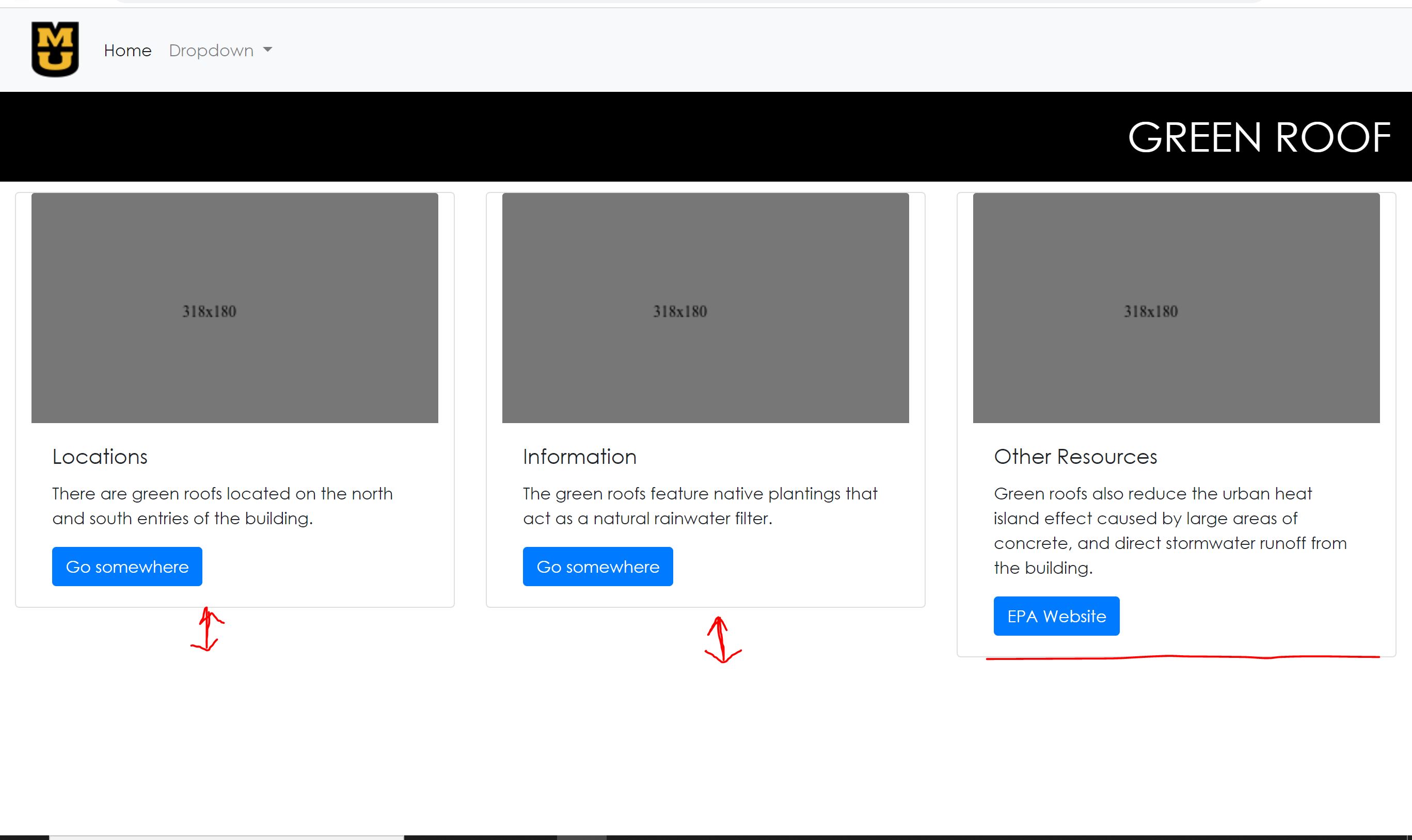
<h5>Locations</h5>
<p>Lorem ipsum dolor sit amet, consectetur adipisicing elit. Accusantium, ut asperiores incidunt debitis sint beatae quia.</p>
<a href="#">Go somewhere</a>
</div>
<!-- end card-->
<!-- start card -->
<div class="card">
<figure>
<img src="..." alt=""></figure>
<h5>Information</h5>
<p>Lorem ipsum dolor sit amet, consectetur adipisicing elit. Accusantium, ut asperiores incidunt debitis sint beatae quia odit qui fugiat nihil consequuntur quam repellendus hic aliquam temporibus architecto corporis perspiciatis laborum!</p>
<a href="#">Go somewhere</a>
</div>
<!-- end card-->
<!-- start card-->
<div class="card">
<figure>
<img src="..." alt="">
</figure>
<h5>Other Resources</h5>
<p>Lorem ipsum dolor sit amet, consectetur adipisicing elit. Accusantium, ut asperiores incidunt debitis sint beatae quia odit qui fugiat nihil.</p>
<a href="#">Go somewhere</a>
</div>
<!-- end card-->
</div>
<!-- end cardsWrapper-->
</body>
</html>
Copy link to clipboard
Copied
DISCLAIMER: Osgood is a Bootstrap hater. He condems everyone here who uses it. But we don't hold it against him. 🙂

Copy link to clipboard
Copied
EXTRA DISCLAIMER: Osgood prefers motor vehicles that he fabricates himself. That way he can show off his prowress and ensures that the vehicle is not overloaded with accessories that he never uses, like a speedometer.
Copy link to clipboard
Copied
EXTRA DISCLAIMER: Osgood prefers motor vehicles that he fabricates himself.
By @BenPleysier
F1 v Morris Minor.

Copy link to clipboard
Copied
web before libs ...

Copy link to clipboard
Copied
Could you impose a Bootstrap logo on that? Lol.
Copy link to clipboard
Copied
DISCLAIMER: Osgood is a Bootstrap hater. He condems everyone here who uses it.
By @Nancy OShea
I condem Bootstrap, with good reason, not the people that use it, its nothing personal against them.
Copy link to clipboard
Copied
To give the cards the same height, add h-100 (height 100%) to the card element as in
<div class="card h-100 col-md-4 col-lg-12">
I notice that you have added extra CSS giving thr row a display value of flex\
.row {
display: flex;
align-items: stretch;
justify-content: center;
flex-direction: row;
padding-top: 10px;
}
This is not neccesary because the Bootstrap row element is already a flex container. Another thing to remember is that content may only be placed inside cols. The correct markup for your page would look like
<main>
    <div class="container mt-5">
        <div class="row">
            <div class="col">
                <h1>Fancy display heading</h1>
            </div>
        </div>
        <div class="row row-cols-1 row-cols-sm-2 row-cols-md-3 row-cols-lg-4 row-cols-xl-5">
            <div class="col">
                <div class="card h-100">
                    <img src="http://gatewaygreenbuilding.com/images/Green%20Roof%20North.jpg" class="card-img-top" alt="Card image cap">
                    <div class="card-body">
                        <h4 class="card-title">Card title</h4>
                        <p class="card-text">Some quick example text to build on the card title and make up the bulk of the card's content.</p>
                        <a href="#" class="btn btn-primary">Go somewhere</a>
                    </div>
                </div>
            </div>
            <div class="col">
                <div class="card h-100">
                    <img src="http://gatewaygreenbuilding.com/images/Green%20Roof%20North.jpg" class="card-img-top" alt="Card image cap">
                    <div class="card-body">
                        <h4 class="card-title">Card title</h4>
                        <p class="card-text">Some quick example text to build on the card title and make up the bulk of the card's content.</p>
                        <a href="#" class="btn btn-primary">Go somewhere</a>
                    </div>
                </div>
            </div>
        </div>
    </div>
</main>
Notice the use of row-cols to organise the layout for different devices,
EDIT: Ooops! Just noticed that when I used the name of your images, the image names contain spaces. This is a no-no. In your case you could name them like Green_Roof_South_01.jpg or GreenRoofSouth_01.jpg
Copy link to clipboard
Copied
Seriously, yet more added overhead, columns which shouldnt be necessary, is it any wonder why l condem Bootstrap, its like div soup all over again and if l remember correctly, pre Bootstrap days, you would have heavily frowned upon that, whats changed?
Copy link to clipboard
Copied
Hi @BenPleysier
Thank you!! I was able to implement the code you provided and it gave me the desired stretching, but I was wondering if there is anyway for me to display three cards on top of another three cards instead of 5 cards all together? I was also hoping you could help me edit my h1 correctly. I am looking to put a graphic icon on the left side of the black header bar where it says green roof, but when I nest it inside of the heading the spacing gets all messed up for the text and the image and I'm not sure if this is the correct way to be doing this. If you or anyone else could help me achieve this that would be great. This community has been so helpful as I just started working with Dreamweaver and know I am not the best at it. Thank you all for the support!!!!!
Copy link to clipboard
Copied
You would need to alter the code that you were supplied substantially to get this presentable in my opinion.
1. your button links would look better if they were lined up instead of being all over the place, up and down like on a 'bad hair day'. To do this you would need to make the card-body a flex item.
2. you need some margin applied below the cards if you intend to have multiple lines of cards.
3. you need to apply the correct 3 items per row layout required to the 'col' wrapping the card items, not applied to the 'row'
4. you should keep all the images at the same depth, the layout looks a little ugly and crazy if you have one which is twice as tall as the rest
5. To line up your h1 text 'Green Roof' and logo correctly you need to apply display: flex; , align-items: center; and justify-content: space-between; to your h1 tag. To do that you need to wrap your h1 text 'Green Roof' in a span, so you have 2 items, the text and the image.
6. I mentioned in a previous post, your images are too large and will download slowly, especially on mobile devices, plus mobile users wont thank you for sucking their band width out if they are on a pay as you go service. Whilst you dont have to be too picky about it you should at least give it some consideration, which will benefit everyone, the user, as they get the content delivered faster and the client because they want users to stay on the website and a slow loading website will have users heading for the door, quickly.
Using the revised code below you should be good to go.
<!DOCTYPE html>
<html lang="en">
<head>
<meta charset="utf-8">
<meta http-equiv="X-UA-Compatible" content="IE=edge">
<meta name="viewport" content="width=device-width, initial-scale=1, maximum-scale=1">
<title>Gateway Green Building Document</title>
<!-- Bootstrap -->
<link href="http://gatewaygreenbuilding.com/css/bootstrap-4.4.1.css" rel="stylesheet">
<style>
body {
font-family: "Century Gothic"
}
</style>
</head>
<body style="padding-top: 15px">
<!-- body code goes here -->
<!-- The fixed navbar will overlay your other content, unless you add padding to the bottom of the <body>. Tip: By default, the navbar is 50px high. -->
<nav class="navbar navbar-expand-lg fixed-top navbar-light bg-light">
<div class="container-fluid" id="wrapper">
<a class="navbar-brand" href="#"><img src="images/University_of_Missouri_Logo.png" alt="MULogo"></a>
<button class="navbar-toggler" type="button" data-toggle="collapse" data-target="#navbarSupportedContent" aria-controls="navbarSupportedContent" aria-expanded="false" aria-label="Toggle navigation">
<span class="navbar-toggler-icon"></span>
</button>
<div class="collapse navbar-collapse" id="navbarSupportedContent">
<ul class="navbar-nav mr-auto">
<li class="nav-item active">
<a href="index.html" title="Gateway Green Building" target="_self" class="nav-link">Home <span class="sr-only">(current)</span></a>
</li>
<li class="nav-item dropdown">
<a class="nav-link dropdown-toggle" href="#" id="navbarDropdown" role="button" data-toggle="dropdown" aria-haspopup="true" aria-expanded="false">
Dropdown
</a>
<div class="dropdown-menu" aria-labelledby="navbarDropdown">
<a href="index1.html" title="Lobby Graphic" target="_self" class="dropdown-item">Lobby Graphic</a>
<a href="index2.html" title="Dorm Room Graphic" target="_self" class="dropdown-item">Dorm Room Graphic</a>
<div class="dropdown-divider"></div>
<a class="dropdown-item" href="#">Extras</a>
</div>
</li>
</ul>
</div>
</div>
</nav>
<main class="mt-5">
<div class="container">
<div class="row">
<div class="col">
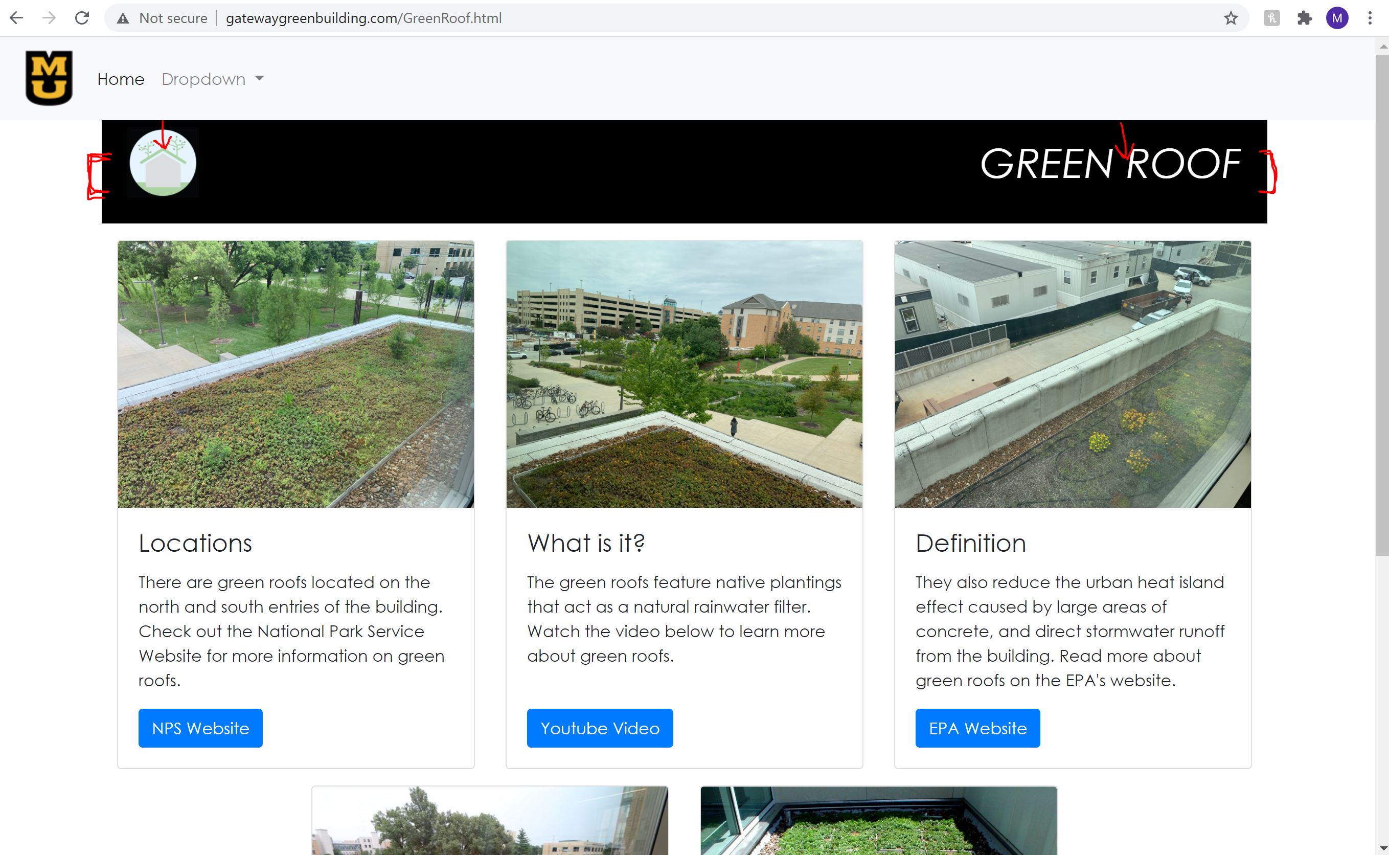
<h1 class="d-flex justify-content-between align-items-center"><img src="http://gatewaygreenbuilding.com/images/Green_Roof_Icon.jpg" class="img-fluid" alt="Green Roof Icon" width="70px" height="70px"><span>GREEN ROOF</span></h1>
</div>
</div>
<div class="row justify-content-center mt-3">
<div class="col-md-4 col-sm-6 mb-3">
<div class="card h-100 d-flex flex-column">
<img src="http://gatewaygreenbuilding.com/images/Green_Roof_North.jpg" class="card-img-top" alt="Card image cap">
<div class="card-body d-flex flex-column">
<h4 class="card-title">Locations</h4>
<p class="card-text">There are green roofs located on the north and south entries of the building. Check out the National Park Service Website for more information on green roofs. </p>
<a href="https://www.nps.gov/tps/sustainability/new-technology/green-roofs/define.htm" target="new" class="btn btn-primary mt-auto align-self-start">NPS Website</a>
</div>
</div>
</div>
<div class="col-md-4 col-sm-6 mb-3">
<div class="card h-100 mb-3">
<img src="http://gatewaygreenbuilding.com/images/Green_Roof_and_Rain_Garden_01.jpg" class="card-img-top" alt="Card image cap">
<div class="card-body d-flex flex-column">
<h4 class="card-title">What is it? </h4>
<p class="card-text">The green roofs feature native plantings that act as a natural rainwater filter. Watch the video below to learn more about green roofs.</p>
<a href="https://www.youtube.com/watch?v=FlJoBhLnqko" target="new" class="btn btn-primary mt-auto align-self-start">Youtube Video</a>
</div>
</div>
</div>
<div class="col-md-4 col-sm-6 mb-3">
<div class="card h-100">
<img src="http://gatewaygreenbuilding.com/images/Green_Roof_South_01.jpg" class="card-img-top" alt="Card image cap">
<div class="card-body d-flex flex-column">
<h4 class="card-title">Definition</h4>
<p class="card-text">They also reduce the urban heat island effect caused by large areas of concrete, and direct stormwater runoff from the building. Read more about green roofs on the EPA's website.</p>
<a href="https://www.epa.gov/heatislands/using-green-roofs-reduce-heat-islands" target="new" class="btn btn-primary mt-auto align-self-start">EPA Website</a>
</div>
</div>
</div>
<div class="col-md-4 col-sm-6 mb-3">
<div class="card h-100mb-3">
<img src="http://gatewaygreenbuilding.com/images/Exterior_Bike_Parking_02.jpg" class="card-img-top" alt="Card image cap">
<div class="card-body d-flex flex-column">
<h4 class="card-title">Other Resources</h4>
<p class="card-text">Interested in green roofs that are in Missouri? Check out the Missouri Botanical Garden's article on green roofs.</p>
<a href="https://www.missouribotanicalgarden.org/sustainability/sustainability/sustainable-living/at-home/rainscaping-guide/green-roofs.aspx" target="new" class="btn btn-primary mt-auto align-self-start">Missouri Botanical Garden</a>
</div>
</div>
</div>
<div class="col-md-4 col-sm-6 mb-3">
<div class="card h-100 mb-3">
<img src="http://gatewaygreenbuilding.com/images/Life_Sciences_Green_Roof.jpg" class="card-img-top" alt="Card image cap">
<div class="card-body d-flex flex-column">
<h4 class="card-title">Example</h4>
<p class="card-text">Gateway Hall isn't the only building with a green roof on Mizzou's Campus. Check out the Bond Life Sciences Center to see more. </p>
<a href="https://www.greenroofs.com/projects/life-science-center/" target="new" class="btn btn-primary mt-auto align-self-start">Life Sciences</a>
</div>
</div>
</div>
</div>
</div>
</main>
<!-- jQuery (necessary for Bootstrap's JavaScript plugins) -->
<script src="js/jquery-3.4.1.min.js"></script>
<!-- Include all compiled plugins (below), or include individual files as needed -->
<!-- Popper -->
<script src="js/popper.min.js"></script>
<!-- Bootstrap js -->
<script src="js/bootstrap-4.4.1.js"></script>
<script src="http://ajax.googleapis.com/ajax/libs/jquery/1.10.2/jquery.min.js"></script>
<script src="jquery.rwdImageMaps.min.js"></script>
<script>
$(document).ready(function(e) {
$('img[usemap]').rwdImageMaps();});
$('area').on('click', function() {
alert($(this).attr('alt') + ' clicked');
});
});
</script>
</body>
</html>
Copy link to clipboard
Copied
@osgood_ This is exactly what I was looking for with the card layout. It looks so much better now thanks to you! The only issue I am still having is with the header content. My icon and text are not centered vertically like I believe it should be. They are where I want them to be, but they need to shift down so that they are more centered on the black header background. Any thoughts? I am eternally grateful for all of your help with this!!!!!
Copy link to clipboard
Copied
Don't hesitate to come back when you have specific questions about Dreamweaver as this is a Dreamweaver product forum.
You've been given excellent advice so far from everyone. However, you cannot keep relying on unpaid forum volunteers to do your coding work for you. That's not what this forum is for. I urge you to spend some time learning code and more specifically how to use Bootstrap properly if that's your chosen framework. Bootstrap is very well documented and Google is your friend. 😉
Otherwise, hire an experienced web developer to help you. Goodbye & good luck with your project!
By @Nancy OShea
Well some of us have given good advice, other not so much, or half-assed advise, which doesn't work properly. How to attract users to the forum wouldn't be your best asset, based on the tone of your reply.
I have no issue with helping as coding is way too easily for me, Bootstrap or no Bootstrap solutions so it takes me minutes to produce, rather than hours, like some who have less experience or use frameworks.
Copy link to clipboard
Copied
How to attract users to the forum wouldn't be your best asset, based on the tone of your reply.
========
Look if someone needs a helping hand to get back on track, fine. I'm more than happy to assist them. And I'm all too happy to answer product questions. But I don't do people's "homework" for them and neither should any of us. That's not what product and technical forums are for. When we go down that slippery slope, nobody benefits, least of all the student/beginner.
Give a hungry man a fish, feed him for an hour. Teach a hungry man how to fish and feed him for a lifetime. 🙂
Copy link to clipboard
Copied
========
Give a hungry man a fish, feed him for an hour. Teach a hungry man how to fish and feed him for a lifetime. 🙂
By @Nancy OShea
Says someone who swears by using frameworks, thats so funny, if you think hard enough about it.
The way I see it is you can send an OP to search Google or Codepen, provide a url link as you and others do frequently in the forum - you're doing much the same thing, providing resources to someone elses coding solutions, only not really providing any real input yourself.
Tell you what why dont I set up a codepen, provide the solution on that platform and then I can priovide a pen link to you and you can pass that onto the OP?
Copy link to clipboard
Copied
The only issue I am still having is with the header content. My icon and text are not centered vertically like I believe it should be. They are where I want them to be, but they need to shift down so that they are more centered on the black header background. Any thoughts? I am eternally grateful for all of your help with this!!!!!
By @defaultvbg7e1p6wn4g
To me it looks like you have been changing the default Bootstrap file? I say this because the background-color of your h1 tag is black and that's not what it is in the default Bootstrap css file and I dont see any other css file linked to your page, where you could have changed it. Also it appears you have changed the default font style in the Bootstrap css default css file.
I would link a fresh copy of the Bootstrap css default file to your page. Never make changes to the default Bootstrap css file. Always make changes in a seperate css stylesheet, which should be linked to the page below the default Bootstrap css file.
So your code for your text GREEN ROOF/logo should look like:
<div class="col">
<h1 class="d-flex justify-content-between align-items-center text-light bg-dark py-3 px-4 font-weight-light"><img src="http://gatewaygreenbuilding.com/images/Green_Roof_Icon.jpg" class="img-fluid" alt="Green Roof Icon" width="70px" height="70px"><span>GREEN ROOF</span></h1>
</div>
and because Bootstrap has no utlility class for a solid black you will have to change the 'bg-dark' default utility class to solid black or create a new class if you think bg-dark is going to be useful for the rest of your project.
The below needs to go in a seperate stylesheet linked to your page or you could include it at the top of your page between <style></style> tags:
.bg-dark {
background-color: #000!important;
}
Copy link to clipboard
Copied
Thanks @osgood_ everything is fixed now and I will leave you all alone! You are amazing and I am so thankful for everything you have helped me with. 🙂
Copy link to clipboard
Copied
Thanks @osgood_ everything is fixed now and I will leave you all alone! You are amazing and I am so thankful for everything you have helped me with. 🙂
By @defaultvbg7e1p6wn4g
No problem. If you have any other issues then post in the forum and I'll try and help if I can.
Copy link to clipboard
Copied
1. your button links would look better if they were lined up instead of being all over the place, up and down like on a 'bad hair day'. To do this you would need to make the card-body a flex item.
2. you need some margin applied below the cards if you intend to have multiple lines of cards.
3. you need to apply the correct 3 items per row layout required to the 'col' wrapping the card items, not applied to the 'row'
4. you should keep all the images at the same depth, the layout looks a little ugly and crazy if you have one which is twice as tall as the rest
5. To line up your h1 text 'Green Roof' and logo correctly you need to apply display: flex; , align-items: center; and justify-content: space-between; to your h1 tag. To do that you need to wrap your h1 text 'Green Roof' in a span, so you have 2 items, the text and the image.
6. I mentioned in a previous post, your images are too large and will download slowly, especially on mobile devices, plus mobile users wont thank you for sucking their band width out if they are on a pay as you go service. Whilst you dont have to be too picky about it you should at least give it some consideration, which will benefit everyone, the user, as they get the content delivered faster and the client because they want users to stay on the website and a slow loading website will have users heading for the door, quickly.
By @osgood_
1. The `card` is already a flex container. All you need to do is add a `card-footer` to get the aligned result.
<div class="card h-100">
    <img src="http://gatewaygreenbuilding.com/images/Green%20Roof%20North.jpg" class="card-img-top" alt="Card image cap">
    <div class="card-body">
        <h4 class="card-title">Card title</h4>
        <p class="card-text">Some quick example text to build on the card title and make up the bulk of the card's content.</p>
    </div>
    <div class="card-footer bg-transparent border-0">
        <a href="#" class="btn btn-primary">Go somewhere</a>
    </div>
</div>
3. WRONG-WRONG - please see my previous reply showing
<div class="row row-cols-1 row-cols-sm-2 row-cols-md-3">
5. 'row` is already a flex container, therefore `col` is a flex item. The correct structure should be
<div class="row align-items-center justify-content-between py-4">
    <div class="col">
        <img src="http://gatewaygreenbuilding.com/images/Green_Roof_Icon.jpg" class="img-fluid" alt="Green Roof Icon" width="70px" height="70px">
    </div>
    <div class="col">
        <h1 class="text-end">GREEN ROOF</h1>
    </div>
</div>
Copy link to clipboard
Copied
5. 'row` is already a flex container, therefore `col` is a flex item. The correct structure should be
<div class="row align-items-center justify-content-between py-4">
    <div class="col">
        <img src="http://gatewaygreenbuilding.com/images/Green_Roof_Icon.jpg" class="img-fluid" alt="Green Roof Icon" width="70px" height="70px">
    </div>
    <div class="col">
        <h1 class="text-end">GREEN ROOF</h1>
    </div>
</div>
By @BenPleysier
That's your prefered way of constructing which involves more mark up and more classes, Why involve 2 more <divs> and 2 more classes? You already have an item, the image without the necessity to wrap it in a div which really should be a figure tag anyway, if you want to be picky. Theres no need to add a class to the h1 tag - 'text-end' if you wrap it in a span tag to create an item as space-between creates an inline block item, so no need to force the h1 text to the extreme right by adding the additional class.
Infact there is no reason to have the h1 wrapped in a redundant col at all, you could just use:
<h1 class="w-100 d-flex justify-content-between align-items-center bg-dark text-light py-3 px-4 font-weight-light"><img src="images/Green_Roof_Icon.jpg" class="img-fluid" alt="Green Roof" width="70px" height="70px"><span>GREEN ROOF</span></h1>
There is also the benefit of the logo being wrapped inside the h1 tag as search engines will read the images alt tag - being as though its inside an h1 tag it may have a positive benefical effect.
Similar with no 4. You're adding another div which is not really required if you optionally add the flex classes to the card-body wrapper.
Ever thought there might be alternative/optional ways of using Bootstrap, even streamlining it, just like there is a myriad of ways when constructing without Bootstrap?
The only one I would agree with is No3, it saves adding duplicate classes to the '<divs> wrapping the 'card' items, which has to be a positive. The less utility classes and unecessary <divs> the better I would argue.
-
- 1
- 2
Find more inspiration, events, and resources on the new Adobe Community
Explore Now
 AdChoices