Known Participant
December 22, 2017
Question

Bootstrap 3 navmenu, at small mobile view, toggle does not collapse fully...

  • December 22, 2017
  • 1 reply
  • 908 views

I've gone through every line of related code, and just do not see what could prevent the nav bar from matching the container, (hiding hamburger toggle).

Site URL: SatGraphics.com

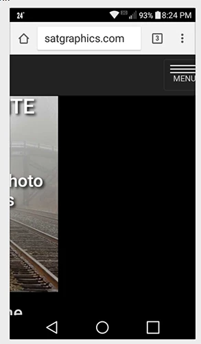
Screenshot of an Android phone; and same on others. All looked good in emulation mode FF Quantum Dev and Chrome Dev, leaving the option of asking for help.
    This topic has been closed for replies.

    1 reply

    Legend
    December 22, 2017

    Not sure what you mean by 'does not collapse fully'. The menu works ok on my mobile devices?

    Are you actually checking on a mobile device or just using some kind of simulator?

    Known Participant
    December 22, 2017

    I actually first became aware when viewing on a smaller screen Android, then on iPhone 6, that I was not seeing the toggle bars. I then have to swipe left to access toggle to access menu.

    That (image I included in initial query) was the screen shot of the Android; the content actually moved left out of view, with a space that I'd guessed to about the breakpoint, when swiped to left, to get to toggle.

    This led me to think there was some sort of min-width or other restraint rule associated with the navbar-header, but I just don't see anything that jumps out at me. (I can, at times, be a "bull in a china shop" but I have learned to not try to make the code do things it doesn't like to do.)

    No, I did not see any of that in emulation mode FF Dev or Chrome Dev, but only on hand held phone.

    All images and content were properly responsive and fit screen well, but had to swipe left to see the toggle trigger in menu.

    ===I've only overwritten a few rules===

    I inserted text "MENU" into the  navbar-toggle...

    /*Change Width of Menu Toggle Bars*/

    .navbar-toggle .icon-bar {

        width: 50px;

    }

    /*Center NavMenu links*/

    .navbar .navbar-nav {

        display: inline-block;

        float: none;

    }

    .navbar .navbar-collapse {

        text-align: left;

    }

    Legend
    December 22, 2017

    I'm obviously not seeing what you are seeing on my tablet or smartphone, both display the hamburger icon as I would expect, no scrolling right/left to view it is necessary.