
Answered
box in a box
Hi,
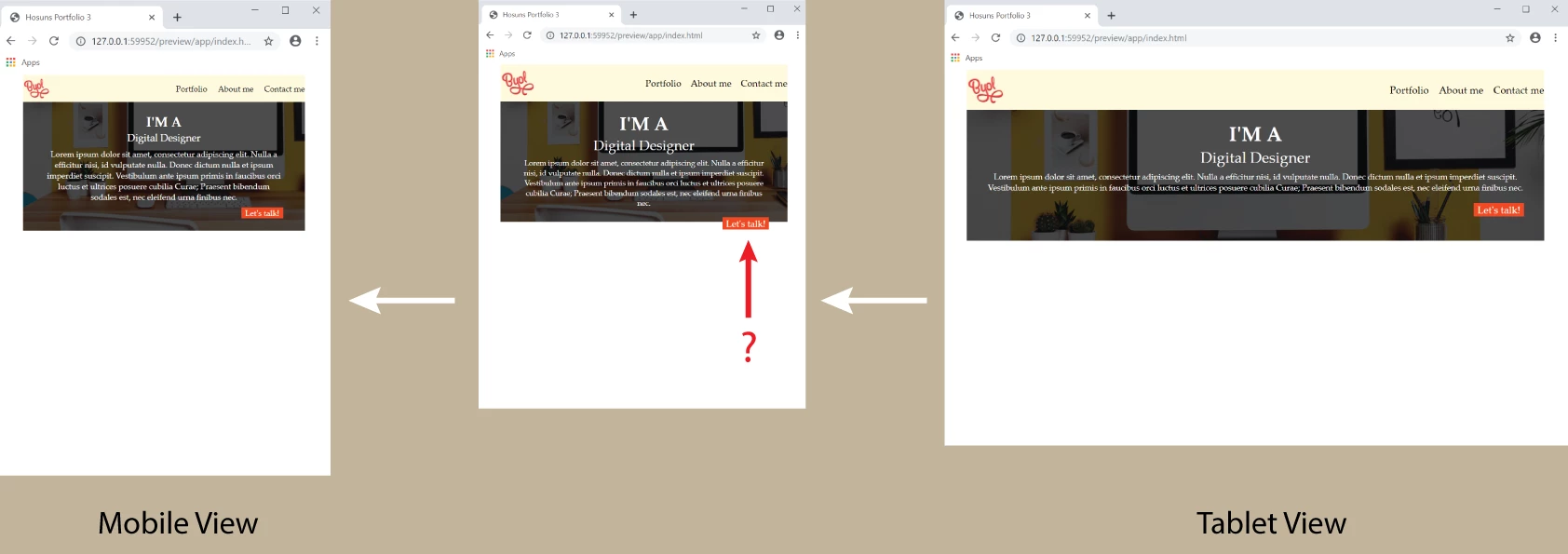
Moving from Tablet to Mobile, I see the orage box is located on the border of the image.
Is it an issue to be resolved?
Hosun Kang

Hi,
Moving from Tablet to Mobile, I see the orage box is located on the border of the image.
Is it an issue to be resolved?
Hosun Kang
Remove the height from .box1 css
.box1 {
height: 208px;
background-color: palegreen;
margin: 0px 40px;
padding: 16px 32px;
background-image: url(mages/hero-background.jpg);
background-size: cover;
color: white;
}
Mobile view:
.box1 {
font-size: 10px;
height: 192px;
}
Already have an account? Login
Enter your E-mail address. We'll send you an e-mail with instructions to reset your password.
 AdChoices