Galeodan
Known Participant
May 5, 2021
Question

How do I control varying page content width?

  • May 5, 2021
  • 3 replies
  • 2434 views

I'm thinking that most of my pages contents do not need full width in the body of each page. But I would like to have full-width page headings, perhaps even some full-width elements in a page that is limited to say 1200px wide.  Something like this:

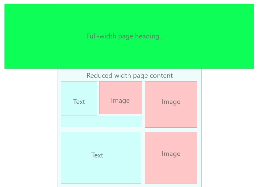
If I set a reduced body width, 

        body {
            max-width1200px;
            margin-left: auto;
            margin-right: auto;
            etc...................
        }

How do I then override this for a full-width element?

.fullwidthheader {

          something to override and set body width to 100% only for this class

          }

If this isn't on, what's the best alternative? Do I set body width to 100% and then put all the content in a reduced-width container?

        .pagecontent {
            max-width1200px;
            margin-left: auto;
            margin-right: auto;
            etc...................
        }


    This topic has been closed for replies.

    3 replies

    B i r n o u
    Adobe Expert
    May 5, 2021

    to get a full width you can use 100vw as value,

    .fullwidth {
        width: 100vw;
    }

     more infos on https://developer.mozilla.org/en-US/docs/Learn/CSS/Building_blocks/Values_and_units

    Galeodan
    GaleodanAuthor
    Known Participant
    May 5, 2021

    The reason I am using max-width in pixels, rather than %, is that I want the content to stay the same width (1200px) and only start shrinking when the screen width gets down to 1200px, I don't think I can get that behaviour using % or vw.

    Galeodan
    GaleodanAuthor
    Known Participant
    May 5, 2021
    quote
    quote

    Wait a minute.... bandwidth is an entirely separate problem and page width has nothing to do with it.


    I think you're trying to put the cart ahead of the horse and that never works well.


    Good luck!


    By @Nancy OShea


    To fill a bigger screen, without the content and photos looking like postage-stamps,the photos need to be bigger too. If you don't want pixelated photos, that means bigger files and slower page loading, especially where you have limited bandwidth. Am I wrong?


    By @Galeodan


    Well that's where image srcset comes into play, you can then serve the appropriate sized image to the appropriate device.........but I dont think a lot of developers actually do it because it takes more time to produce 3 or 4 alternative sized images of the same image for different devices, they just use a large image.


    Some may do it for a limited amount of hero images (main images) but probably if you have dozens of smaller images it would be a nightmare to manage..........welcome to the world of the web-developer. Its not easy IF you are doing it properly.


    srcset:

    https://www.w3schools.com/tags/att_source_srcset.asp 


    Well that's where image srcset comes into play, you can then serve the appropriate sized image to the appropriate device.........but I dont think a lot of developers actually do it because it takes more time to produce 3 or 4 alternative sized images of the same image for different devices, they just use a large image.


    srcset:

    https://www.w3schools.com/tags/att_source_srcset.asp 


    By @osgood_

    True - But the issue here is not the just the device screen, it's the quality of connection to the server. What I would need is a facility to detect the bandwidth of their connection and feed the appropriate image based on screensize AND download speed. Is there an app for that?  🙂


    Brainiac
    May 5, 2021

    In the example you show use the second approach if you want to set a specific 'section' of your page content to a max-width;


       .pagecontent {
                max-width1200px;
                margin-left: auto;
                margin-right: auto;
                etc...................
            }
     
    That then allows other content/containers to consume the maximum width of the 'body' if necessary.
     
    However consider that 1200px may look very small on a large screen so maybe consider setting the max width in % percent.
     
    Personally I hardly ever set width/padding/margin on the body tag.
    Nancy OShea
    Adobe Expert
    May 5, 2021

    Stop working with pixels.


    Use % throughout. 


    To fill the screen with your banner image, use width:100%.  But keep in mind that a low res JPG or PNG  banner that is upscaled beyond its native file size will look very pixelated on larger displays.  But if you use SVG images instead of rasters, you won't have that problem because SVGs are math-based instead of pixel-based. See screenshot.


    Vectors are ideal for non-photographic, flat images like icons, logos, drawings, comics, text, infographics and digital images made in Illustrator or Inkscape.


    Nancy O'Shea— Product User, Community Expert & Moderator