Galeodan
Known Participant
April 17, 2021
Answered

How Do I Wrap Text Around and Below an Image?

  • April 17, 2021
  • 3 replies
  • 9760 views

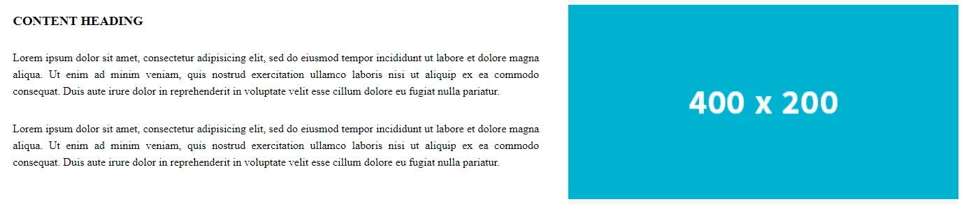
I am trying to wrap text around an image so that it wraps next to the image and below the image. This is especially desired for responsiveness \ resizing pages. Here is how one of the standard temaplates appears on a wide screen:

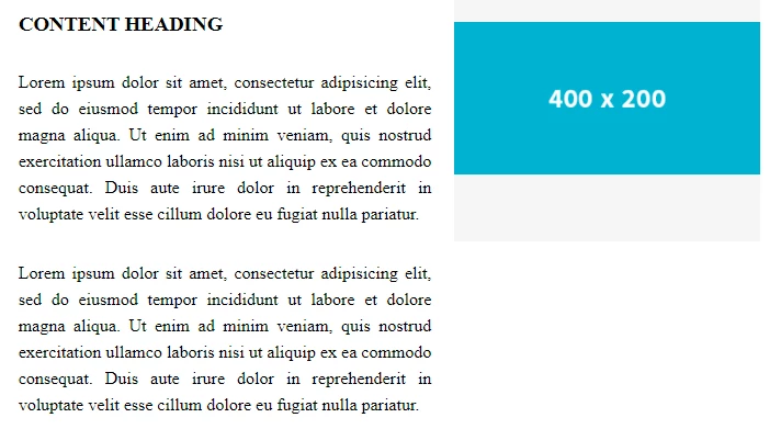
When the page shrinks, it changes to this:

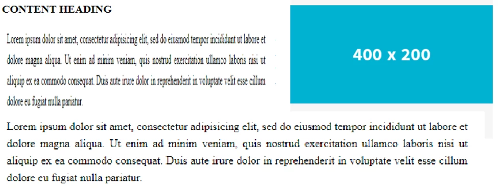
But, as the screen shrinks, I want the text to wrap beside AND across, under the image:


I cannot find an example of this behavious in any of the templates. Surely it can be done?

Any help appreciated.

Sean

    This topic has been closed for replies.
    Correct answer B i r n o u
    quote

    What we call in the UK 'Murdered' but maybe that wont translate so well given its not used in the correct context to describe a poor reproduction of a classic song.

    =========

    In US slang, when someone "kills it" it's regarded as wonderful!  But when they "murder it" it's downright offensive and best forgotten -- eg The Muppets performing Queen's Bohemian Rhapsody. 😞


    English is not an easy language, that's for sure.


    yes... you're so right... I always loved this one https://www.youtube.com/watch?v=Q5KKVC3JyJA... well, not in the same way than the previous link about a moment of pure emotion

    3 replies

    Liam Dilley
    Inspiring
    April 22, 2021

    There has been a lot of things in this thread.


    - Bootstrap and it's use is a discussion topic

    - Boostrap removing jQuery, Javascript frameworks like react vs native ES6 is a topic as well as young developers and this stuff as well

    - There is the original CSS side of the original post

    - There is a deeper aspect to the OP


    A lot going on!

    I could do a deep dive on each of those because I feel there is some missunderstanding and representation on all those points here.


    In terms of the image and text positioning I am supprised with the code shown here.

    I need to touch on content for a website though.

    In this day an age content should not be stactically created in a development tool and static on a page baked into the overal page/page template. Especially with how DW (which is out dated to be honest in lots of ways) still builds a site out of the box.

    Content needs to be managed and evolving for a website/online business so at the very least would be in a headless CMS. The output driven by your chosen code language pulling from the headless CMS. Or through an actual CMS.


    With that the content will be in the form of some form of WYSIWYG editor. Either the standard one with buttons, font styles, media picker and so on or some of the cooler approaches like what Umbraco does with its grid concept.

    If you have the latter this is really a non issue but if you considering what many will output it would be the text and an image inserted in the editor.

    This would then 90% of the time have an IMG inside P tag.


    With that in mind..

    This is your very very basic output [P and IMG and pure CSS]:

    https://jsfiddle.net/5tckm2pL/1/


    Now to control left and right you would have a class. Doable in most editors as there should likely a dropdown to add a class on the item.

    Now this would either be added directly to the IMG or often wrapping it in a span:

    https://jsfiddle.net/5tckm2pL/7/
    I been a little verbose in the code in places but you can see what is going on.

    And you can style it up:
    https://jsfiddle.net/mcvru4e1/9/

    Noting the before and after CSS does not work on the IMG but if you have a sollution wrapping the img tag you can do more fancy things as well.
    You would also look to have your media quries in place so the image could be full width bound and so on as indicated in some of the other posts.


    But where it actually goes into (CMS etc) dictates the output and HTML markup and thus what you do with the CSS and Javascript being the last resort.

    Now the kicker though... Modern design and web content consumption you do not actually do images this way any more 🙂
    Yep, showing how to do it but you should not really struture images in this way these days. Mobile first is really often the key consumption, you have to consider things like AMP, sharing and just the design even on desktop. If you look at the Verge articles for example:

    https://www.theverge.com/2021/4/21/22395449/apple-ipad-pro-2021-liquid-retina-xdr-mini-led-explainer

    This is standard

    Full width that scales for mobile, clear images, no need to try and do modal popups for bigger versions of the images.. Lots of reasons.

    A grid layout would involve full width content on the left and images on the right or vice versa:

    (Very basic example - https://codepen.io/chadlol/pen/jQqvzM)


    And as has been mentioned here as well you go into flexbox/CSS grid use.


    In terms of CSS grid:

    It is not ready for prime time yet so you use it at your own risk. Mozilla is still founding changes and fixes to common issues with it. Even in one of their recent blog posts they have:

    “If your site serves a market sector that is tied to older browsers, however, it may not make sense yet.”
    And when they say older browsers they are not talking IE8.


    Target Audiance and how you build and code and design a site is again another big topic.


    Nancy OShea
    Community Expert
    Community Expert
    April 23, 2021

    @Liam Dilley,

    The OP has previously stated this is a 3 page [static] website, not a headless or any other type of CMS.  


    According to Can I Use, Firefox versions 52 - 89 support CSS Grids as do all other modern browsers. 

    https://caniuse.com/css-grid


    Nobody cares about IE anymore (thank goodness), least of all Microsoft 🙂


    Nancy O'Shea— Product User & Community Expert
    Nancy OShea
    Community Expert
    Community Expert
    April 24, 2021

    I am advised to put images with captions inside a <figure> container. But <figure> shrinks the image and indents it from the margin, which I don't want. Using <div>, <container> and <section> seems to work just as well and doesn't have the effect of shrinking and indenting the image. So what's the story with <figure>?

    Sean


    Figure is symantically correct for images with captions and is exactly what you should use. If desired, use CSS to override the browser default <figure> styles  -- margin: 0; padding: 0. 


    Also review HTML5 semantic elements.


    Nancy O'Shea— Product User & Community Expert
    hans-g.
    Legend
    April 20, 2021

    Hi Sean,


    sicherlich sind eine Menge Vorschläge gemacht worden. Soweit ich verstanden habe - da gibt es halt leider diese Sprachbarriere - könntest Du so etwas brauchen, was ich vor langer Zeit auf meiner Webseite ausprobiert habe. Hier die Links dazu:

    http://hansgd.de/DWTest/TextUmfliessen/TextUmfliessenInitialeBild02.php 

    http://hansgd.de/DWTest/TextUmfliessen/TextUmfliessenFoto.php 

    http://hansgd.de/DWTest/TextUmfliessen/FloatingBild.htm


    Vielleicht passt etwas davon von diesen zugegebenermaßen uralten Testseiten.


    Stay safe

    Hans-Günter


    Galeodan
    GaleodanAuthor
    Known Participant
    April 20, 2021

    Danke Hans, für die Links. Der dritte Link (http://hansgd.de/DWTest/TextUmfliessen/FloatingBild.htm) ähnelt der Art und Weise, wie ich es jetzt mache.

    Sean

    Nancy OShea
    Community Expert
    Community Expert
    April 17, 2021

    Which is more important to site users? 

    Responsive:  being able to see appropriately scaled image and text on ANY sized device? 

    Non-Responsive: text that wraps around a static sized image with old fashioned floats? 


    <!doctype html>
    <html lang="en">
    <head>
    <meta charset="utf-8">
    <title>Bootstrap 4.5 Starter Page</title>
    <meta http-equiv="X-UA-Compatible" content="IE=edge">
    <meta name="viewport" content="width=device-width, initial-scale=1">
    
    <!--Bootstrap 4.5 on CDN-->
    <link rel="stylesheet" href="
    https://stackpath.bootstrapcdn.com/bootstrap/4.5.0/css/bootstrap.min.css">
    </head>
    
    <body style="padding-top: 70px">
    
    <nav class="navbar fixed-top navbar-expand-lg navbar-light bg-light">
    <a class="navbar-brand" href="#">Brand/Logo</a>
    <button class="navbar-toggler" type="button" data-toggle="collapse" data-target="#navbarSupportedContent1" aria-controls="navbarSupportedContent1" aria-expanded="false" aria-label="Toggle navigation">
    <span class="navbar-toggler-icon"></span>
    </button>
    <div class="collapse navbar-collapse" id="navbarSupportedContent1">
    <ul class="navbar-nav mr-auto">
    <li class="nav-item active">
    <a class="nav-link" href="#">Home <span class="sr-only">(current)</span></a>
    </li>
    <li class="nav-item">
    <a class="nav-link" href="#">Link</a>
    </li>
    <li class="nav-item dropdown">
    <a class="nav-link dropdown-toggle" href="#" id="navbarDropdown1" role="button" data-toggle="dropdown" aria-haspopup="true" aria-expanded="false"> Dropdown </a>
    <div class="dropdown-menu" aria-labelledby="navbarDropdown1">
    <a class="dropdown-item" href="#">Action</a>
    <a class="dropdown-item" href="#">Another action</a>
    <div class="dropdown-divider"></div>
    <a class="dropdown-item" href="#">Something else here</a>
    </div>
    </li>
    <li class="nav-item">
    <a class="nav-link disabled" href="#">Disabled</a>
    </li>
    </ul>
    <form class="form-inline my-2 my-lg-0">
    <input class="form-control mr-sm-2" type="search" placeholder="Search" aria-label="Search">
    <button class="btn btn-outline-info my-2 my-sm-0" type="submit">Search</button>
    </form>
    </div>
    </nav>
    <header class="container-fluid bg-info text-light">
    <div class="row">
    <div class="col">
    <h1>Bootstrap 4.5 in Dreamweaver</h1>
    </div>
    </div>
    </header>
    
    <main class="container my-3">
    <div class="row">
    <div class="col-md-12">
    
    <h2 class="text-info">1 Column, Floated image</h2>
    <p><img class="float-right" src="https://dummyimage.com/500x350" alt="placeholder">Lorem ipsum dolor sit amet, consectetur adipisicing elit. Dicta reprehenderit eaque incidunt dolorum quo ea expedita quibusdam obcaecati repellat atque deleniti molestias, quas aperiam accusamus, esse quos deserunt natus! Recusandae. Lorem ipsum dolor sit amet, consectetur adipisicing elit. Dicta reprehenderit eaque incidunt dolorum quo ea expedita quibusdam obcaecati repellat atque deleniti molestias, quas aperiam accusamus, esse quos deserunt natus! Recusandae.</p>
    </div>
    </div>
    
    <hr>
    <div class="row">
    <div class="col-md-6">
    <h2 class="text-info">Responsive, 2 Columns</h2>
    <p>Lorem ipsum dolor sit amet, consectetur adipisicing elit. Ipsum tenetur ipsa tempore sed, a cupiditate mollitia aliquid delectus corporis accusamus pariatur atque voluptates deserunt debitis, odit omnis suscipit dolore natus.
    Lorem ipsum dolor sit amet, consectetur adipisicing elit. Ipsum tenetur ipsa tempore sed, a cupiditate mollitia aliquid delectus corporis accusamus pariatur atque voluptates deserunt debitis, odit omnis suscipit dolore natus.</p>
    </div>
    
    <div class="col-md-6">
    <img class="img-fluid" src="https://dummyimage.com/500x350" alt="placeholder">
    </div>
    </div>
    </main>
    
    <footer class="container-fluid text-center bg-info text-light p-4">
    <p>Some footer text here...</p>
    </footer>
    
    <!--Supporting scripts: first jQuery, then popper, then Bootstrap JS, etc...--> 
    <script src="https://code.jquery.com/jquery-3.5.1.min.js" integrity="sha256-9/aliU8dGd2tb6OSsuzixeV4y/faTqgFtohetphbbj0=" crossorigin="anonymous"></script> 
    <script src="https://cdnjs.cloudflare.com/ajax/libs/popper.js/1.14.7/umd/popper.min.js"></script>
    <script src="js/popper.min.js"></script>
    <script src="https://stackpath.bootstrapcdn.com/bootstrap/4.5.0/js/bootstrap.min.js"></script>
    </body>
    </html>


    Hope that helps. 


    Nancy O'Shea— Product User & Community Expert
    Galeodan
    GaleodanAuthor
    Known Participant
    April 18, 2021

    I don't really know what's more important to users. But what I want to achieve is text that "responds" by wrapping under as well as beside an image as the screen size changes - As in the sequence of images in my post. I thought I was describing "responsive" behaviour but maybe not - I'm new to this stuff.