Copy link to clipboard
Copied
I am trying to wrap text around an image so that it wraps next to the image and below the image. This is especially desired for responsiveness \ resizing pages. Here is how one of the standard temaplates appears on a wide screen:
When the page shrinks, it changes to this:
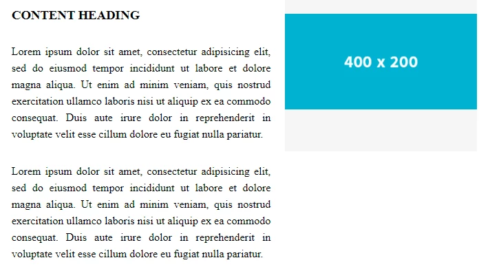
But, as the screen shrinks, I want the text to wrap beside AND across, under the image:
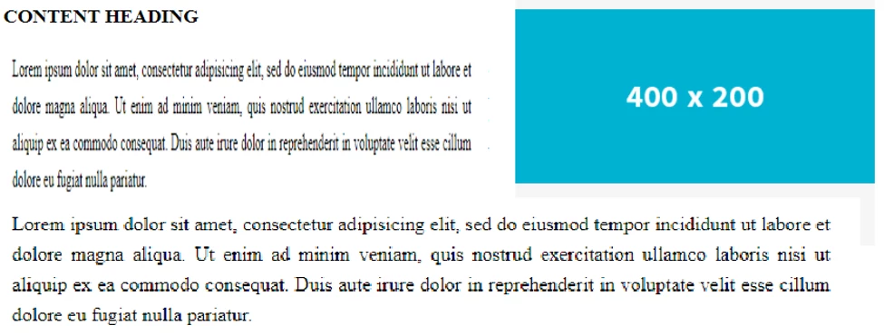
I cannot find an example of this behavious in any of the templates. Surely it can be done?
Any help appreciated.
Sean
yes... you're so right... I always loved this one https://www.youtube.com/watch?v=Q5KKVC3JyJA... well, not in the same way than the previous link about a moment of pure emotion
Copy link to clipboard
Copied
Hi Sean,
sicherlich sind eine Menge Vorschläge gemacht worden. Soweit ich verstanden habe - da gibt es halt leider diese Sprachbarriere - könntest Du so etwas brauchen, was ich vor langer Zeit auf meiner Webseite ausprobiert habe. Hier die Links dazu:
http://hansgd.de/DWTest/TextUmfliessen/TextUmfliessenInitialeBild02.php
http://hansgd.de/DWTest/TextUmfliessen/TextUmfliessenFoto.php
http://hansgd.de/DWTest/TextUmfliessen/FloatingBild.htm
Vielleicht passt etwas davon von diesen zugegebenermaßen uralten Testseiten.
Stay safe
Hans-Günter
Copy link to clipboard
Copied
Danke Hans, für die Links. Der dritte Link (http://hansgd.de/DWTest/TextUmfliessen/FloatingBild.htm) ähnelt der Art und Weise, wie ich es jetzt mache.
Sean
Copy link to clipboard
Copied
There has been a lot of things in this thread.
- Bootstrap and it's use is a discussion topic
- Boostrap removing jQuery, Javascript frameworks like react vs native ES6 is a topic as well as young developers and this stuff as well
- There is the original CSS side of the original post
- There is a deeper aspect to the OP
A lot going on!
I could do a deep dive on each of those because I feel there is some missunderstanding and representation on all those points here.
In terms of the image and text positioning I am supprised with the code shown here.
I need to touch on content for a website though.
In this day an age content should not be stactically created in a development tool and static on a page baked into the overal page/page template. Especially with how DW (which is out dated to be honest in lots of ways) still builds a site out of the box.
Content needs to be managed and evolving for a website/online business so at the very least would be in a headless CMS. The output driven by your chosen code language pulling from the headless CMS. Or through an actual CMS.
With that the content will be in the form of some form of WYSIWYG editor. Either the standard one with buttons, font styles, media picker and so on or some of the cooler approaches like what Umbraco does with its grid concept.
If you have the latter this is really a non issue but if you considering what many will output it would be the text and an image inserted in the editor.
This would then 90% of the time have an IMG inside P tag.
With that in mind..
This is your very very basic output [P and IMG and pure CSS]:
https://jsfiddle.net/5tckm2pL/1/
Now to control left and right you would have a class. Doable in most editors as there should likely a dropdown to add a class on the item.
Now this would either be added directly to the IMG or often wrapping it in a span:
https://jsfiddle.net/5tckm2pL/7/
I been a little verbose in the code in places but you can see what is going on.
And you can style it up:
https://jsfiddle.net/mcvru4e1/9/
Noting the before and after CSS does not work on the IMG but if you have a sollution wrapping the img tag you can do more fancy things as well.
You would also look to have your media quries in place so the image could be full width bound and so on as indicated in some of the other posts.
But where it actually goes into (CMS etc) dictates the output and HTML markup and thus what you do with the CSS and Javascript being the last resort.
Now the kicker though... Modern design and web content consumption you do not actually do images this way any more 🙂
Yep, showing how to do it but you should not really struture images in this way these days. Mobile first is really often the key consumption, you have to consider things like AMP, sharing and just the design even on desktop. If you look at the Verge articles for example:
https://www.theverge.com/2021/4/21/22395449/apple-ipad-pro-2021-liquid-retina-xdr-mini-led-explainer
This is standard
Full width that scales for mobile, clear images, no need to try and do modal popups for bigger versions of the images.. Lots of reasons.
A grid layout would involve full width content on the left and images on the right or vice versa:
(Very basic example - https://codepen.io/chadlol/pen/jQqvzM)
And as has been mentioned here as well you go into flexbox/CSS grid use.
In terms of CSS grid:
It is not ready for prime time yet so you use it at your own risk. Mozilla is still founding changes and fixes to common issues with it. Even in one of their recent blog posts they have:
“If your site serves a market sector that is tied to older browsers, however, it may not make sense yet.”
And when they say older browsers they are not talking IE8.
Target Audiance and how you build and code and design a site is again another big topic.
Copy link to clipboard
Copied
Sure css grid level 1 is ready for prime time use, it has 95% global browser support. Thats good enough for me and a lot more progressive devs who have been deploying it for a couple of years now.
Copy link to clipboard
Copied
Thanks to everyone's input I have a ton of stuff to review and I am going ahead with some protoptyping for my first new page. And one of the next challenges I have found is this: How to add a caption to the Image that has text flowing around it.
I have tried to put a <figcaption> below the image but have not been able to get it placed under the bottom left corner of the image. It floats around everywhere else!
I also would like to place text on the wrapped image. I can do it on a regular image but, once again, I can't figure out how to get it to show on the wrapped image rather than anywhere else on the page. Here's the code: Please excuse some redundant definitions and probably non-standard sequencing w.r.t. media queries. :
__________________________________________________________
Copy link to clipboard
Copied
The proper syntax for figures is this:
Optional CSS:
{float:right; width: 50%}
figcaption {font-style:italic;}
HTML:
<figure class="float-right">
<img src="https://dummyimage.com/400x300" alt="placeholder">
<figcaption>Fig 1. Your Caption Goes Here....</figcaption>
</figure>
<p>Lorem ipsum dolor sit amet, consectetur adipisicing elit. Eius, facere, adipisci! Explicabo sint dolores, sapiente provident saepe itaque aut, aliquam nam incidunt exercitationem eveniet, ad, quisquam excepturi vero enim iure.Lorem ipsum dolor sit amet, consectetur adipisicing elit. Eius, facere, adipisci! Explicabo sint dolores, sapiente provident saepe itaque aut, aliquam nam incidunt exercitationem eveniet, ad, quisquam excepturi vero enim iure.</p>
Copy link to clipboard
Copied
I have added CSS for the float-right class:
Copy link to clipboard
Copied
@Galeodan wrote:It looks good, on its own. But how do I stop the next section from encroaching? Overflow: hidden doesn't do it this time. The revised code is below (took out the surplus heading css).............
If you are not going to surround the floated container and associated paragraph(s) in a parent wrapper container to which you would apply overflow: hidden; to clear the float, then you need to apply a clearing method to the following <h3> tag:
<h3 class="clear">Next Section - Should not Encroach </h3>
CSS:
.clear {
clear: both;
}
Copy link to clipboard
Copied
I had tried putting the whole thing in a container, but the figcaption broke loose 🙂 Obviously not doing it right. I prefer the method you suggest. I was doing it one time with an empty para: <p class="clearfloat"></p> but that's redundant if I can apply it to the following element.
Copy link to clipboard
Copied
I prefer the method you suggest.
Yes, the way you have your content set up to follow on it is the best clearing method. overflow: hidden; can be used if a 'natural' container like footer or header, a section etc exists, which contain a float........just have to be observant and ask yourself when and where to apply which clearing method.
Copy link to clipboard
Copied
Here's the thing about floats to which I eluded earlier when I said "they're messy."
Floats are a hack. They remove content from it's normal document flow which brings along other unwanted problems. To mitigate this, you must resort to MORE hacks like overflow:hidden on a parent container or separate float clearing methods throughout your markup. In either case, it's a messy, slippery slope that experienced designers would prefer to avoid. Hacks are bad. But hacks on top of hacks are worse than bad.
I'm not interested in revisiting the "float experience" of 1998 except for academic and historical discussions. Beyond that, I can't recommend floats in 2021 site production.
Good luck with your project.
Copy link to clipboard
Copied
Floats are a hack.
Whilst I kind of agree with you about using floats for modern website construction (personally I would avoid them unless you really need to use them in a very limited capacity), floats are NOT a hack when applied to images. Thats exactly what float was originally intended for. Yes float became known as a hack when developers started using it to position containers side by side, just as developers used tables to layout a website in the earlier days, which was a hack. Roll forward to today and we have flex and grid..........developers needed to use hacks because there was limited option.
Whether float becomes a hack if you stick the image in a floated container and use figcaption is debatable.
Copy link to clipboard
Copied
Whether float becomes a hack if you stick the image in a floated container and use figcaption is debatable.
=========
Quick, get me the headache powder!!!
Copy link to clipboard
Copied
The OP has previously stated this is a 3 page [static] website, not a headless or any other type of CMS.
According to Can I Use, Firefox versions 52 - 89 support CSS Grids as do all other modern browsers.
Nobody cares about IE anymore (thank goodness), least of all Microsoft 🙂
Copy link to clipboard
Copied
I am advised to put images with captions inside a <figure> container. But <figure> shrinks the image and indents it from the margin, which I don't want. Using <div>, <container> and <section> seems to work just as well and doesn't have the effect of shrinking and indenting the image. So what's the story with <figure>?
Sean
Copy link to clipboard
Copied
Figure is symantically correct for images with captions and is exactly what you should use. If desired, use CSS to override the browser default <figure> styles -- margin: 0; padding: 0.
Also review HTML5 semantic elements.
Copy link to clipboard
Copied
I have reviewed those sections and I think I do grasp the "semantic" aspect of using the proper elements. I was wondering if there's some good reason for <figure> working the way it does - That maybe I'll discover when it's too late. But maybe it just is what it is and it doesn't necessarily have to make sense.
Copy link to clipboard
Copied
Edited: Should be the 'figure' tag not 'picture' tag when figcaption is used.
Its semantically correct coding to insert an image in a 'figure' tag just as it is when using 'h' tags for headings and 'nav' tags for navigation etc however most devs seems to overlook it and just use a div. You should be able to zero out the margin/padding on the 'figure' tag so it acts the way you want. Do l always use the 'figure' tag, nope, l overlook it as well because its not so well documented.
Copy link to clipboard
Copied
Not <picture>. <figure> and <figcaption>. Different elements for completely different purposes.
https://developer.mozilla.org/en-US/docs/Web/HTML/Element/picture
https://developer.mozilla.org/en-US/docs/Web/HTML/Element/figure
Copy link to clipboard
Copied
Not <picture>. <figure> and <figcaption>. Different elements for completely different purposes
By @Nancy OShea
Yes, l edited my post accordingly after re-reading my response. I often get tags connected with images mixed up, picture, srcset, figure, figcaption, probably why images seem to mostly get dumped into a div. It doesnt help because picture is more descriptive of a photographic image rather than figure which l tend to associate more with linear diagrams.
Perhaps there should be the 'photo' and 'photocaption' tag.
Copy link to clipboard
Copied
Unfortunately, a <div> tag imparts no semantic meaning. It's just a container. <figure> is carried over from journalism where each image has a designated Fig # which is referenced in the article's text. The right tag gives content both meaning and structure which is helpful for SEO and screen readers.
If you wanted to offer alternate images for different sized devices, you could do that too by nesting <picture> inside the <figure> tag. But that's another topic for another discussion.
Copy link to clipboard
Copied
<qoute>
<figure> is carried over from journalism where each image has a designated Fig # which is referenced in the article's text.
</quote>
You're partly correct. In publicatons the word 'figure' usually refers to a graphic, diagram or maybe a simple linear sketch, not a photo.
You dont say:
The figure above shows an elephant and her young unless its a graphic.
You say:
The image above shows an elephant and her young or in some instances you could say: The picture above......
So in my opinion the spec hasnt really got the current image tags descriptively as accurate as they could be. We probably need more tags for variable situations to describe better the senario, especially in terms of screen readers as that is what they are essentially for. It would designate the distinction more readily between a graphic and a photographic image.
This just opens up an interesting observation as to which other tags are 'misleading/confusing'. For instance what does 'aside' mean, we have 'header' , 'footer', 'main' etc why not just 'side', rather than 'aside'. If you're thinking well you could have 2 sidebars or 2 columns and 'aside' describes a single side, well you can have 2 headers or 2 footers, so why not 'afooter' or 'aheader'
The spec naming and descriptive objective leaves a lot to be desired.
Copy link to clipboard
Copied
https://developer.mozilla.org/en-US/docs/Web/HTML/Element#image_and_multimedia
Copy link to clipboard
Copied
https://developer.mozilla.org/en-US/docs/Web/HTML/Element#image_and_multimedia
By @BenPleysier
and what does that have to do with the distinction between whether an image is of a photographic source or a graphic/diagramatic one. I cant see a tag in that list that would provide any indication to a user who might have accessibility issues.
Copy link to clipboard
Copied
I saw this posted somewhere and thought that a full listing might help someone.
"This just opens up an interesting observation as to which other tags are 'misleading/confusing'. For instance what does 'aside' mean, we have 'header' , 'footer', 'main' etc why not just 'side', rather than 'aside'. If you're thinking well you could have 2 sidebars or 2 columns and 'aside' describes a single side, well you can have 2 headers or 2 footers, so why not 'afooter' or 'aheader'"