
Answered
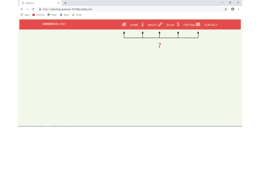
How to make icons disappear
Hi,
To make the icons disappear on the Tablet/Desktop view, I added the lines below to css.
153 .site-nav--icon {
display: none;
}
But the icons are still there.
How would I do?
Link Generico
Hosun Kang

Hi,
To make the icons disappear on the Tablet/Desktop view, I added the lines below to css.
153 .site-nav--icon {
display: none;
}
But the icons are still there.
How would I do?
Link Generico
Hosun Kang
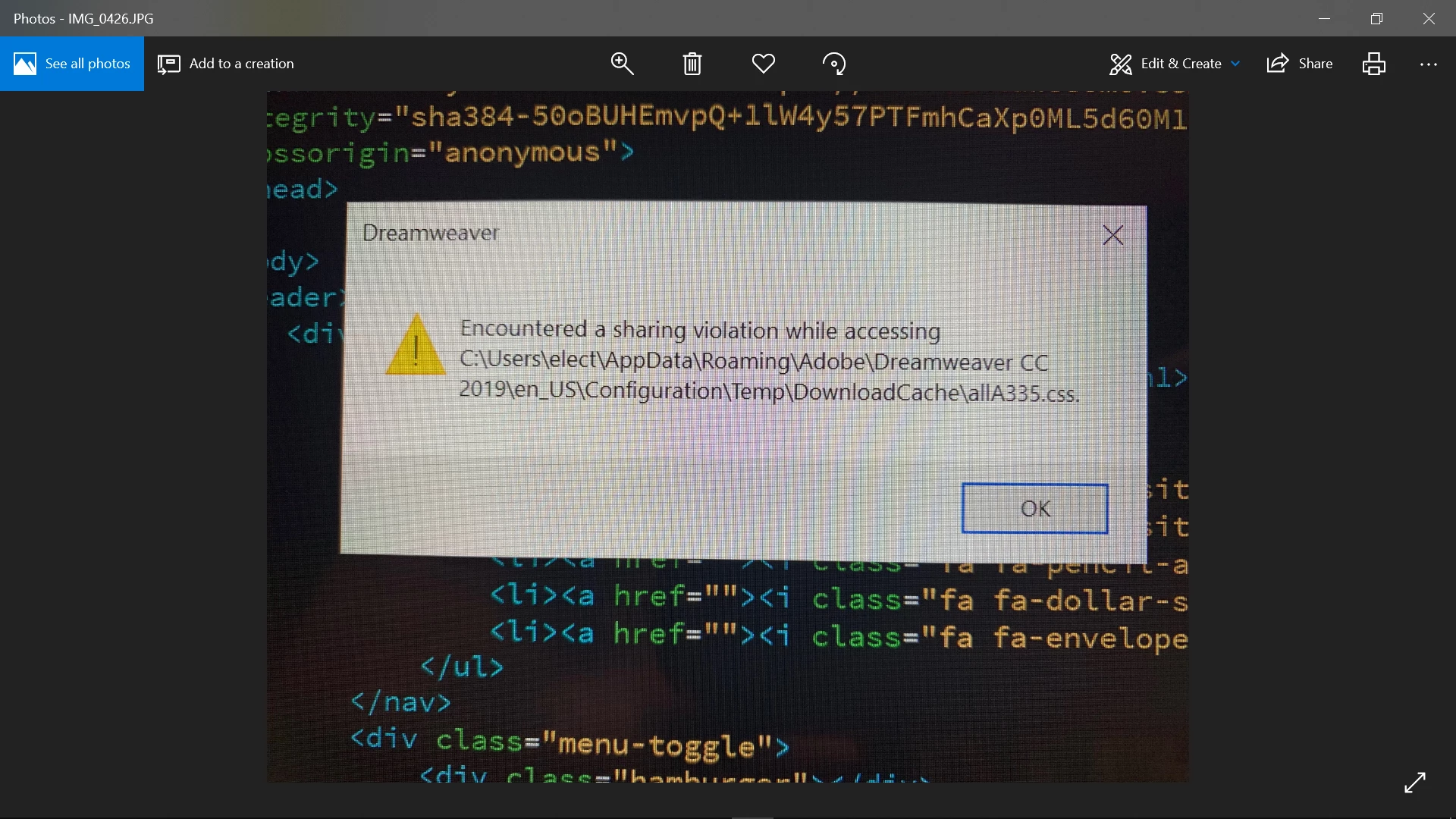
(continued from my previous reply)
I see the message below.
Is it relevant?
Hosun Kang
Please don't duplicate posts. It's very confusing. I have locked your other one to avoid further confusion.
Copy & paste the following code into a new, blank document. SaveAs test.html and preview in browsers to test. For expediency in the forum, I have combined CSS and JS into one document. The relevant code for removing icons starts on line 95.
<!doctype html>
<html lang="en">
<head>
<meta charset="utf-8">
<title>Generico</title>
<meta http-equiv="X-UA-Compatible" content="IE=edge">
<meta name="viewport" content="width=device-width, initial-scale=1">
<style>
/*Mobile Global View*/
body {
background: #F0F8EA;
font-family: 'Quicksand', sans-serif;
}
.container {
width: 95%;
max-width: 1000px;
margin: 0 auto;
}
header {
background: #E54B4B;
color: #EBEBD3;
padding: 1em 0;
position: relative;
}
header::after {
content: '';
clear: both;
display: block;
}
.logo {
float: left;
font-size: 1rem;
margin: 0;
text-transform: uppercase;
font-weight: 700;
}
.logo span { font-weight: 400; }
.site-nav {
position: absolute;
top: 100%;
right: 0%;
background: #464655;
height: 0px; /*toggle*/
overflow: hidden; /*toggle*/
}
.site-nav--open { height: auto; } /*toggle*/
.site-nav ul {
margin: 0;
padding: 0;
list-style: none;
}
.site-nav li { border-bottom: 1px solid #575766; }
.site-nav li:last-child { border-bottom: none; }
.site-nav a {
color: #EBEBD3;
display: block;
padding: 2em 4em 2em 1.5em;
text-transform: uppercase;
text-decoration: none;
}
.site-nav a:hover, .site-nav a:focus {
background: #E4B363;
color: #464655;
}
.site-nav--icon {
display: inline-block;
font-size: 1.5em;
margin-right: 1em;
width: 1em;
text-align: right;
color: rgba(255,255,255,0.65)
}
.menu-toggle {
padding: 1em;
position: absolute;
top: .5em;
right: .5em;
cursor: pointer;
}
.hamburger, .hamburger::before, .hamburger::after {
content: '';
display: block; /*=*/
background: #EBEBD3;
height: 2px;
width: 1.75em;
border-radius: 3px;
transition: all ease-in-out 300ms;
}
.hamburger::before { transform: translateY(-6px); }
.hamburger::after { transform: translateY(4px); }
.open .hamburger { transform: rotate(45deg); }
.open .hamburger::before { opacity: 0; }
.open .hamburger::after { transform: translateY(-2px) rotate(-90deg); }
/**remove FA icons from mobile**/
@media (max-width:500px){
.fa {display:none !important}
}
/*Tablet Desktop View*/
@media (min-width: 501px) {
.menu-toggle { display: none; }
.site-nav {
height: auto;
position: relative;
background: transparent;
float: right;
}
.site-nav li {
display: inline-block;
border: none;
}
.site-nav a { padding: 0; }
.site-nav--icon { display: none; }
}
</style>
<link rel="stylesheet" href="https://use.fontawesome.com/releases/v5.8.1/css/all.css" integrity="sha384-50oBUHEmvpQ+1lW4y57PTFmhCaXp0ML5d60M1M7uH2+nqUivzIebhndOJK28anvf" crossorigin="anonymous">
</head>
<body>
<header>
<div class="container">
<h1 class="logo">Generico<span>Logo</span></h1>
<nav class="site-nav">
<ul>
<li><a href=""><i class="fa fa-home site-nav--icon"></i>Home</a></li>
<li><a href=""><i class="fa fa-info site-nav--icon"></i>About</a></li>
<li><a href=""><i class="fa fa-pencil-alt site-nav--icon"></i>Blog</a></li>
<li><a href=""><i class="fa fa-dollar-sign site-nav--icon"></i>Pricing</a></li>
<li><a href=""><i class="fa fa-envelope site-nav--icon"></i>Contact</a></li>
</ul>
</nav>
<div class="menu-toggle">
<div class="hamburger"></div>
</div>
</div>
</header>
<script src="https://code.jquery.com/jquery-3.4.0.min.js" integrity="sha256-BJeo0qm959uMBGb65z40ejJYGSgR7REI4+CW1fNKwOg=" crossorigin="anonymous">
</script>
<script>
//JS toggle class
$('.menu-toggle').click(function() {
$('.site-nav').toggleClass('site-nav--open');
$(this).toggleClass('open');
})
</script>
</body>
</html>
Already have an account? Login
Enter your E-mail address. We'll send you an e-mail with instructions to reset your password.
 AdChoices