

- Accueil
- Dreamweaver
- Discussions
- Setting a Max Height for Added Images
- Setting a Max Height for Added Images

Copier le lien dans le Presse-papiers
Copié
I am making an artist website and want to add a few photos of my work. I want the images to be responsive to the page, which I can do by making max-width 100%, however the image grows too long in height and requires the viewer to scroll to see the entire image. See attached images, one where the image fits on the screen and one where extending the page has made it not fit.
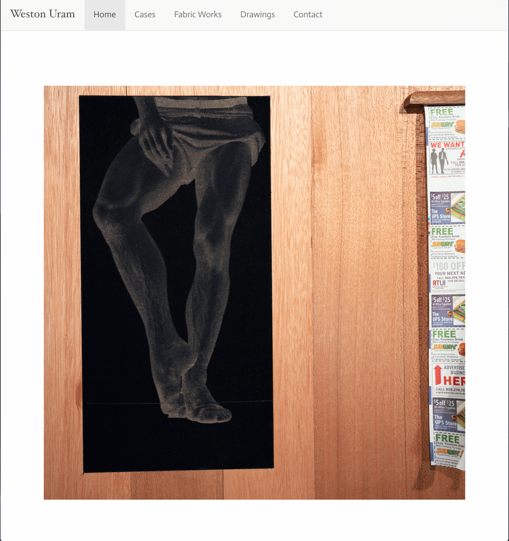
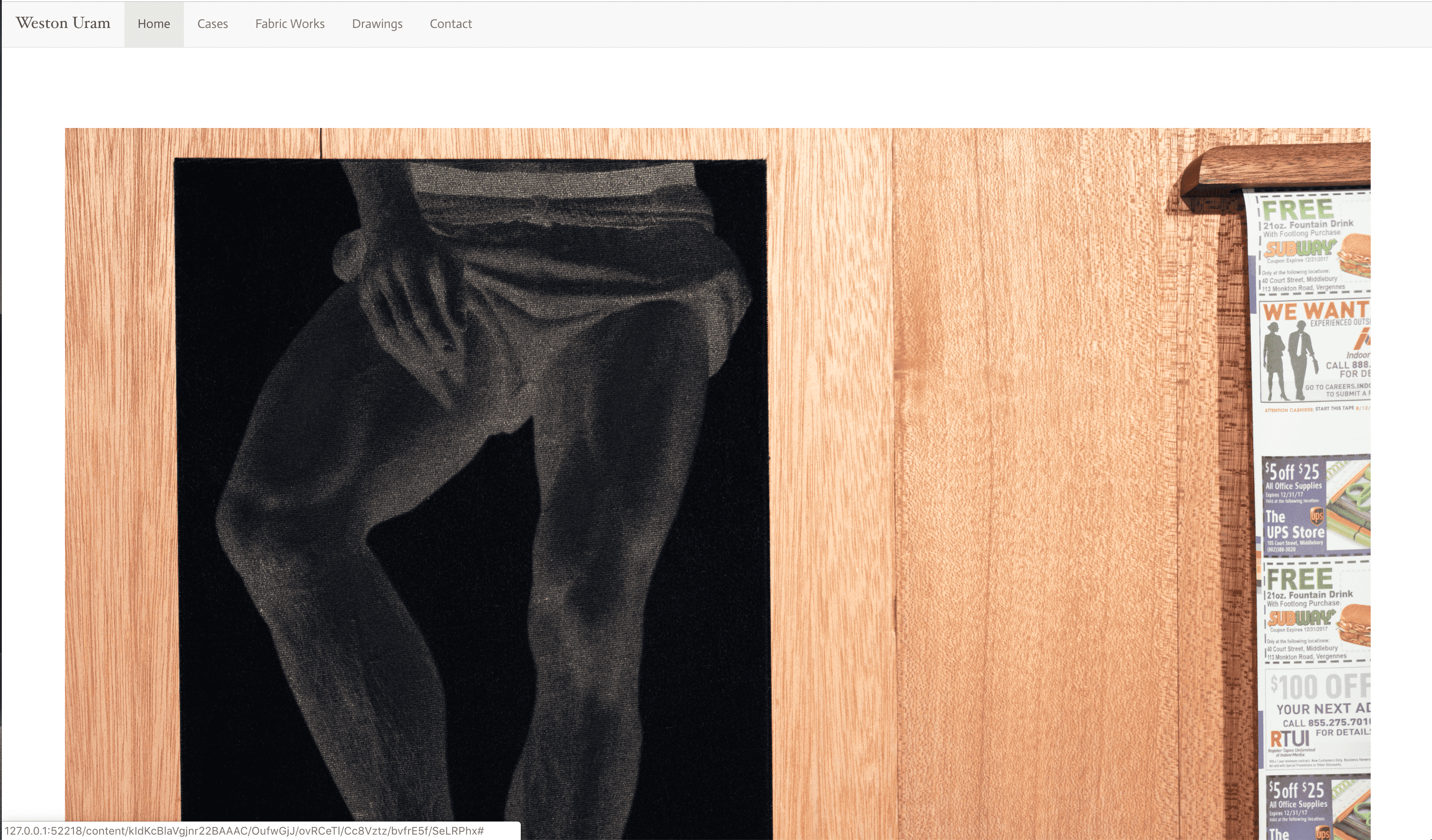
Best, Weston Uram


 1 bonne réponse

Use a responsive Lightbox viewer. The image should scale to available viewport and maintain proper aspect ratio.
 13
Réponses
13
13
Réponses
13

Copier le lien dans le Presse-papiers
Copié
did you tried max-height:100vh
Copier le lien dans le Presse-papiers
Copié
hmm, max-heigh:100vh fixes the height, but makes the image disproportioned. How can I make sure the scale remains the same?
Copier le lien dans le Presse-papiers
Copié
try
<!doctype html>
<html>
<head>
<meta charset="utf-8">
<title>image max</title>
<style>
body {
height:100vh;
}
img {
display:block;
margin:0 auto;
height: 100%;
width: auto;
max-width: 100%;
max-height: 100vh;
}
</style>
</head>
<body>
<img src="your-image.png">
</body>
</html>

Copier le lien dans le Presse-papiers
Copié
In practice, this is probably the better approach if you want to support the fact that some versions of Dreamweaver, in some cases, will automatically insert a height and width attribute on the image tag:
body {
height:100vh;
}
img {
height: auto: !important;
width: auto !important;
max-width: 100%;
max-height: 100vh;
vertical-align: bottom;
}
Vertical align fixes image positioning inside a box without converting it to a block level element. If you want an image centered, then display block and auto margins should be used (as you did), making vertical-align bottom dispensable.
Copier le lien dans le Presse-papiers
Copié
now it is you that surprise me... the CSS tree is build after the DOM tree... so CSS override the HTML attribute... as you can see on this grab
any how.. before uploading production files, I always run a npm script that clean up my entire files... and unnecessary attributes are always removed. width and height images file information are included in binary data and browser are able to read them if needed
Copier le lien dans le Presse-papiers
Copié
any how.. before uploading production files, I always run a npm script that clean up my entire files... and unnecessary attributes are always removed. width and height images file information are included in binary data and browser are able to read them if needed
You're right, the !important directives are not required. Just an old habit of mine.
And that's really good that you run an npm script. But I'm not sure the original poster does  .
.
But the height 100% you suggested is what I was really correcting.
Copier le lien dans le Presse-papiers
Copié
ALsp a écrit
But the height 100% you suggested is what I was really correcting.
sorry for answering, you say that you replacing the height:100%; by a height:auto;
I miss your point...
if one use auto as value... the image size decrease if one zoom in not with 100%... please can you go further ?
Copier le lien dans le Presse-papiers
Copié
https://forums.adobe.com/people/B+i+r+n+o+u wrote
ALsp a écrit
But the height 100% you suggested is what I was really correcting.
sorry for answering, you say that you replacing the height:100%; by a height:auto;
I miss your point...
if one use auto as value... the image size decrease if one zoom in not with 100%... please can you go further ?
Apologies to the original poster. I was hoping to keep this a simple thread 
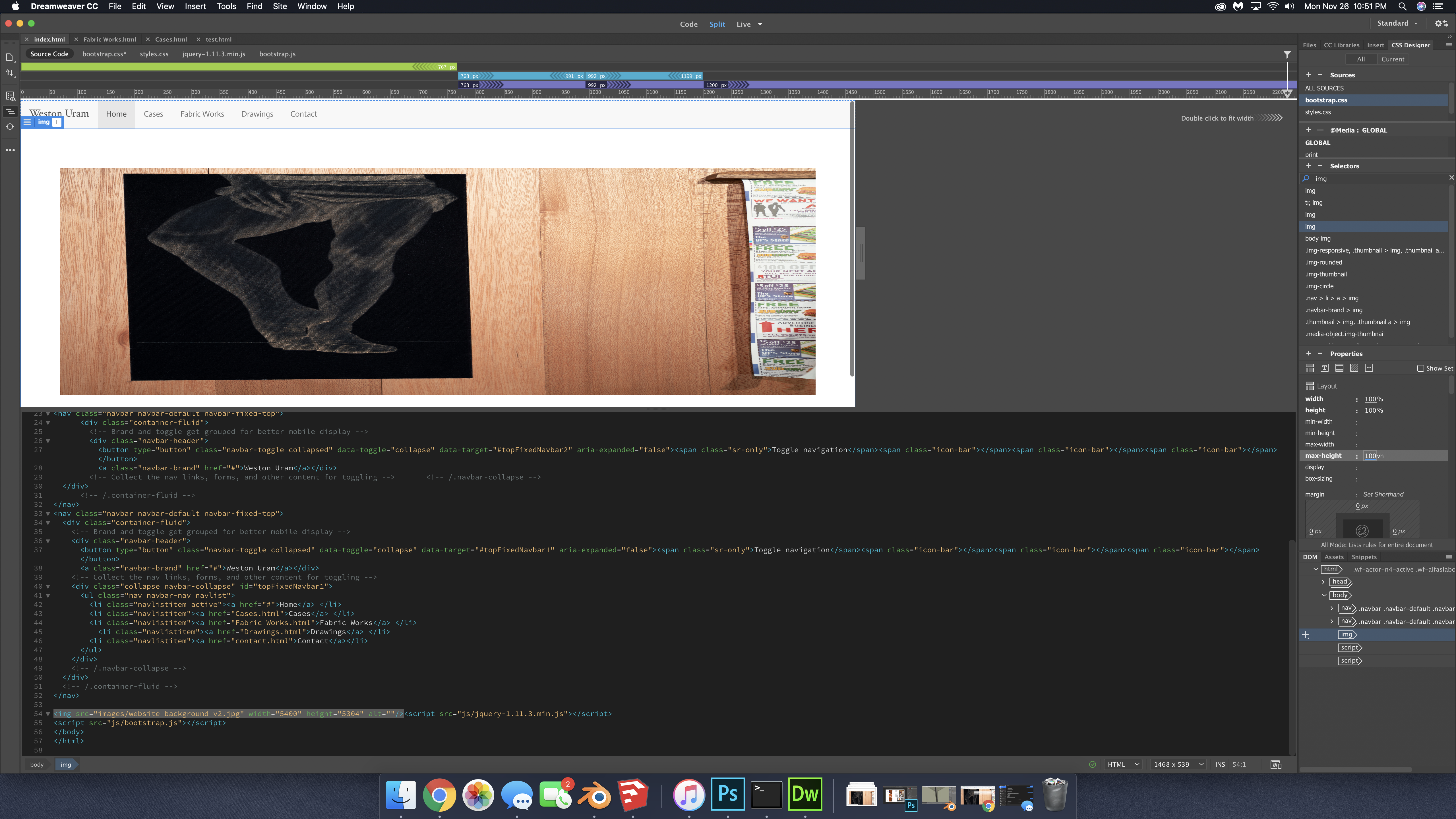
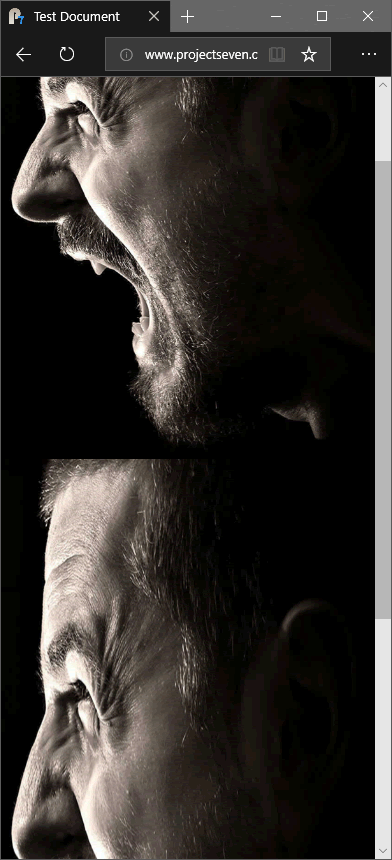
Birnou, please view the test page for which I posted a link. To cover all layout contingencies, height needs to be set to auto or the combination of max-height and max-width will distort the image. Look carefully at the second image as you make your browser window narrow and watch how the images scale. If you are still not clear on this, please contact me offlist.
Copier le lien dans le Presse-papiers
Copié
I still don't see where the image ratio is distorded... don't forget that the parent container has a height defined.
I made the last bottom and the last right pixel of the image blue to see it when hovering the small, the normal and the bigger ratio... resizing the window doesn't affect anything.... nor the zoom when text only is selected... or not... sorry for being dummy
Copier le lien dans le Presse-papiers
Copié
This is where these threads go south. Now we're helping each other instead of the original poster and he or she has got to be really confused by now. Oh, well. Here you go...
I'm testing the rule you gave in all contingencies. Because someone is going to grab that code and run with it and their page is not going to be exactly what you had in mind, and the images will not scale properly.
Copier le lien dans le Presse-papiers
Copié
why doesn't this happen on the interactive test I posted online?
Copier le lien dans le Presse-papiers
Copié
ok, sorry, I was long on that one, and I got what you mean... sorry...
I was only focusing on the fact that the OP was asking that the height should fit the height... which is probably wrong... but I was focusing on that...
Copier le lien dans le Presse-papiers
Copié
Use a responsive Lightbox viewer. The image should scale to available viewport and maintain proper aspect ratio.
- https://fancyapps.com/fancybox/3/
- lightGallery
- 15 Lightbox Libraries For Mobile Responsiveness - Hongkiat
Trouvez plus d’idées, d’événements et de ressources dans la nouvelle communauté Adobe
Explorer maintenant
 AdChoices