Hosun
Inspiring
April 28, 2019
Resuelto

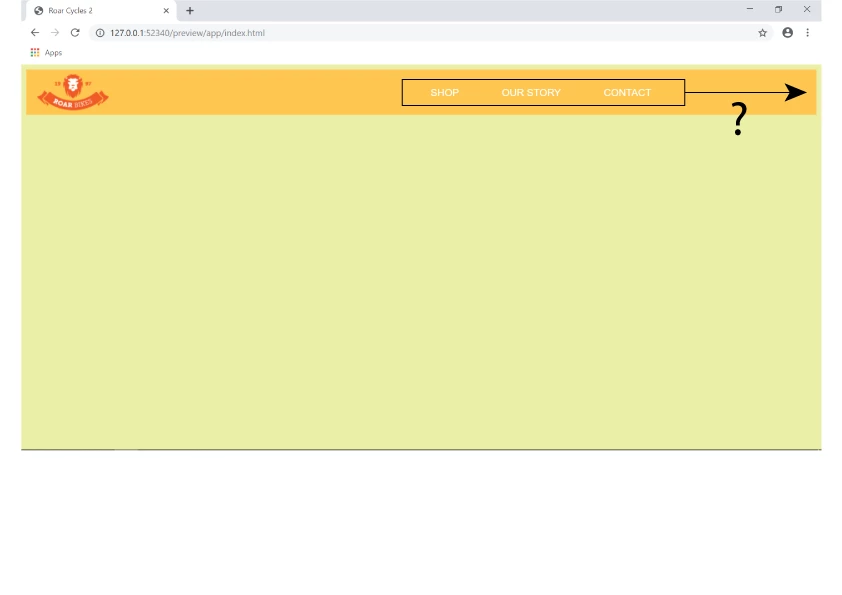
How to move the navigation menu list to the right side of web page.

  • April 28, 2019
  • 2 respuestas
  • 1620 visualizaciones

Hi,

I am making the hamburger menu.

I don't know how to move the list to the right-side border.

Link  Roar Cycles 2

I tried LINE 132 .site-nav { }.

Hosun Kang

The Tittle was edited by moderator.

Este tema ha sido cerrado para respuestas.
Mejor respuesta de osgood_

It is working BUT you have changed the original css styling. For instance you have misspelt 'background' - see in red below, so all you are currently seeing is white text on a white background, nothing.

@media screen and (max-width: 1024px) {

    .hamburger-icon {

        display: block;

    }


    .site-nav {

        position: absolute;

        width: 200px;

        top: 5.5em;

        right: 30px;

        display: none;

        backgound-color: #000;

        padding: 20px;

    }

}

2 respuestas

Legend
April 28, 2019

Give the below a go:

<!doctype html>

<html>

<head>

<meta charset="utf-8">

<title>Roar Cycles 2</title>

<link rel="stylesheet" href="https://use.fontawesome.com/releases/v5.8.1/css/all.css" integrity="sha384-50oBUHEmvpQ+1lW4y57PTFmhCaXp0ML5d60M1M7uH2+nqUivzIebhndOJK28anvf" crossorigin="anonymous">

<style>

* {

box-sizing: border-box;

}

body {

margin: 0;

font-family: helvetica, sans-serif;

}

header {

display: flex;

justify-content: space-between;

align-items: center;

background-color: #fec64f;

padding: 10px 30px;

}

.hamburger-icon {

color: #fff;

display: none;

font-size: 20px;

}

.site-nav {

display: block;

}

.site-nav ul {

display: flex;

margin: 0;

padding: 0;

list-style: none;

}

.site-nav a {

color: #fff;

display: block;

padding: 0 10px;

text-decoration: none;

}

.site-nav a i {

padding: 0 10px 0 0;

}

@media screen and (max-width: 768px) {

.hamburger-icon {

display: block;

}

.site-nav {

position: absolute;

width: 200px;

top: 5.5em;

right: 30px;

display: none;

background-color: #000;

padding: 20px;

}

.site-nav ul {

display: flex;

flex-direction: column;

}

.site-nav li {

margin: 0 0 5px 0;

}

}

@media screen and (max-width: 480px) {

.site-nav {

width: 100%;

right: 0;

}

}

</style>

<!-- jQuery library -->

<script src="http://code.jquery.com/jquery-3.3.1.min.js" integrity="sha256-FgpCb/KJQlLNfOu91ta32o/NMZxltwRo8QtmkMRdAu8=" crossorigin="anonymous"></script>

<script>

$(document).ready(function(){

// MOBILE MENU

$('.hamburger-icon').css('cursor' , 'pointer').click(function(){

$('.site-nav').slideToggle();

});

// WINDOW RESIZE FUNCTION TO SET NAV DISPLAY OPTIONS

$(window).resize(function() {

var width = $(document).width();

if (width > 768) {

$('.site-nav').show();

}

else if (width < 768) {

$('.site-nav').hide();

}

});

});

</script>

</head>

<body>

<header>

<div class="logo">

<img class="logo" src="https://dreamy-kalam-5ecd62.netlify.com/images/logo.png" alt="Roar Bikes logo">

</div>

<!-- end logo -->

<div class="hamburger-icon">

<i class="fas fa-bars"></i>

</div>

<!-- end hamburger-icon -->

<nav class="site-nav">

<ul>

<li><a href=""><i class="fas fa-shopping-cart site-nav--icon"></i>SHOP</a></li>

<li><a href=""><i class="fas fa-comment site-nav--icon"></i>OUR STORY</a></li>

<li><a href=""><i class="fas fa-envelope site-nav--icon"></i>CONTACT</a></li>

</ul>

</nav>

<!-- end site-nav -->

</header>


</body>

</html>

Hosun
HosunAutor
Inspiring
May 1, 2019

Hi,

Thank you very much for your instruction.

I am wrapping it up line by line.

My current issue is "toggle doesn't work on the hamburger menu in Tablet View".

I set the break point at 1024.

I made css and js files separately from html.

I added a hover effect in Desktop View (lines 46-48 on css).

Link

Roar Cycles 4 

Hosun Kang

osgood_Respuesta
Legend
May 1, 2019

It is working BUT you have changed the original css styling. For instance you have misspelt 'background' - see in red below, so all you are currently seeing is white text on a white background, nothing.

@media screen and (max-width: 1024px) {

    .hamburger-icon {

        display: block;

    }


    .site-nav {

        position: absolute;

        width: 200px;

        top: 5.5em;

        right: 30px;

        display: none;

        backgound-color: #000;

        padding: 20px;

    }

}

Nancy OShea
Community Expert
Community Expert
April 28, 2019

Review CSS Flexbox justify-content.

CSS Flexbox (Flexible Box)

Tryit Editor v3.6

Nancy O'Shea— Product User & Community Expert