- Home
- FrameMaker
- Discussions
- Re: FrameMaker typesetting versus Word Typesetting
- Re: FrameMaker typesetting versus Word Typesetting
Copy link to clipboard
Copied
I am using FrameMaker 12.0 with Adobe Jenson family of fonts. I am moving a high fantasy novel from Word over to FrameMaker. Currently, the typesetting in word seems tighter than in FM. Please look at these two images:

Here is the same text in FrameMaker:

While FM does a better job in spacing the first line, it seems to me that Word does a better job for the next two lines. In particular, Word manages to keep the text in 3 lines where FM needed 4. Also, the "Bold" in the author portion of that text in Word appears bolder than in FM.
Due to these differences, the first chapter of the novel requires one more page in FM than in word...
Any pointers on how to control, improve typesetting in FM?
Thanks,
 1 Correct answer
Try clearing out the tweaks that you've done:
Font tab:
Set Stretch back to 100% (this is actually distorting the individual letter forms)
Enable Pair Kern
Advanced tab:
Turn OFF the "Allow Automatic Letter Spacing"
Set Optimum Spacing to 100%
Give yourself some more flexibility in the word spacings: Min 60-65% ; Max: 115-125%
The "CreateSpace" joboption is a custom one, so you need to ensure that the Font options specify that all fonts are to be embedded and to "Cancel job" if embedding fails.
Copy link to clipboard
Copied
Do you have kerning (Pair Kern) turned on in the paratag Default Font section? Have you changed the defaults on the Advanced tab for Word Spacing controls?
Copy link to clipboard
Copied
Don't forget also that both Word and FrameMaker base their displays on
the selected print driver. So if you've got your desktop laser printer
selected for Word and Adobe PDF selected for FM, onscreen formatting,
line breaks, etc. are likely to come out slightly different. Even
changing your default printer in FM from Adobe PDF to HP LaserJet can
change the line breaks in your document, without any font changes.
And a 96 ppi monitor cannot display anything as accurately as an output
device that prints at 300 or even 2540 dpi. So, even with kerning turned
on, the on-screen spacing of words and characters is not going to be
exactly the same as your final output-- though the line breaks should be
the same.
FrameMaker even has a setting in maker.ini which can change the way
characters display on screen:
DisplayUsingPrinterMetrics=On
When set to On, FM tries to get character spacing and line length close
to what will actually print, with a trade-off that text is very slightly
less clear. When set to Off, FM tries to make the characters clearer on
screen (by fitting them better to the pixels), and gives less attention
to spacing. So appearance of spacing between characters and accuracy of
the line length become less trustworthy. Characters may bump against
each other and, if I recall correctly, setting to Off may even make
lines in justified text appear not to justify-- even extending past the
right border. Everything will print properly kerned and justified,
though. The printer's metrics will alwyas be used for printing,
regardless of this setting in maker.ini. The setting is only a choice
for on-screen viewing.
Copy link to clipboard
Copied
Just adding to Mike's comments, the default setting for FM12 is to have the DisplayUsingPrinterMetrics set to ON (so you shouldn't have to fiddle with this component). But all else should be kept in mind and that's also why it's recommended to always have the AdobePDF printer instance as your default printer for any FM session. There is a (freebie) utility from Sundorne Commications that will automatically do this for you. See: Sundorne Communications - SetPrint
Copy link to clipboard
Copied
Mike and Arnis:
Thank you very much for your advice. My printer for FM is set to the Adobe pdf printer. I spent several hours fiddling with the spread and the distance between words parameters. I have managed to get a pdf from FM that is truly close to the one I produced with Word, with a couple of exception. I'll showcase one of them in the hope you guys might be able to shed some insight.
Here are two fragments from my book. The first one is from FM and the second from word (I do mean output)... please take a close look at the double lls in the fragments. The first fragment is produced by FM. See how the double "lls" in the words "medallion," "small," and "metallic" are spread apart?

Here is the same fragment (shorter version) from the pdf from word:

Much more pleasing to the eye, don't you think? I am not sure why FM is not kerning the lls properly.
Be that as it may, is there a tip you might be able to provide me to fix this? I thought of creating a special character tag with spread set to -10% and apply it to the first "l" in each doublet but that's a manual process which is error prone and tedious. I couldn't figure out how to do this using the Find and Replace tool. I tried to use regexp to search for (l)l in the hope that FM will pick up on the proper parametric search and pick only the first "l" but this did not work. I am a bit stumped here...
Thanks,
Copy link to clipboard
Copied
re: creating a special character tag with spread set to -10% and apply it to the first "l" in each doublet
You could also create a Variable for those "ll" instances, and apply it globally by find and replace by Pasting. The Var would express the Character format.
I assume this is the same font on the same system. Otherwise I'd suspect some font metrics problem.
Copy link to clipboard
Copied
Yes, it is on the same system. What's throwing me off is that the font (Adobe Jenson Pro) is an Adobe font and I would have thought FM would know how to handle it better than Word.
Copy link to clipboard
Copied
I did as quick test with JensonPro and I don't see any odd spacing between the "ll".

What parameters are you using in the Paragraph Designer for the Font tab and then on the Advanced tab (screen captures of these tabs would help)? Your layout also looks quite loose.
Also, which joboptions file did you specify for the PDF and are you using the RGB or CMYK output stream?
Copy link to clipboard
Copied
Ok, this is weird: I unchecked "Pair Kern" and the problem went away! FM is doing a much better job kerning the letter without "Pair Kern" checked. Any explanation for this behavior?
Copy link to clipboard
Copied
Pair Kern was checked in my test. When it was unchecked, there was a bit of reflow, but nothing odd happened with the "ll" pair as shown below:

Are you by any chance enabling "Allow Automatic Letter Spacing"? This starts to play with the inter-character spacing in a completely uncontrollable way.
Copy link to clipboard
Copied
Hi Arnis,
First of all, thank you so much for putting up with me! This goes to show how much of a beginner I am when it comes to using FM!
Alright: here are the answers to your questions:
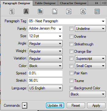
1. Font tab:

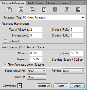
2: Advanced tab:

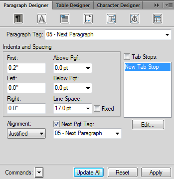
3: para tab (just in case):

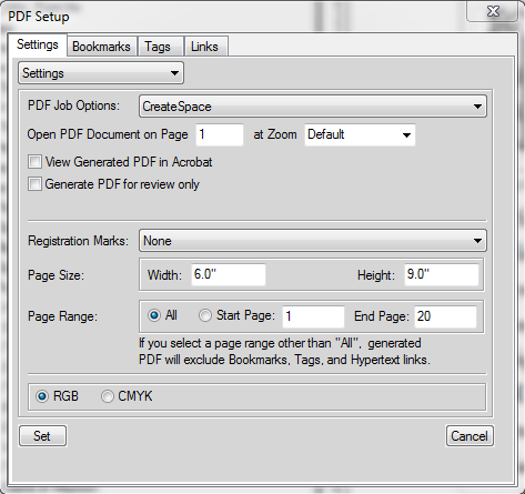
4: pdf options:

Copy link to clipboard
Copied
Try clearing out the tweaks that you've done:
Font tab:
Set Stretch back to 100% (this is actually distorting the individual letter forms)
Enable Pair Kern
Advanced tab:
Turn OFF the "Allow Automatic Letter Spacing"
Set Optimum Spacing to 100%
Give yourself some more flexibility in the word spacings: Min 60-65% ; Max: 115-125%
The "CreateSpace" joboption is a custom one, so you need to ensure that the Font options specify that all fonts are to be embedded and to "Cancel job" if embedding fails.
Copy link to clipboard
Copied
Arnis:
Thanks for your advise. It worked. I had to use CMYK in my joboptions and the result is pleasing to the eye in the resulting pdf. Here is the final result:
1. Adobe Jenson Pro 12 pt, pair kern: on, spread:0, strech: 0, Word spacing: min:65%, max: 125%, Optimum:100%
2. Joboptions: Use CMYK. Using RGB produces less than optimal results.
Here are three final excerpts: the first is straight from FM: you can see that the kerning does not appear to work right with the double lls but as you indicated before, that's a display issue. The second with RGB setting: again the kerning is sub-par. The last is with CMYK and the page is pleasing to the eye.

RGB:

CMYK

Get ready! An upgraded Adobe Community experience is coming in January.
Learn more