Answered
FrameMaker typesetting versus Word Typesetting
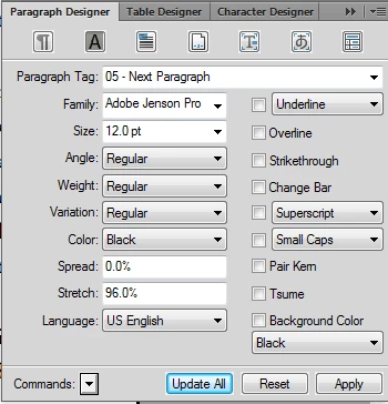
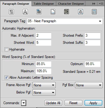
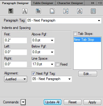
I am using FrameMaker 12.0 with Adobe Jenson family of fonts. I am moving a high fantasy novel from Word over to FrameMaker. Currently, the typesetting in word seems tighter than in FM. Please look at these two images:
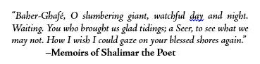
Here is the same text in FrameMaker:

While FM does a better job in spacing the first line, it seems to me that Word does a better job for the next two lines. In particular, Word manages to keep the text in 3 lines where FM needed 4. Also, the "Bold" in the author portion of that text in Word appears bolder than in FM.
Due to these differences, the first chapter of the novel requires one more page in FM than in word...
Any pointers on how to control, improve typesetting in FM?
Thanks,