- Home
- Illustrator
- Discussions
- Re: Ai 2020 - Stroke Path won't do anything
- Re: Ai 2020 - Stroke Path won't do anything
Ai 2020 - Stroke Path won't do anything
Copy link to clipboard
Copied
Most threads addressing this subject are based on older versions of Ai (2013 etc), so in order not to get info based on older versions, in case the newer version tweaked stuff, Im posting this new thread.
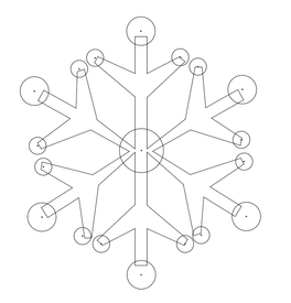
I have a Snowflake. I just want to outline it. That's it!! Preferably as a group so it elliminates 50 other steps). Steps Ive taken:
1. Selected group and all visible objects under group, Object > Path > Outline stroke.
Does nothing. no stroke no error, no new layer. Nothing.
2. Selected group and all visible objects under group, Applied Stroke Fx via Display panel.
Does nothing. no stroke no error, no new layer. Nothing.
3. Released all objects and put them into one layer, Object > Path > Outline stroke.
Does nothing. no stroke no error, no new layer. Nothing.
4. Released all objects and put them into one layer, Applied Stroke Fx via Display panel.
Does nothing. no stroke no error, no new layer. Nothing.
5. Made compound shape, Object > Path > Outline stroke.
Does nothing. no stroke no error, no new layer. Nothing.
6. Made compound shape, Applied Stroke Fx via Display panel.
Does nothing. no stroke no error, no new layer. Nothing.
Please Help.
Explore related tutorials & articles
Copy link to clipboard
Copied
I don't understand at all what you want to do or how you have created your artwork or how that even looks.
Copy link to clipboard
Copied
Can you show something or even bettter, share an Illustrator example?
Copy link to clipboard
Copied
If I understand you intent correctly, then Outline Stroke is not what you need.
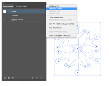
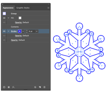
Make a group of your snowflake objects, Add New Fill to the Group, and fill it with White - then add New Stroke to the Group in the Apperance Panel, and move it behind Contents in the Appearance Panel.
Copy link to clipboard
Copied
So, I made the following video to explain.
SJRiegel: I thank you very VERY much! I think you have hit the nail on the head in regards to affecting a group. This will work. However, I am running into the same issue that I touch on in the video at 5:25. Yes, it talks about the stroke and paths, but keep watching from that point and it ties in with the appearance effect that yeilds the same issue. The tips are getting cut short (tips that don't have two anchors) and some tips coming out rounded. And in order to get the thickness Im needing, it has to be at least 60 points.
Copy link to clipboard
Copied
I can't watch youtube videos at work - can you post a few screenshots, and maybe share the file?
Copy link to clipboard
Copied
will as soon as I can, but it might not be for a few hrs.
Copy link to clipboard
Copied
Sry for delay. Suffered a bad migraine all evening/night, could look at a computer screen.
Ok, so the GROUP appearancew effects are exactly what Im needing. So, thank you Soooooo much for that
But, Im runing into major issues with stroke caps/tips when using the strok effect. Is there a different approach?
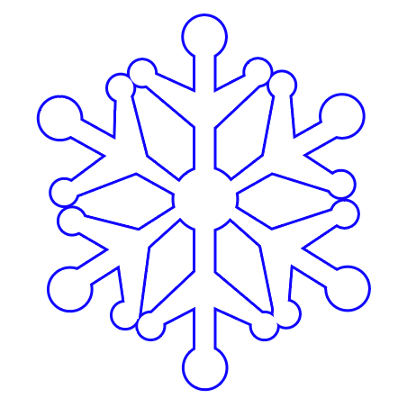
What Im going for, the type of border:
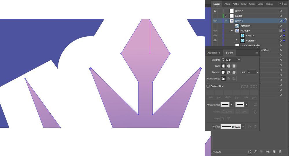
What it looks like with my orrginal spae, which for whatever reason had extra anchor points. Some had round tips, and some had square tips.
This is what it looks like when I correct the issue and eliminate extra anchor points. Tips are still cut off:
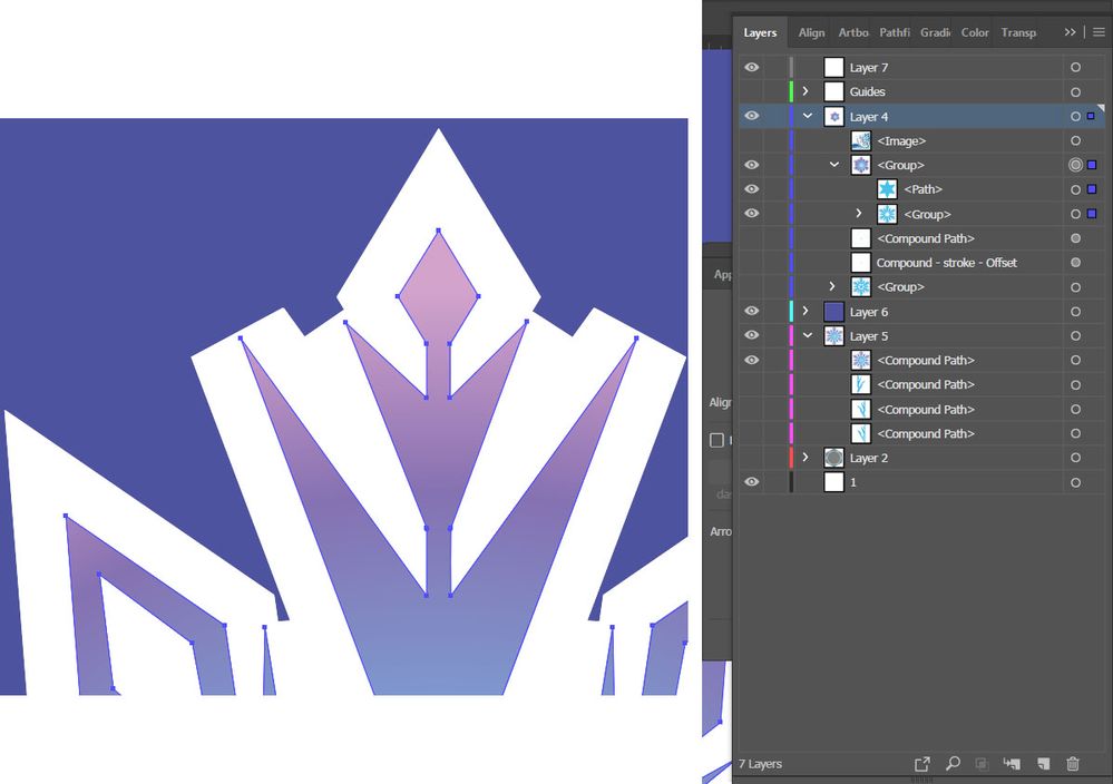
This is what it looks like when I increase limit to 5. Some correct themselves, but some tips are still cut off:
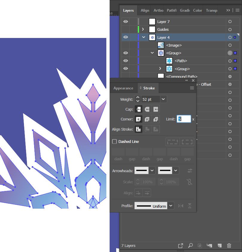
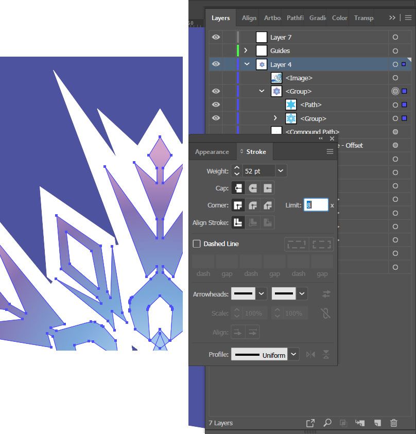
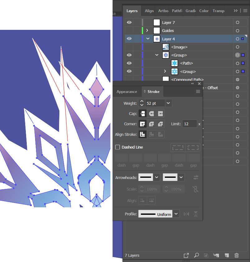
This is what it looks like when I increase the limit to 8. All tips are corrected, but the thickness is far too inconsistant:
The blue lines represent the desired thickness, where the red represent the spikes are way too far out.
Im hoping that there is an djustment, setting, feature I just not aware of yet to acheive a nice even border around the base shape, like in the refference. I understand that in the reference image, they probably didnt have a "border" but that the whole thing is one shape and the notched out shapes are seperate. But if I have to do that, it's twice the work. For anyone that might attack me as Im lazy, Im not. If twice the work is the only option, then Im A-okay with that. I've spent hrs on detail work when necessary. But I value my time, which is limted as I suffer from chronic migraines. So, if there is a more efficient way of going about something, cutting out steps, I want to know.
Copy link to clipboard
Copied
You can't get that automatically, because what you have in your result is how strokes in corners work.
Copy link to clipboard
Copied
varxtis,
I am afraid it is a no show (nothing shown but image names).
Copy link to clipboard
Copied
@Jacob_Bugge
The screenshots I posted don't appear? I see them on 2 of my computers and my wife Laptop, without signing in...
I neglected to follow SJRiegel suggection to provide the project file when I posted screenshots, so I'll do that here.
@Monika_Gause
First reply summed up: "I dont understand all!" strongly implying that the fault lies with me for explaining it in a way you can't understand. SJRiegel got it ^_^
Second reply summed up: "You can't do that because of how stroke corners are" This may be true, but You uh . . . .Youre not helpful. Nothing more constructive? No further suggestions or questions huh? The whole, "If I can't answer it on the first try, in one sentance, then its the other persons incompetance!" thing just doesn't set well with me. If you're not got to provide anything more constructive, please stop replying to my posts. Ruins my whole zen thing. Besides, you'll save us both time.
Copy link to clipboard
Copied
varxtis,
Sorry, I could see the screenshots clearly the following day; maybe Firefox was overloaded so the page failed to load fully when I first looked at it.
I also apologize for the rather late answer. There were a few urgent other tasks, and this snowflake challenge grew on me, to the extent that I thought of splitting the answer into two posts.
Here it is:
Looking at the images, I could see an obvious potential for a new feature or two, so I have made a feature request about an enhanced Miter Join.
It is here for possible votes and comments:
Basic properties/possible feature request(s)
This is based upon the first three rows in the image below. I will spare you the exact details and calculations, which are known to our Design Team friends at Adobe, of course.
The first row of stroked triangles shows some of the basic properties of Miter Joins and Bevel Joins: To the left is a black triangle with a sufficiently high Miter Limit. In the middle the first triangle is overlaid with a red Bevel Join triangle (or a Miter Join triangle where the Miter Limit is too low, which makes it default to the shape of a Bevel Join). To the right the two triangles are overlaid with partially transparent white open paths with Butt Caps; their ends cross at the corners of the spine of the triangles, and their outer edges end at the corners of the Bevel shapes. As it appears, the Bevel sides lie outside the corners of the spine, rather than passing though them.
The second row of stroked paths with a rather sharp angle at the top (corresponding to a Miter Limit of 8 ) shows a symmetric way an enhanced Miter Join could work (1 is the lowest selectable Miter Limit and effectively comprises a Bevel Join): Under each path the quotient shows the chosen/required Miter Limit, and the effect of the enhanced Miter Join is a shortening of the Miter shape to a blunter angle which corresponds to the chosen Miter Limit, like the tip of an obelisk or a metal chisel; the faint grey line behind the shapes shows the Bevel Join height, and it appears that the transition is indistinct at high values and obvious at low values.
The third row of stroked paths with a rather sharp angle at the top (corresponding to a Miter Limit of 8 ) shows an asymmetric way an enhanced Miter Join could work. This corresponds to the second row, but is one sided so only the left side has the blunter angle which corresponds to the chosen Miter Limit, resulting in an asymmetric shape somewhat like a wood chisel with a sharper point for the same Miter Limit; in the corresponding mirrored shape only the right side has the blunter angle.
A Stroke palette Enhanced Symmetric Miter Join feature (request) could consist of suggesting two options for the Miter Limit, namely Obelisk and Default, where Obelisk gives the shortening corresponding to the chosen Miter Limit and Default gives the Bevel Join shape.
Or, more comprehensively including the asymmetric version, a Stroke palette Enhanced Miter Join feature (request) could consist of suggesting four options for the Miter Limit. These could be Obelisk (as in the first row), Chisel Left (as in the second row), Chisel Right (as in the second row, only mirrored), and Default, where Obelisk and Chisel give the different kinds of shortening corresponding to the chosen Miter Limit and Default gives the Bevel Join shape; it could be one Chisel option with the additional options Left and Right. As an alternative, the options could be Chisel Center (as in the first row), Chisel Left (as in the second row), Chisel Right (as in the second row, only mirrored), and Default; it could be one Chisel option with the additional options Center and Left and Right.
More flexiblly, an alternative/additional Stroke property Enhanced Miter Join Tool feature (request) somewhat corresponding to the variable Width Tool and to Live Corners and applicable to one/more/all joins, could consist of suggesting the Obelisk/Chisel Center and Chisel Left and Chisel Right and Default as Miter Join Styles options, corresponding to Corner Styles, in connexion with something similar to the two forms of adjusting Live Corners, namely by inserting values of Miter Limit similar to Corner Profile, and by dragging similar to dragging the Live Corner Widget.
Even with such a feature request (set), you will have to continue in a more laborious was until the feature request is implemented or till the end of time, whichever occurs first.
To be continued under the image.
A few solutions to the present case
What you need is shown in some of the snowflakes in your first image where the outermost parts of the outer shape are less sharp/more blunt than the corresponding inner shapes, in some cases forming two angles, more blunt at the tips, just like the suggested Miter Join Obelisk option. In connexion with those snowflakes, you have Compound Paths, and the inner and outer paths are only partially related, if at all.
For your own very customized snowflakes, you may proceed in a few different ways, depending on how regular or irregular/freeform you wish to make them.
The image above shows three ways, A1 - A3 and B0 - B6 and C1 - C3, on the common blue background. All three ways start out with a tormented (default) 5 point star consisting of a red filled path and a set of white/pale blue stroked paths (with sufficient/insufficient Miter Limit) behind the filled path, the upper right and left points to be shortened. All three ways require outlining of the stroke(s).
The Line Segment Tool and Smart Guides are your friends. Remember to lock the background path.
The instructions below apply to the image above, so you need to adapt to your snowflake case(s).
If you wish to go freeform with symmetric Obelisk/Chisel Center shapes, you may:
A1) Start with the red filled path, then Ctrl/Cmd+C+B to create a copy behind the original and switch from red fill to white stroke and set the Stroke Weight and select Bevel Join, then Ctrl/Cmd+C+B to create a second stroked path and change to a pale blue colour and Miter Join with a sufficiently high value, then outline both stroked paths, then with the Line Segment Tool ClickDrag between the points of the red path and the pale blue path to create a black temporary line for each point to be shortened;
A2) With the Add Anchor Point Tool click the Bevel part of the white path beside the black line, then switch to the Direct Selection Tool and ClickDrag the added Anchor Point outwards along the temporary line until you have the desired shape (you may go back and forth and readjust both points until you are satisfied);
A3) Hide (if you wish to be able to redo later, when the entire shape is as desired you can always delete later) the temporary lines and the pale blue path, and select the red triangle and Ctrl/Cmd+C+F+X+F to bring it to the front.
This gives you the opportunity to customize the Obelisk tip shape at each point in different ways; I applied Object>Path>Add Anchor Points to both temporary lines and simply ClickDragged to the added midpoint, thereby shortening the shape to one half the original length for both points.
If you wish to use a certain angle/sharpness at the tips, directly corresponding to the symmetric Obelisk/Chisel Center shapes option feature (request), you may:
B0) Create a (less) pale blue filled triangle with the desired sharpness of the tip angle (pointing upwards), then Object>Path>Add Anchor Points, then delete the added Anchor Points in the slanting sides (with the Delete Anchor Point Tool) so only the midpoint at the bottom remains;
B1) Do as in A1), only reverse the colours of the stroked paths and extend each temporary line inwards (in the Transform palette you may click the relevant upper corner Reference Point and multiply the W by 2 or something and press Ctrl/Cmd+Enter);
B2) With the Selection Tool Alt/OptionClickDrag (a copy of ) the triangle B0) by the lower midpoint to snap to the temporary line close enough (see B3)) to the inner end, then switch to the Rotate Tool and Click the midpoint (to set it as the centre of rotation) and ClickDrag the top point round to snap to the line further outwards;
B3) Switch back to the Selection Tool and ClickDrag outards along the temporary line until the sides of the triangle reach the corners of the Bevel shape thereby only just covering it;
B4) Do as in A3);
B5) - B6) Select both the triangles and the Miter Join shape and combine/trim/recolour them, depending on version you may use Pathfinder>Divide and delete the unwanted bits and Pathfinder>Unite, or you may use the Shapebuilder Tool, see below.
This gives you the same Obelisk tip shape at both/all points.
If you wish to go freeform with asymmetrical Chisel Left/Right shapes, you may:
C1) Start with the red filled path, then Ctrl/Cmd+C+B to create a copy behind the original and switch from red fill to white stroke and set the Stroke Weight and select Bevel Join, then Ctrl/Cmd+C+B to create a second stroked path and change to a pale blue colour and Miter Join with a sufficiently high value, then outline both stroked paths;
C2) With the Direct Selection Tool and ClickDrag the desired Bevel shape Anchor Point outwards along the Miter shape until you have the desired shape (you may go back and forth and readjust both points until you are satisfied);
C3) Hide (if you wish to be able to redo later, when the entire shape is as desired you can always delete later) the pale blue path, and select the red triangle and Ctrl/Cmd+C+F+X+F to bring it to the front; I applied both Chisel Left and Chisel Right, the opposite asymmetries producing a degree of overall symmetry.
This gives you the opportunity to customize the asymmetric Chisel tip shape at each point in different ways. As it appears, this is simpler than for the symmetric tip shape shown in A1) - A3).
A similar way can be used to create asymmetric shapes with a certain tip angle, simpler than B0) - B6).
https://helpx.adobe.com/illustrator/using/creating-shapes-shape-builder-tool.html
It may be noted that the Shape Builder (along with its family member Live Paint) is less exact than the Pathfinder, see this post by Ton,
https://community.adobe.com/t5/illustrator/measurement-precision-fail/m-p/10562216#M141790
Copy link to clipboard
Copied
Thank you you so very much. I saw the reponse yesterday but didnt have a chance to look over it. Im really anxious to read through it today, and I'll get back to you. and I will definitely submit a feature request. I think being about to have better custom control over the Mite joints and strokes would be amazing. I'm a fairly new user, but it still surprised me that theres not more control functionality in Ai.
Also, to be fair, I think I have to apologize about an innaccurate comparison I mate with Photoshop. I was thinking of the selection feature in Ps. But the path/stroke feature in Ps has the same issue as Ai.
Anyway, again, thank you, and I'll try to look over it before this evening.
Copy link to clipboard
Copied
You are welcome, varxtis.
I look forward to your findings.
Copy link to clipboard
Copied
varxtis,
I have just finished editing the long post; it kind of snowballed a bit further.
Copy link to clipboard
Copied
varxtis,
And now I have made the feature request in the long post.
Find more inspiration, events, and resources on the new Adobe Community
Explore Now

