Carla,
Here is an elaboration on my first answer, still the only one viable for both simple (point) Type and Area Type; as mentioned I (mis)interpreted your screenshot to show the former.
Generally, alignment of type is a matter of obtaining the appearance of alignment rather than alignment of specific parts of characters, but this is a design choice.
To obtain the alignment in question, you can use the following opposite and rather simple way, and you can always realign the Paragraph/Type instance with the rest of the artwork:
Instead of trying to move the first line with the N to the left, you can move the following lines individually to the right in a sneaky way, still using live Type and only normal operations in the Character palette. If there are other instances of Type, this set can be adjusted as a whole relative to the rest.
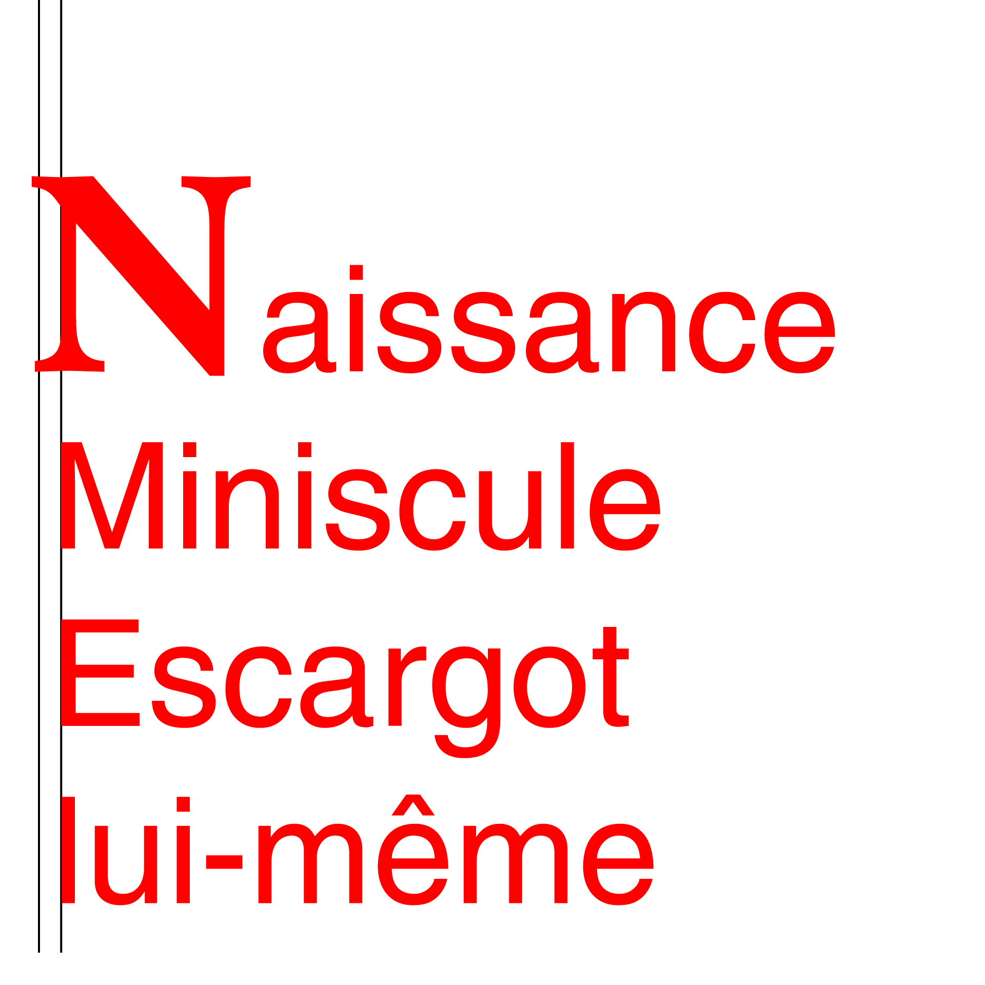
You can click the screenshots to zoom in, and you can see the left alignment of all the stem parts in the final screenshot here by the faint rim of the black line showing just to the left of the stems (no two stem parts were left aligned to start with, neither in the initial screenshot here nor in your screenshot).
Two other fonts have been used, the fairest font and the most famous grotesk/grotesque font, the former in 72pt Bold and the latter in 36pt Medium.
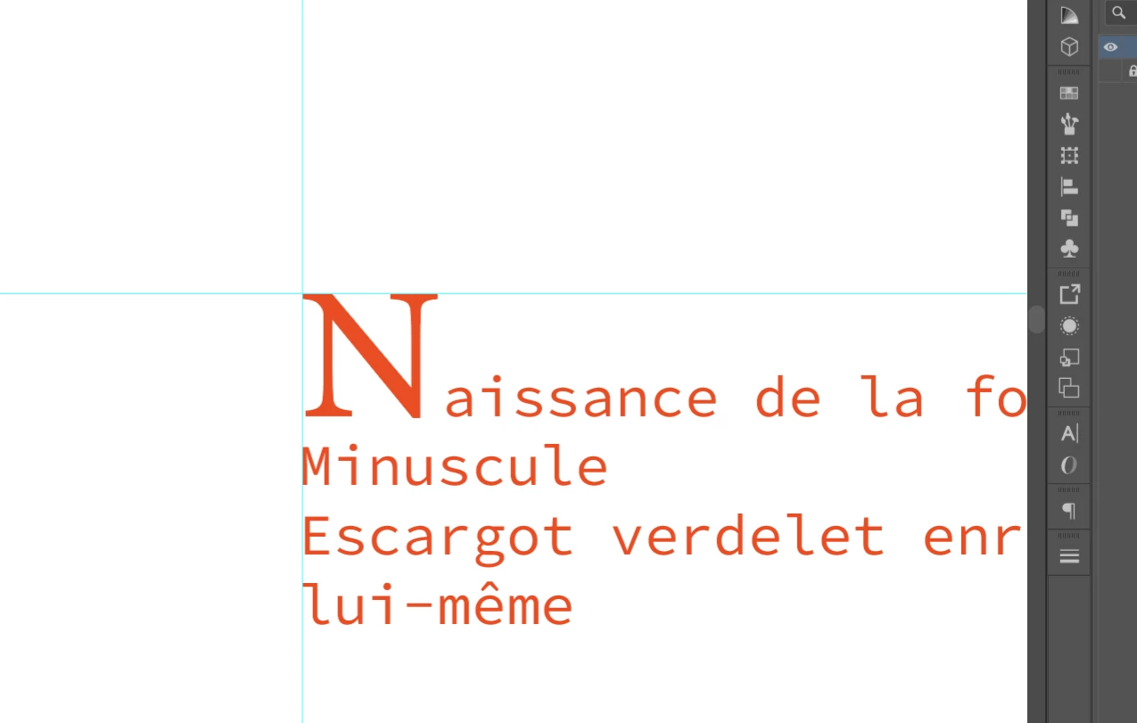
The original non alignment is shown here, the leftmost vertical line left aligned with the left stem of the M, the rightmost vertical line almost left aligned with the left stem of the N with just a faint rim of the black line showing just to the left of the stem to enhance the actual alignments:
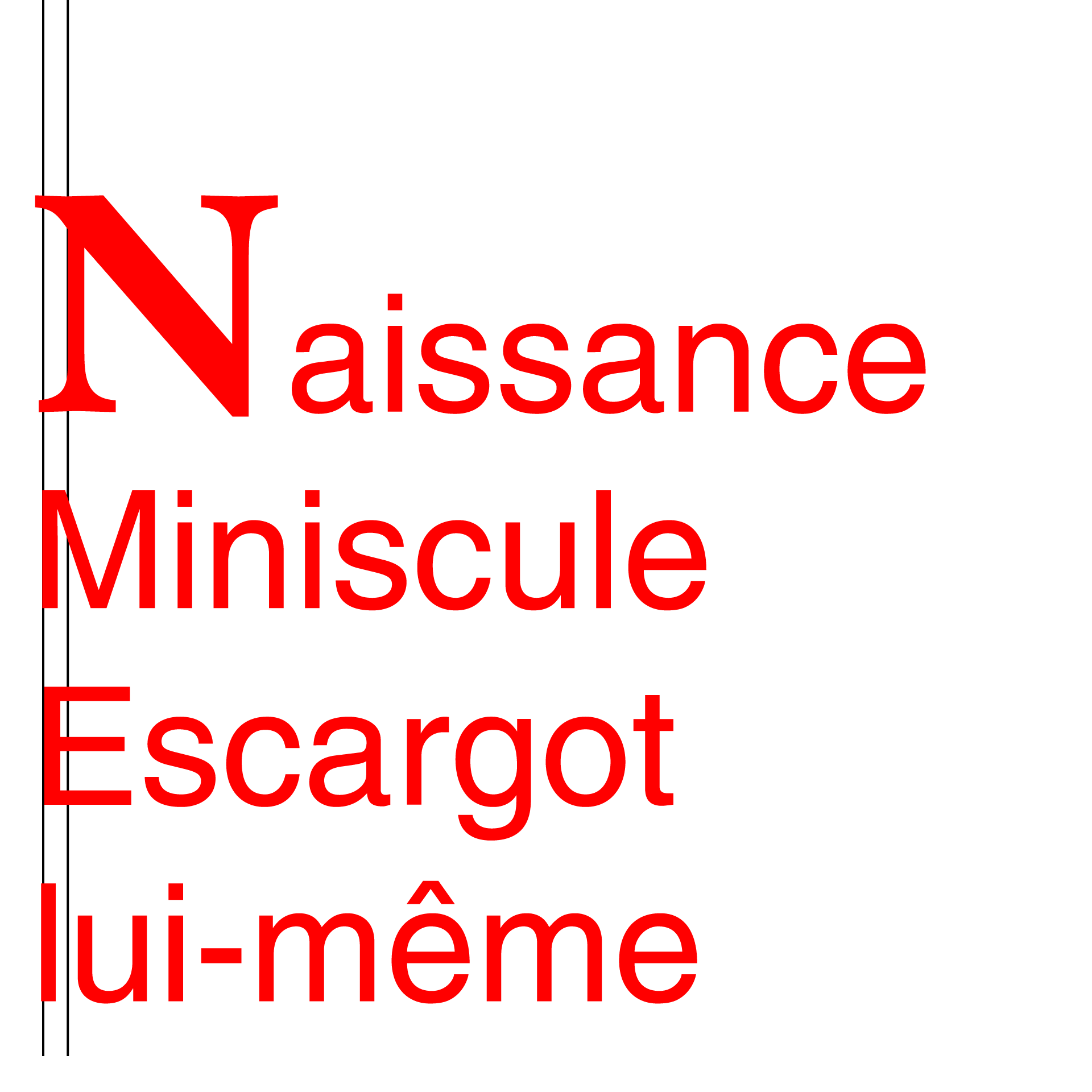
As the first step, a simple space is inserted before the first letter in the 2nd, 3rd, and 4th, line:
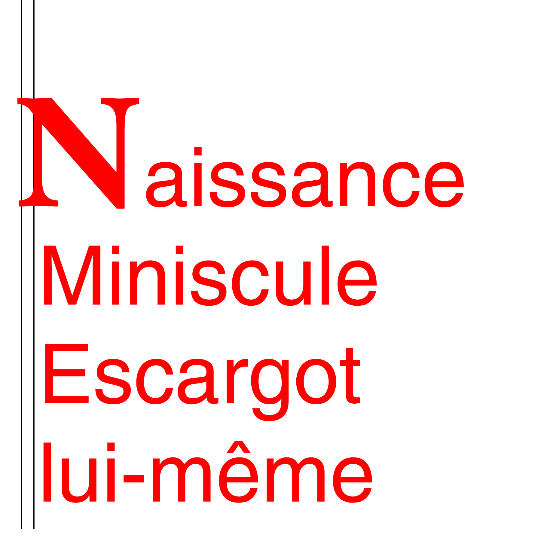
As the second and final step, each space is selected, and the Horizontal Scale is reduced to the value that gives the exact alignment in each line (56% in the 2nd, 52% in the 3rd, and 60% in the 4th, line):
Click to get closer, Click again to get closer still