 Adobe Community

Copy link to clipboard
Copied
Forgive me if this is a silly question, but what is the best practice for creating an RGB version of a logo that has been designed in CMYK?
I have recently been promoted to manager of my small design team, and am reviewing some of the processes that the previous manager was in charge of. I've found that a lot of the RGB logos in the asset libraries are visibly different from their CMYK counterparts. This would not surprise me if the CMYK versions looked dull, but instead it seems like they have been correctly designed for print (the primary medium) but converted afterwards to RGB colours that don't perfectly match. Sometimes this makes the RGB versions look "off", like warm yellows becoming slightly greenish, while others are just a bit washed out and flat.
I suspect part of the reason may be that he had been trying to use "web-safe" colours, but am not sure if this practice is still necessary with technology where it is. Also at least one of the logos has an RGB version that is not web-safe either.
I don't know if I've been doing it correctly all this time, but when I convert from CMYK to RGB in Illustrator, I just change the document colour mode and then create a new swatch, changing its colour mode from CMYK to RGB and letting Illustrator choose the closest equivalent.
Can someone shed light on the (current) best practice for this? I've only ever encountered problems trying to convert RGB backwards to CMYK so this is new to me and a bit puzzling.


 1 Correct answer

nryan.design wrote
However we'll be looking to update the guidelines in the near future and I'm wondering if this is a good time to address the issue of the murky colours.
It absolutely is!
I'd start with Pantone's Lab values for the coated versions of those colours, and convert to sRGB for the RGB values. For the CMYK values, I'd convert them to the most appropriate CMYK profile (based on your spelling of 'colour', I'd go for PSO Coated/FOGRA51, and PSO Uncoated/FOGRA52 for uncoated paper). You m
...Explore related tutorials & articles
 22
Replies
22
22
Replies
22

Copy link to clipboard
Copied
I would check your Edit > Color Settings.
If the RGB version of the logo is meant for Web use, make sure that the RGB working space is set to sRGB.
Then choose File > Document Color Mode > RGB Color.
Edit and don't forget to save it under another name.

Copy link to clipboard
Copied
And of course: don't rely on automatic conversion alone.
If you don't like the RGB colors, just change them.

Copy link to clipboard
Copied
Going from CMYK to RGB is easier, as RGB has a wider color space, so you should be able to more closely.
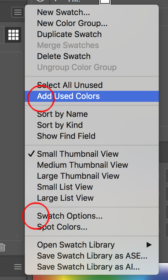
In addition to Ton's advice use the swatches panel & global colors to correct this.
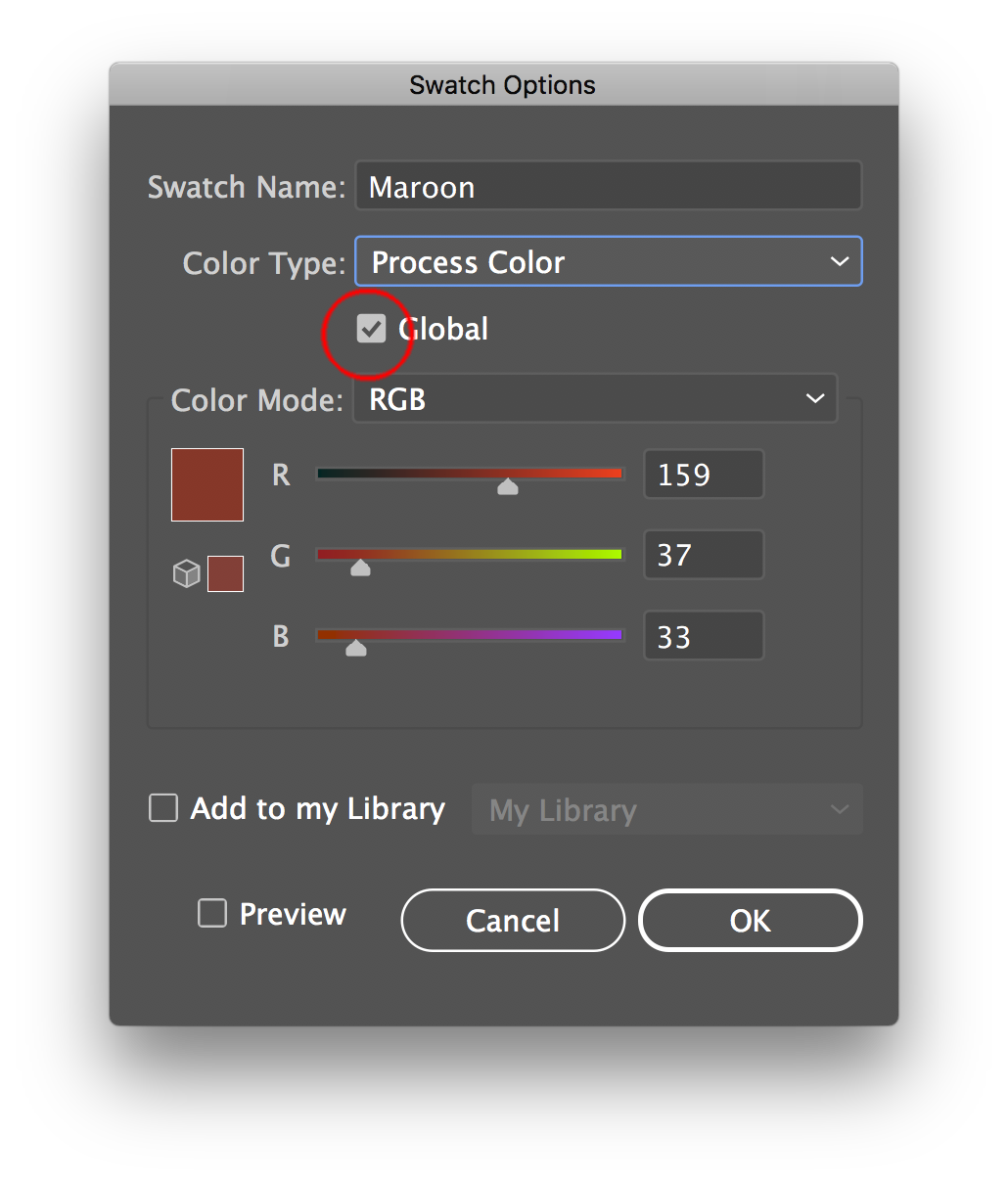
Some useful commands to help you will be to use
Add Used colors. - Adds selected colors to your swatches if they do not exist.
Swatch Options - You can change them, them to be global
Merge Swatches - if you have multiple swatch for the same colors, you can tidy up and merge the swatches into the first one you selected, the ones you ad by command clicking will merge into the first one
Copy link to clipboard
Copied
I should clarify that I have never had problems using the automatic conversion and am happy with the results when I use this method. It's the existing logos in the library that I'm scratching my head over. I'm hesitant to alter them in case there's some reason for them to be that way that I don't know about.
Is web-safe still a thing? I thought it wasn't really necessary anymore because the technology in users' device screens handle a lot more colours these days.
Copy link to clipboard
Copied
nryan.design schrieb
Is web-safe still a thing?
It has actually never worked at all.
Copy link to clipboard
Copied
When the CMYK values are the 'bible', best practice is to establish what CMYK profile those values are intended for (for instance PSO Coated/FOGRA51), and convert to sRGB (using Ton's method). Then, if there are any off-blacks resulting from 'pure black' (100% K) being used, it's usually better to change it to R0 G0 B0 (Mike's advice will help with that)
Do these files have ICC profiles embedded?

Copy link to clipboard
Copied
Do any of the logos have any kind of specific reference colors? CMYK alone is kind of a moving target. Depending on the profiles being used it may print one way out of one printer and come out looking different when output from a different printer. The same applies when viewed on different monitors or even different graphics applications. Many logos will often use Pantone spot or process swatch color books as a visual target for color matching. RGB colors can be tweaked to more closely match what you see in a physical Pantone swatch book.
Copy link to clipboard
Copied
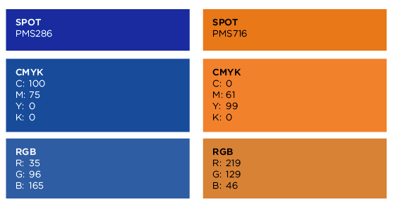
There are Pantone colours listed in the brand guidelines, although they haven't specified which book they are from so I'm just guessing that they are from the Solid Coated book. They don't help much with RGB though, since every screen will be different.
But the part that I'm finding strange is the CMYK colours below look so much richer and truer than the RGB counterparts that were chosen by whoever set up the brand guidelines. On the other hand, when I use Adobe's automatic conversion the numbers are different but it looks identical to the CMYK version (which makes sense). For example, Illustrator give me a blue of R=0, G=72, B=153 and an orange of R=239, G=123, B=5.
So is there any reason why different RGB values might have been used here? Or am I right to be finding it weird?
Copy link to clipboard
Copied
You could ask them about it.
Copy link to clipboard
Copied
These guidelines are years old and all the people who had anything to do with them are long gone. I did try to question the previous manager about it when I was working under him, but his answers usually along the lines of "that's just how it is so why change it". However we'll be looking to update the guidelines in the near future and I'm wondering if this is a good time to address the issue of the murky colours.
Copy link to clipboard
Copied
I don't see a reason why they should be looking that way. Other than the other person had set up their color management inappropriately when making them. And then never checking the result.
So when making new color guides you should consider adjusting them.
Copy link to clipboard
Copied
https://forums.adobe.com/people/Monika+Gause wrote
I don't see a reason why they should be looking that way. Other than the other person had set up their color management inappropriately when making them. And then never checking the result.
That's almost certainly what happened. Out of all the colour specifications I see in brand guidelines, only a small but increasing minority are done properly.
I was guessing that they'd started with too dull a CMYK profile (SWOP Coated maybe), and if I fill a CMYK Photoshop document with those CMYK values, I have to assign a newsprint profile to get them as dull as that RGB patch.

Copy link to clipboard
Copied
Web safe was a thing and it did work. It worked because people were widely using 256-colour video cards (yes, the card could show only 256 colours). Web safe stuck to the colours that were pretty universally available. Nobody has used video cards like that for maybe 20 years, so it isn't a thing any more.
Copy link to clipboard
Copied
https://forums.adobe.com/people/Test+Screen+Name schrieb
Web safe was a thing and it did work.
Not really: Webmonkey: design: Death of the Websafe Color Palette?
Copy link to clipboard
Copied
nryan.design wrote
However we'll be looking to update the guidelines in the near future and I'm wondering if this is a good time to address the issue of the murky colours.
It absolutely is!
I'd start with Pantone's Lab values for the coated versions of those colours, and convert to sRGB for the RGB values. For the CMYK values, I'd convert them to the most appropriate CMYK profile (based on your spelling of 'colour', I'd go for PSO Coated/FOGRA51, and PSO Uncoated/FOGRA52 for uncoated paper). You might then want to tweak them a little to get rid of 1% dots etc. But bear in mind that as Bobby said, CMYK is a moving target, and despite lingering misconceptions, those values will only ever have limited 'authority'.
Copy link to clipboard
Copied
Thanks Danny! That helps.  I'll follow this advice when the time comes to work on the guidelines (you know, when all the stakeholders finally decide to push play haha.)
Copy link to clipboard
Copied
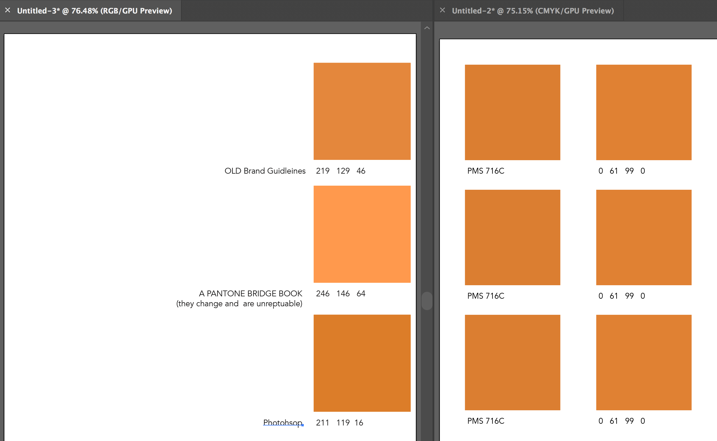
Not sure how the screeshot was created that you posted but would say the old brandguide is not that bad.
Note there is no exact number conversion that everyone uses, but wanted to do a little experiment on my Eizo monitor using in Illustrator in both color modes.
Copy link to clipboard
Copied
MikeGondek schrieb
Not sure how the screeshot was created that you posted but would say the old brandguide is not that bad.
I compared it to the printed Pantone book and it looks like a completely different color.

Copy link to clipboard
Copied
Colors on your (RGB) screen can have a much larger range of brightness and saturation, compared to colors in ordinary (CMYK) print. Any brilliant RGB color stated, or rendered, or converted into CMYK will probably lose some of that brilliance. So once the RGB colors are converted CMYK numbers, it's hard to tell what the original color might have been...
Imagine all possible colors schematically as a sphere, or presented as a flat circle. (Scientifically it's more like a 3D blob in a three-axis model, but let's keep it simple for the sake of the explanation.) The brightest colors in the outer range of the sphere will be 'truncated' to the nearest possible color in print, which is less brilliant, more dull...
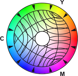
(The hole in the middle indicates the fact that the brightest and pure white tints will also be replaced by the tint of the paper stock.)
If you're sure the original RGB colors were much brighter, and you want to bring that brilliance back, you'll need to edit their numbers (in RGB) manually, or you could consider giving them a boost using the Color Editing dialogue in Illustrator:
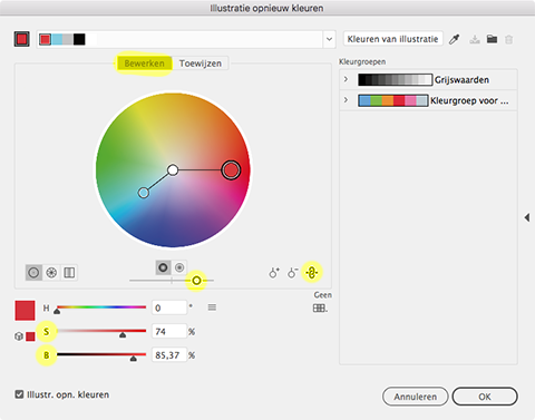
Use the yellow highlighted levels to bring back some brightness and saturation.
Note: switch the chain icon to on, in order to change colors simultaneously.
Copy link to clipboard
Copied
Thanks for your reply Peter, but my issue is not about conversion from RGB to CMYK, but the opposite direction. The CMYK values look beautiful and we have very few problems (we primarily use the logo in print and I think that's what they were designed for). The RGB logos on the other hand look so "off" to me that I basically never use them unless I absolutely can't avoid it.
Copy link to clipboard
Copied
If it looks okay to us, but bad to you, consider if your colour management and screen calibration needs attention.
Copy link to clipboard
Copied
Actually yellows are at a point of the colour gamut, and they may go lime green. Also many cyan tones are not reproducible in standard RGB monitors. The missmatch in the whitepoint will also affect the distortion. This has to do with the shape of the colour spaces. (If you want pure yellows in RGB you will need to use ECI RGB or similar, but that will not work for web). Chaning the hue to the warmer you may been to sacrifice some intensity but it will usually give a better result. Colour is so much judged in context and it really depends on too many factors to give a simple answer. Setting colour settings to General purpose settings and using global swatches to manage colours more easily is the only advice for managing this.
Image of RGB and how it both exceeds and is smaller than CMYK at different colours (sRGB vs FOGRA39 using Color Sync utility) Remember colour space is 3dimensional, often comparison charts only show it 2 dimensional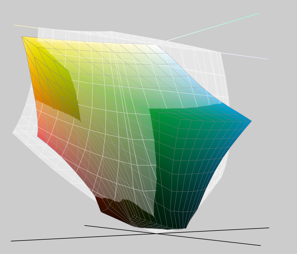
Note that if original colours are in Pantone (Lab) you may be seeing the Spot colour simulation and not the CMYK simulation.

 AdChoices